1936:
to be continued ..
Moderador: Rein


Scott did not have it separately, and that is why in the Americas it is not known???Michael D escribió:Hallo,
der Scotts Weltkatalog von 1849 kennt auch noch beide Varianten.
Viele Grüße
Michael
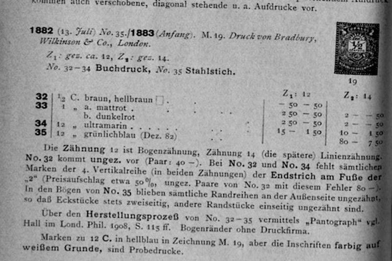
The Kohl-Handbook of 1926 does refer to the Pantograph process for the typographed stamps! It does mention the recess printing for the 12c! Also with the Pantograph?!buzones escribió:Hallo Rein,
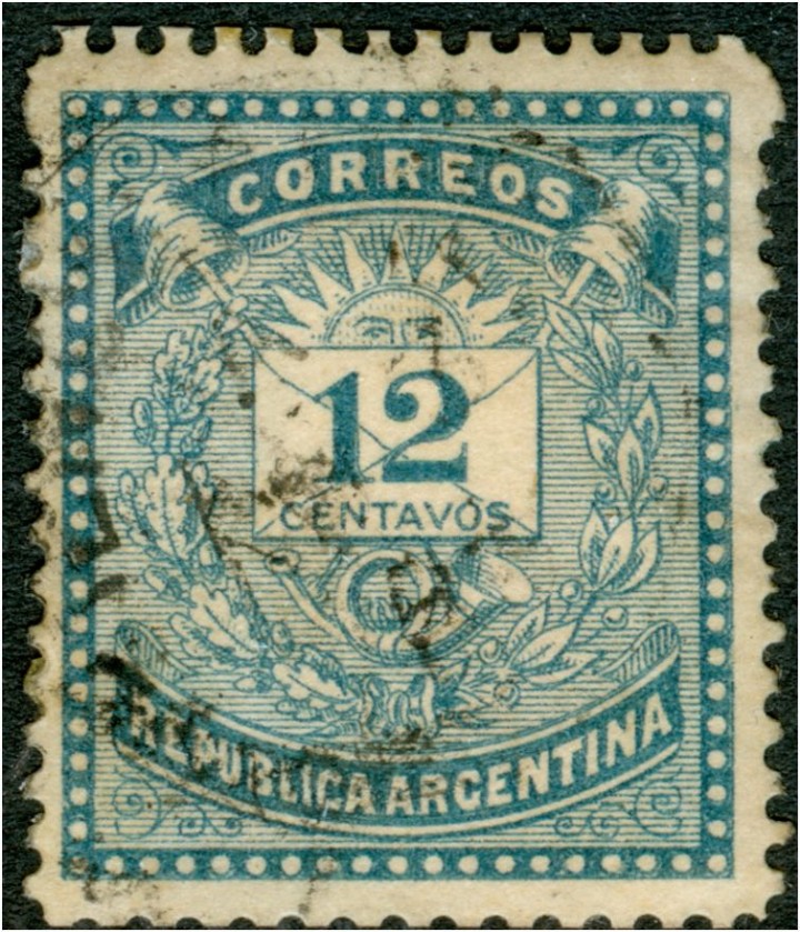
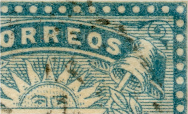
interessanterweise gibt auch das Kohl-Handbuch in der 11. Auflage von 1926 die Information, dass der 12c-Wert der Ausgabe 1882/83 bei BW in London auch im Tiefdruckverfahren hergestellt wurde (gez. 14), "zusätzlich" zur Buchdruckausgabe.
Ab 1884 sollen dann alle Werte im Tiefdruck bei der ABNC in New York, in Zähnung 12, hergestellt worden sein.
Anbei ein Scan der betreffenden Stelle. Man beachte auch den Literaturhinweis auf den London Philatelist von 1908!
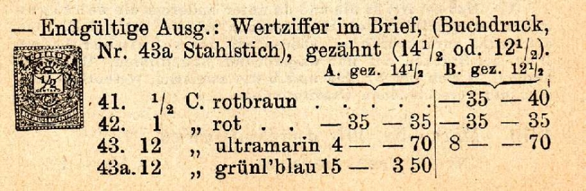
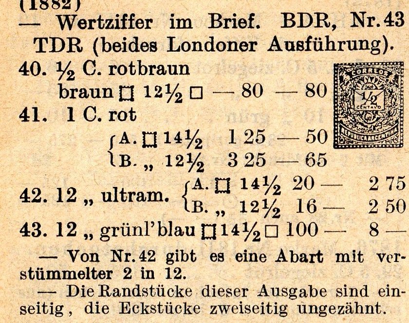
It did have it separately as recess, but only in older editions. You even forgot that you found out about this in a Scott catalog for the very first time (check again that old thread).Rein escribió:Scott did not have it separately, and that is why in the Americas it is not known???
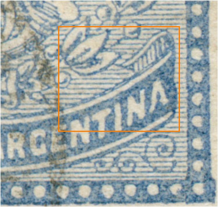
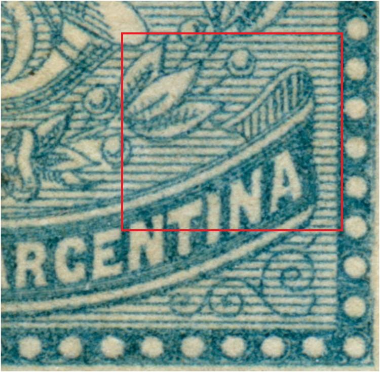
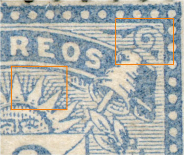
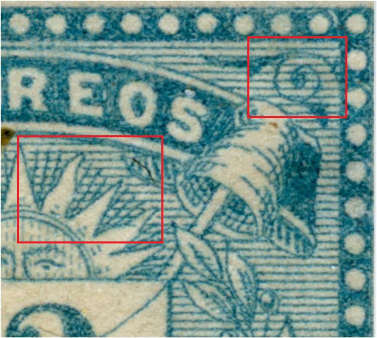
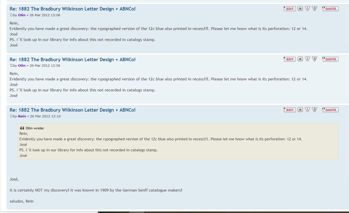
What exactly do you mean? Do you mean that, according to your opinion, other values besides the 12c of the Bradbury set were also printed using recess ? Or are you talking about something else?Rein escribió:But this is not just about the 12c! It is the start for more!
From Buzones to Rein:
Hallo Rein,
interessanterweise gibt auch das Kohl-Handbuch in der 11. Auflage von 1926 die Information, dass der 12c-Wert der Ausgabe 1882/83 bei BW in London auch im Tiefdruckverfahren hergestellt wurde (gez. 14), "zusätzlich" zur Buchdruckausgabe.
Ab 1884 sollen dann alle Werte im Tiefdruck bei der ABNC in New York, in Zähnung 12, hergestellt worden sein.
Anbei ein Scan der betreffenden Stelle. Man beachte auch den Literaturhinweis auf den London Philatelist von 1908!