Próceres y Riquezas volume II
Moderador: Rein
- Rein
- Usuario Colaborador
- Mensajes: 6258
- Registrado: 13 Mar 2009 15:59
- Ubicación: Leiden, Netherlands
- Contactar:
Re: Próceres y Riquezas volume II
The 1p Ganaderia had a short life - issued 01.04.1958 and superceded by the 1p Horse in August 1959!
The normal way for sheet-fed photogravure was to have a perpendicular direction of printing in relation to the direction of paper. The direction of paper being M - along the long axis of the stamp - the direction of printing would be either B [ink flowing upwards] or O [downwards]; the stamps here have the ink flowing upwards!!!
in the fragments you can see a shade pointing upwwards.
the doctor's blade flaw!
to be continued ....
- Rein
- Usuario Colaborador
- Mensajes: 6258
- Registrado: 13 Mar 2009 15:59
- Ubicación: Leiden, Netherlands
- Contactar:
Re: Próceres y Riquezas volume II
The Servicio Oficial with serifs in typography in black; direction of printing still B [ink upwards]:
to be continued ....
- Rein
- Usuario Colaborador
- Mensajes: 6258
- Registrado: 13 Mar 2009 15:59
- Ubicación: Leiden, Netherlands
- Contactar:
Re: Próceres y Riquezas volume II
The Servicio Oficial without serifs in typography in black; direction of printing still B [ink upwards]:
to be continued ....
Última edición por Rein el 05 Sep 2012 05:50, editado 1 vez en total.
- Rein
- Usuario Colaborador
- Mensajes: 6258
- Registrado: 13 Mar 2009 15:59
- Ubicación: Leiden, Netherlands
- Contactar:
Re: Próceres y Riquezas volume II
Somewhere during this period - 01.04.1958 - August 1959 - a new cylinder was made -probably with two tête-bêche panes of 10x10!
We find directions of printing L [ink flowing towards the left] and R [towards the right].
all 3 stamps with L!
the last 2 stamps with R!
to be continued ....
We find directions of printing L [ink flowing towards the left] and R [towards the right].
all 3 stamps with L!
the last 2 stamps with R!
to be continued ....
- Rein
- Usuario Colaborador
- Mensajes: 6258
- Registrado: 13 Mar 2009 15:59
- Ubicación: Leiden, Netherlands
- Contactar:
Re: Próceres y Riquezas volume II
For the Servicio Oficial - sans serif version in typography - we find direction of printing R [towards the right], although L [ink flowing towards the left] should exist too:
this stamp with R!
to be continued ....
this stamp with R!
to be continued ....
- Rein
- Usuario Colaborador
- Mensajes: 6258
- Registrado: 13 Mar 2009 15:59
- Ubicación: Leiden, Netherlands
- Contactar:
Re: Próceres y Riquezas volume II
For the Servicio Oficial - sans serif version in black photogravure - we find both directions of printing: L [ink flowing towards the left] and R [towards the right] too:
this stamp with L!
this stamp with R!
N.B. both colours [brown and black] have the same direction of printing!
to be continued ....
this stamp with L!
this stamp with R!
N.B. both colours [brown and black] have the same direction of printing!
to be continued ....
- Rein
- Usuario Colaborador
- Mensajes: 6258
- Registrado: 13 Mar 2009 15:59
- Ubicación: Leiden, Netherlands
- Contactar:
Re: Próceres y Riquezas volume II
For the Servicio Oficial - sans serif version in blue photogravure - we find both directions of printing: L [ink flowing towards the left] and R [towards the right] too:
this stamp with L and a doctor's blade flaw in BLUE!
this stamp with R and a - short - doctor's blade flaw in BLUE!!
N.B. both colours [brown and blue] have the same direction of printing!
to be continued ....
this stamp with L and a doctor's blade flaw in BLUE!
this stamp with R and a - short - doctor's blade flaw in BLUE!!
N.B. both colours [brown and blue] have the same direction of printing!
to be continued ....
- Rein
- Usuario Colaborador
- Mensajes: 6258
- Registrado: 13 Mar 2009 15:59
- Ubicación: Leiden, Netherlands
- Contactar:
Re: Próceres y Riquezas volume II
Fredy,Fredy 28.04.2011 » 10:16 escribió:
Hola amigos.
Reforzando un poco la idea que presenta José (Otin), encontré en el sitio de Guillermo Jalil esta piecita que me parece nos aclara por qué hay "corridas" de tintas para un lado y para otro.
Miren esta imagen:
Esto nos da la pauta que las planchas pasaron en un sólo sentido y que hubo un único cilindro impresor. Al cortar el pliego por el medio, queda la sensación que fueron impresas dos planchas por separado si tenemos en cuanta el corrimiento de la tinta, pero evidentemente no sucedió asi.
Espero que esto aclare algunos comentarios y teorías que en distintos posteos se han vertido sobre el tema.
Saludos.
Fredy
this is more or less what José suggested! It explains the existence of both directions of printing- L and R - in more or less the same period!
Nevertheless there is a second cylinder with the direction of printing B [ink flowing upwards]!!!!! Notwithstanding the existence of an even different type of design in the case of the 5p!
In the PYR series it is quite common to have more than one cylinder - among them at least one having a tete-beche lay-out!
saludos, Rein
- Rein
- Usuario Colaborador
- Mensajes: 6258
- Registrado: 13 Mar 2009 15:59
- Ubicación: Leiden, Netherlands
- Contactar:
Re: Próceres y Riquezas volume II
José,
I am glad a part of the mystery is gone. Simultaneously having L and R explained! But the normal lay-out for most of the P&R in photogravure would have been the axis of the stamp running parallel to the axis of the cylinders resulting in ink flowing upwards [mostly] in the case of stamps with a landscape or ink flowing to the left [mostly] for stamps in portrait! Meanwhile having the direction printing and the direction of paper perpendicular!
saludos, Rein
- Rein
- Usuario Colaborador
- Mensajes: 6258
- Registrado: 13 Mar 2009 15:59
- Ubicación: Leiden, Netherlands
- Contactar:
Re: Próceres y Riquezas volume II
The mess we have with our 1p Ganaderia we have with the 1p Girasol as well!Augusto Nieva » 26.05.2011 18:34 escribió:Estimados: en un lote comprado encontré este sello (digo singular a pesar de haber 2, porque el otro está roto). Mi duda es la siguiente: estaba a punto de retirar y romper el sello dañado, pero al ver el catálogo JG me doy cuenta que no tiene precio. ¿Conviene que retire el sello roto? ¿O lo conservo para dar "legitimidad" del matasellos? ¿Es raro el sobrecarga doble circulado?
Desde ya muchas gracias por sus respuestas.
Les comento que con el tiempo postearé bastante acá porque tengo varios cientos de oficiales que nunca les presté atención pero que a partir del desarrollo del catálogo GJ se hace mas amena e interesante la clasificación
Augusto
Augusto, the "S. Oficial" can be applied both in typography and in photogravure! You do not mention it so I assume it is the typographical version, which makes it easier to understand the double impression. For as it seems this is a real double impression and not just an ink flow or vibration!
To make it even more complicated we have several types of paper for this 1p to count with AND at least TWO different printing cylinders for the 1p Girasol just as we have seen here for the 1p Ganaderia!
to be continued ...
- Rein
- Usuario Colaborador
- Mensajes: 6258
- Registrado: 13 Mar 2009 15:59
- Ubicación: Leiden, Netherlands
- Contactar:
Re: Próceres y Riquezas volume II
Augusto,Augusto Nieva » 27.05.2011 02:38 escribió:Siguiendo con mi análisis al montón de "oficiales" que poseo hace mucho tiempo y nunca le di importancia, he encontrado cierto patrón en la sobrecarga tipo XIII que me gustaría compartir para saber cuan raro es:
1er patrón: la "A" de OFICIAL tiene un punto en su vértice superior (lo encontré en 3 sellos) y
2do patrón: antes de la "S" aparece un punto a media altura. (lo encontré en 2 sellos)
Como "yapa", en el 1er sello del 2do patrón aparecen unas fallas en la impresión del sello que afectan a la sobrecarga (la sobrecarga se "corta" al encontrar el pliegue original del sello). Se observa que un pliegue corta a la "I" y a la "A" de OFICIAL y a una flor, otro pliegue afecta a la otra flor y hay otro pliegue paralelo al tallo.
De esto último me acabo de dar cuenta al escanear el sello y con una lupa de mucho aumento se observa perfecto en fenómeno.
Although you do not mention it, I will assume that the "S.Oficial" was applied by photogravure! Your "blot in front of the S'' certainly is as I do have it as well!
The "A" of the 5p stamps does not yet look familiar, but it would not surprise me that it was applied in photogravure as well!
to be continued ....
- Rein
- Usuario Colaborador
- Mensajes: 6258
- Registrado: 13 Mar 2009 15:59
- Ubicación: Leiden, Netherlands
- Contactar:
Re: Próceres y Riquezas volume II
S.Oficial in typography; the 1p in photogravure with direction of printing B [ink flowing upwards]:
Uncoated paper from Zárate, orthogonal watermark, symmetrical paper mesh; vertical direction of paper.
to be continued ...
Uncoated paper from Zárate, orthogonal watermark, symmetrical paper mesh; vertical direction of paper.
to be continued ...
- Rein
- Usuario Colaborador
- Mensajes: 6258
- Registrado: 13 Mar 2009 15:59
- Ubicación: Leiden, Netherlands
- Contactar:
Re: Próceres y Riquezas volume II
S.Oficial in photogravure; the 1p in photogravure with direction of printing L [ink flowing to the left]:
The stamp at the right has the blot Augusto told us about!
Uncoated paper from Wiggins Teape, parallel watermark, asymmetrical paper mesh; vertical direction of paper.
to be continued ...
The stamp at the right has the blot Augusto told us about!
Uncoated paper from Wiggins Teape, parallel watermark, asymmetrical paper mesh; vertical direction of paper.
to be continued ...
- Rein
- Usuario Colaborador
- Mensajes: 6258
- Registrado: 13 Mar 2009 15:59
- Ubicación: Leiden, Netherlands
- Contactar:
Re: Próceres y Riquezas volume II
Augusto Nieva » 27.05.2011 15:22' escribió: Perdón. Mala pregunta. Lo que quise decir es que si es posible encontrar este error de sobrecarga en todos los sellos a los que se le aplicó la sobrecarga XIII (no a cada uno de los sellos), o sea desde el GJ734 al GJ767 de los oficiales, si al menos podemos encontrar un sello de cada viñeta con ese error. Espero haber sido mas claro esta vez.
Augusto Nieva
labanderanocturna » 27.05.2011 21:21 escribió:
A ver si entiendo la teoría de Augusto, sólo para clarificar:
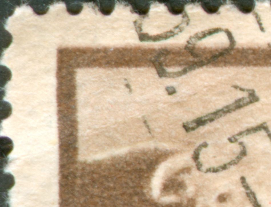
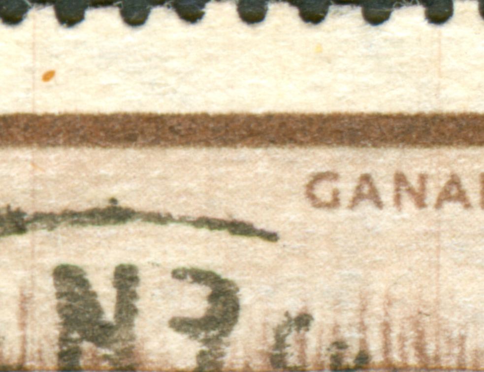
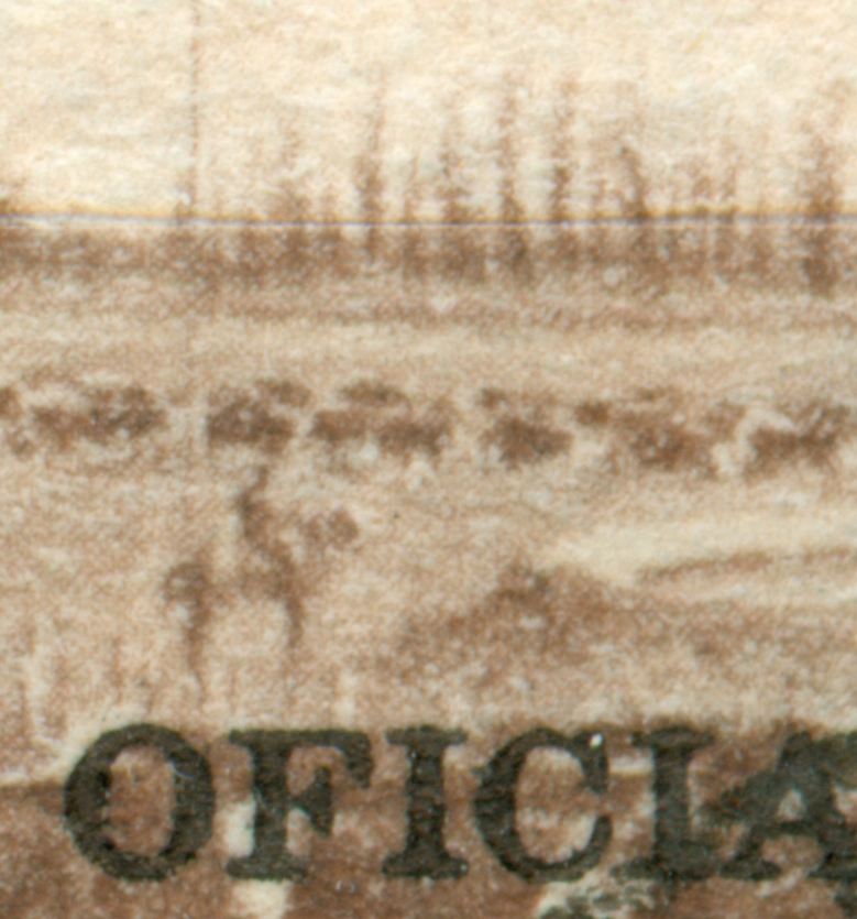
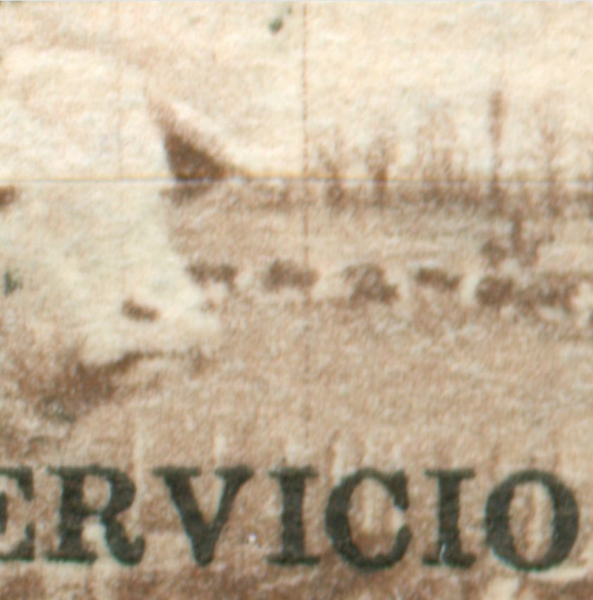
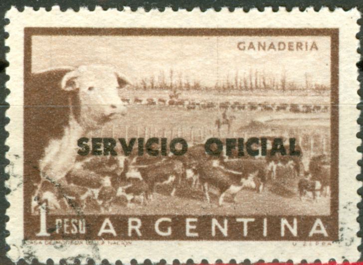
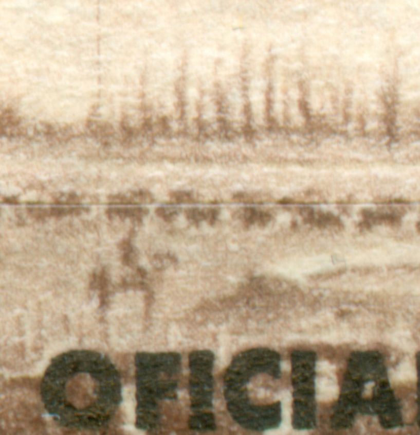
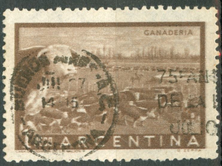
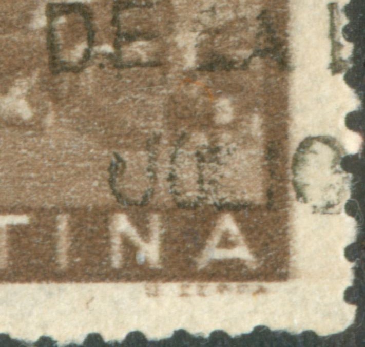
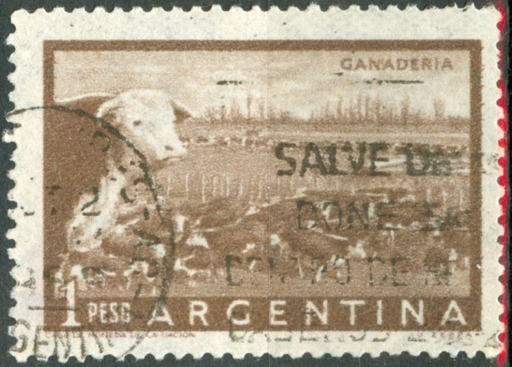
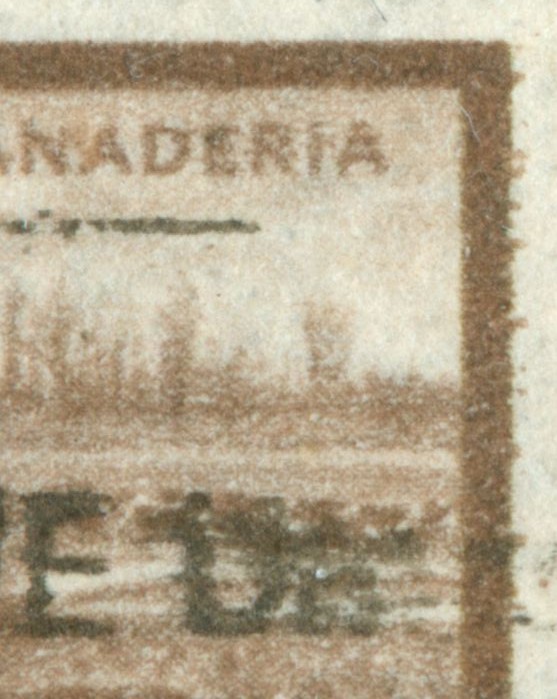
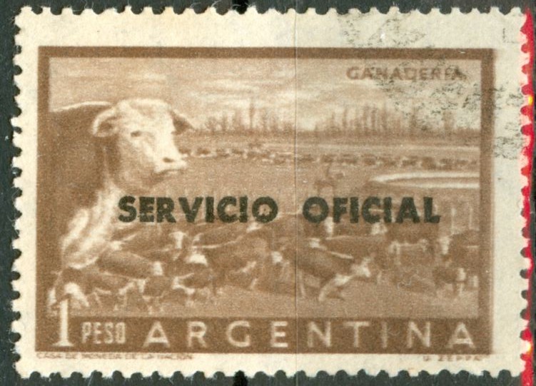
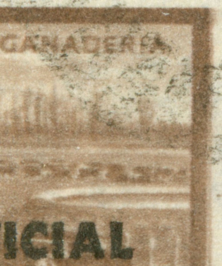
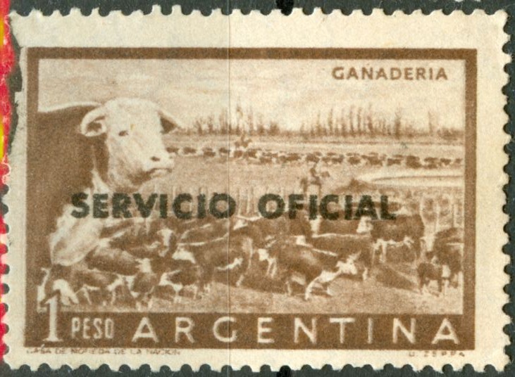
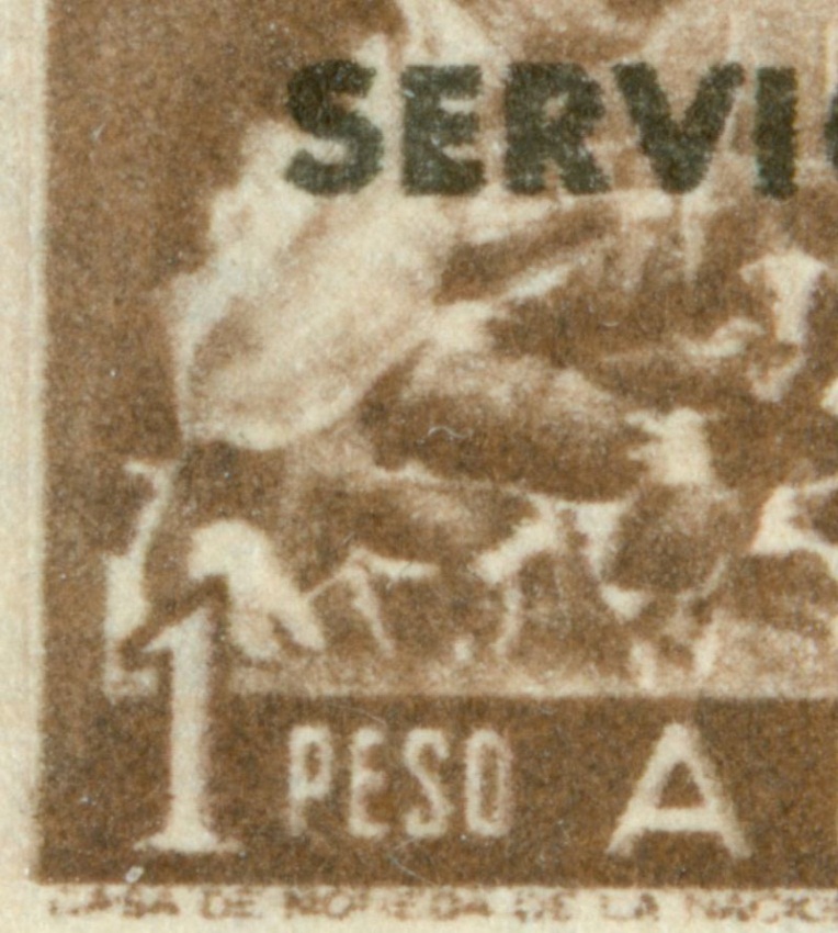
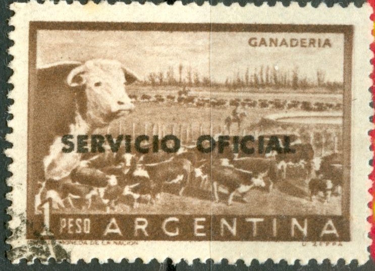
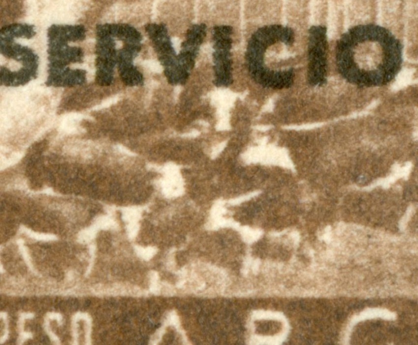
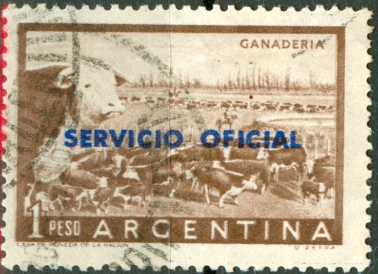
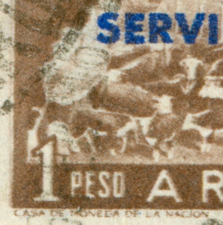
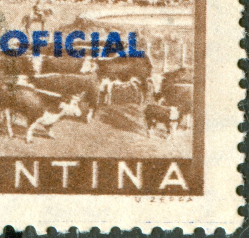
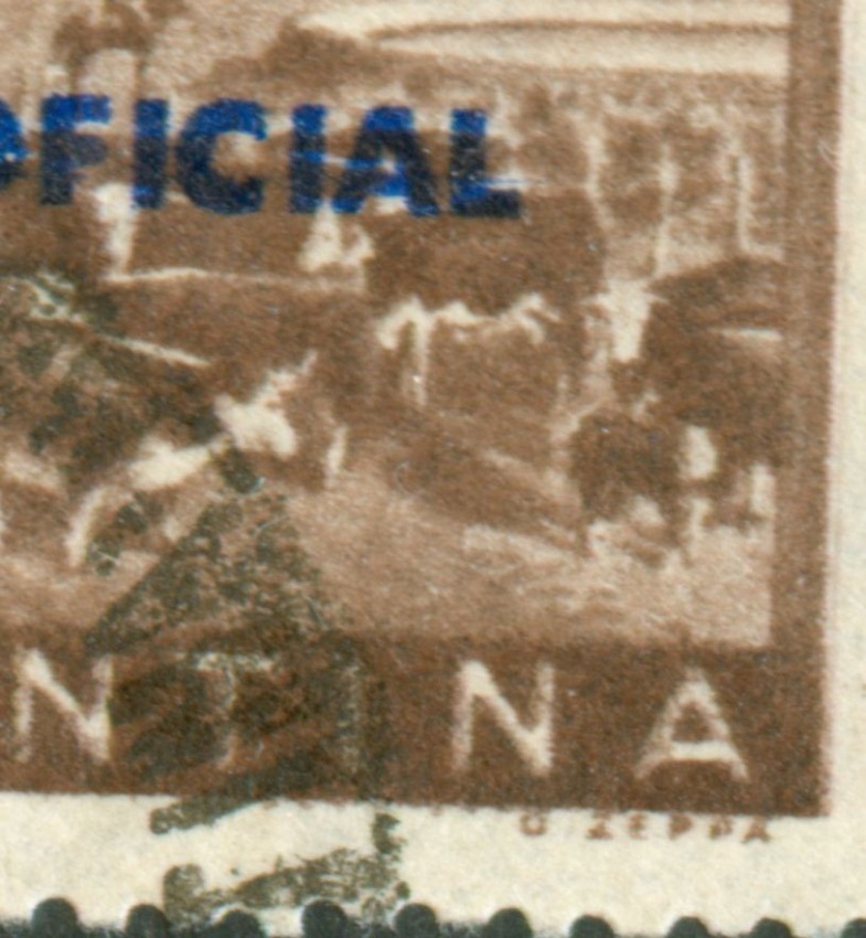
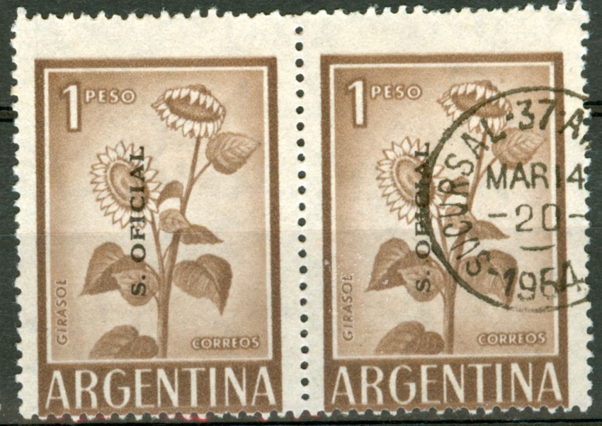
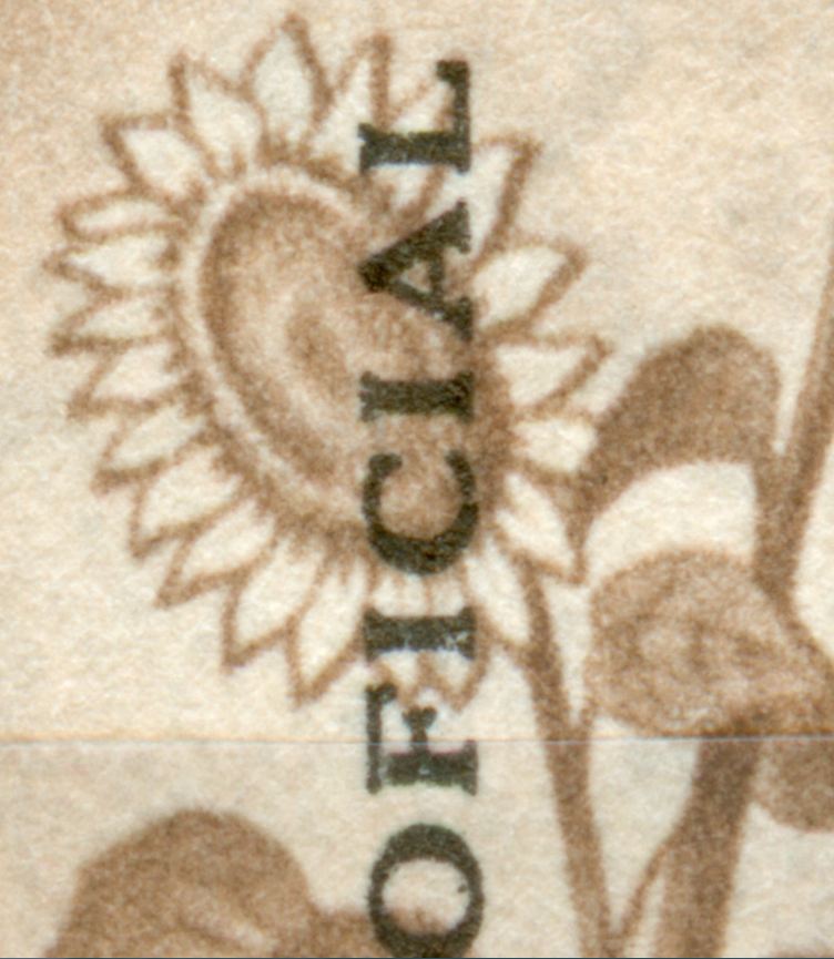
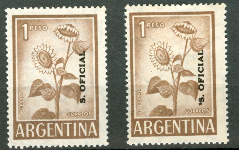
Para aplicar la sobrecarga XIII se utilizó el mismo cilindro (¿?) en todos los sellos que llevan dicha sobrecarga, o al menos hasta que se rompió. Por lo tanto tendríamos que encontrar estos defectos en todos los sellos que posean sobrecarga XIII. Fredy no ahorra el trabajo diciendo las posiciones en las cuales encontramos la variedad en los sellos verticales, teniendo que deducir para los sellos horizontales o con sobrecarga hacia abajo.
Desde mi punto de vista cómo lector, en los sellos de formatos "grandes" se daría esta situación si seguimos la teoría Augustuniana:
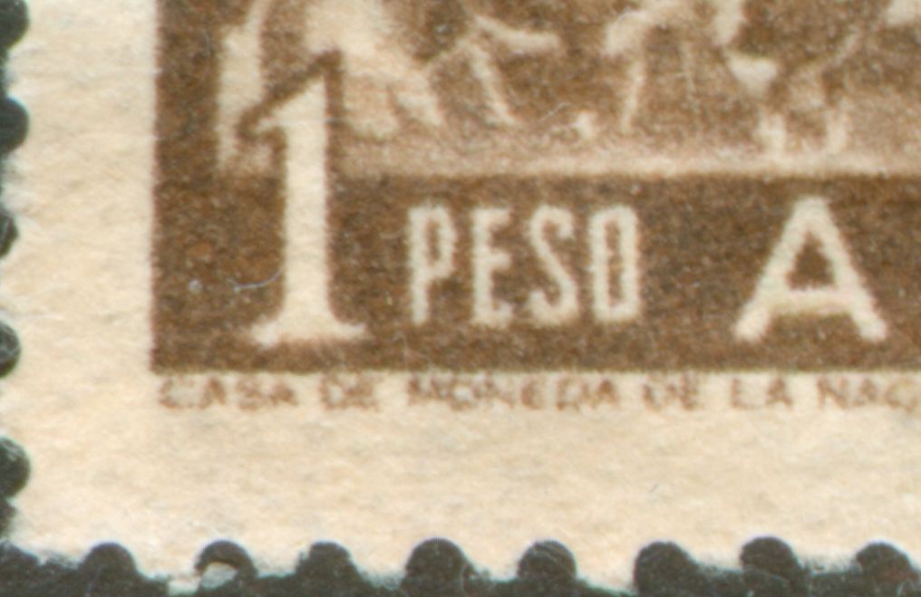
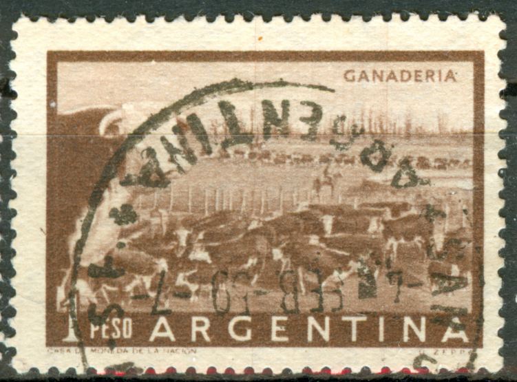
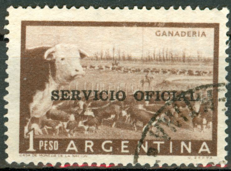
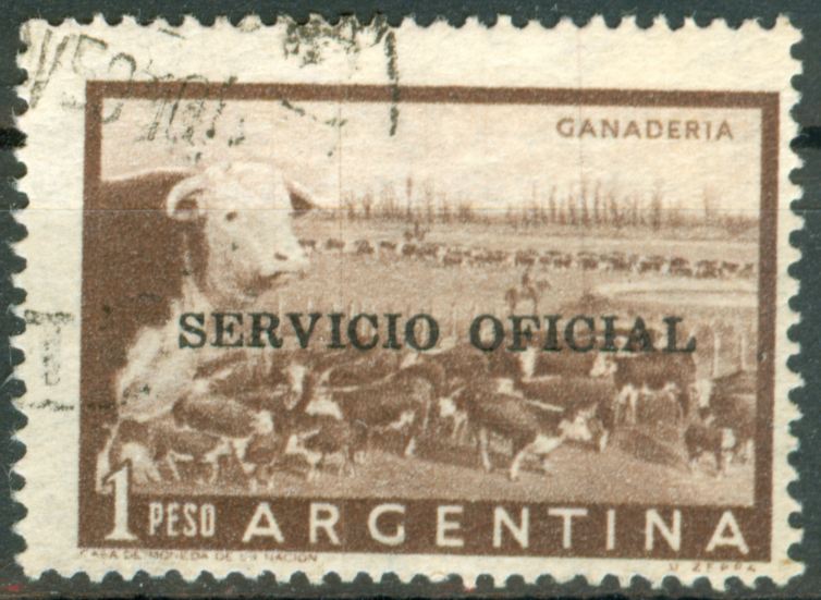
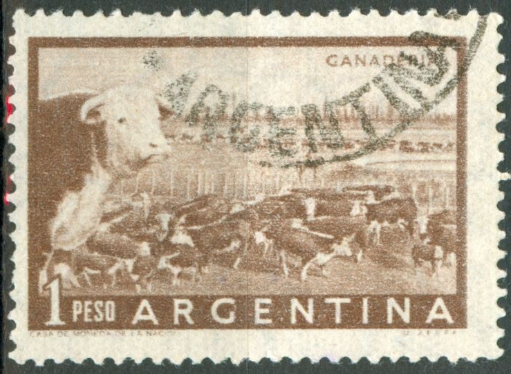
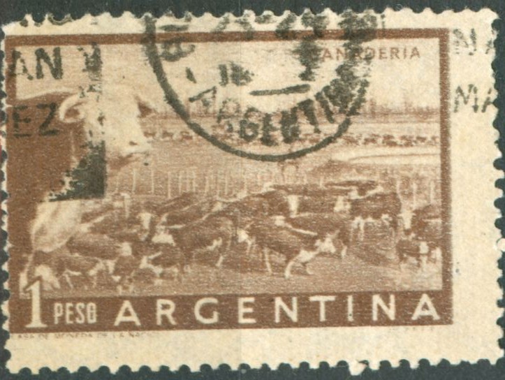
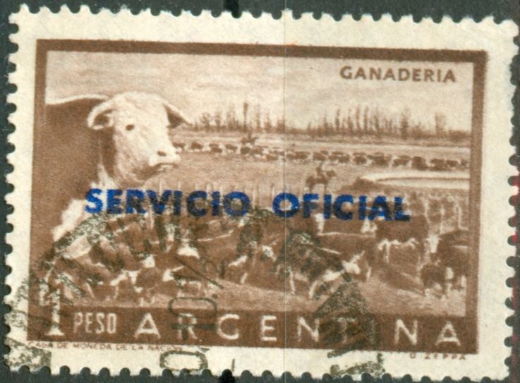
1 P girasol,, 2 P Sarmiento, 3 P Cuesta de Zapata, 4 y 6 P Hernandez, 10 P puente del Inca, 20 P Nahuel Huapi, 23 y 25 P Quebracho colorado, 43 y45 P Industria, 50 P San Martin y 90 P Brown.
Pero por supuesto, esto es lo que entendí, que no tiene or qué ser verdad.
Saludos
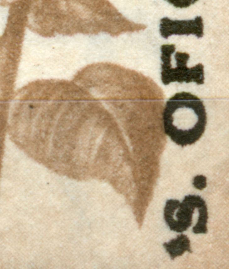
Do the characteristics occur in all stamps with overprint type XIII according to Göttig-Jaliil?Augusto Nieva » 28.05.2011 00:51 escribió:
Exacto, esa es mi inquietud, si podemos inferir que en todos esos valores se encuentran esas sobrecargas con detalles...
Augusto Nieva
Apart from the fact that the types of GJ - VII, XII and XIII are not defined! "S. Oficial" with serifs.... but then...????
to be continued ...
- Rein
- Usuario Colaborador
- Mensajes: 6258
- Registrado: 13 Mar 2009 15:59
- Ubicación: Leiden, Netherlands
- Contactar:
Re: Próceres y Riquezas volume II
Only the stamps with the same size - 26.5x37.5mm - and printed in photogravure are candidates!Fredy » 28.05.2011 01:21 escribió:
Vamos por partes, como dijo el viejo Jack.
Para no confundirnos, diría que los sellos que menciona la bandera son medianos (Chicos San Martín 2, 4, 8 y 10 pesos; y grandes Bariloche, San Martín de 50).
Ejemplos:
Tamaños: chico, mediano y grande.
Luego decimos que las sobrecargas Tipo XIII se imprimieron en los sistemas offset y huecograbado. Descartemos los sellos chicos porque no vi acentos ni comillas en ellos y los grandes porque no tienen esa sobrecarga.
Entonces, se puede afirmar que esas variedades se dan en los sellos tamaño mediano cuya sobrecarga se imprimió en huecograbado. Las he visto en los valores 1p Girasol, 5p Riqueza Austral, 10p Puente del Inca, 25p Quebracho (roja), 45p Industria.
Aquí algunas comillas:
Variedad con comillas.
En al caso de los acentos, encuentro dos tipos: Uno con la mancha sobre el ángulo de la letra A y otro con el acento al lado. Vayan estos ejemplos:
Tipos de acentos a) y b).
Otro en sello apaisado:
Sobrecarga con acento Tipo b).
Lo que no he podido determinar es si los acentos a) y b) ocupan la misma posición en las planchas.
Espero se entienda, sino, como dice Mr. Rein: to be continued...
Fredy
And we can distinguish two different accents for the "A' - one just on top and one a bit next to it...
to be continued ....