Double impression or preferential ink flow?

Topics about Argentina Philately in english language.

Moderador: Rein

Avatar de Usuario
Rein
Usuario Colaborador
Usuario Colaborador
Mensajes: 6258
Registrado: 13 Mar 2009 15:59
Ubicación: Leiden, Netherlands
Contactar:

Re: Double impression or preferential ink flow?

Mensaje por Rein »

Si Rein me muestra un sello del1p Toro con una melladura de la cuchilla,la raya vertical que atraviesa la viñeta, en sentido horizontal a la misma, entonces sí aceptaré lo de los dos cilindros con formatos opuestos.
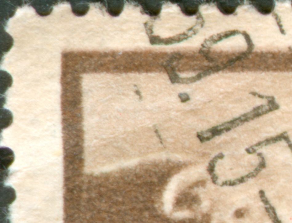
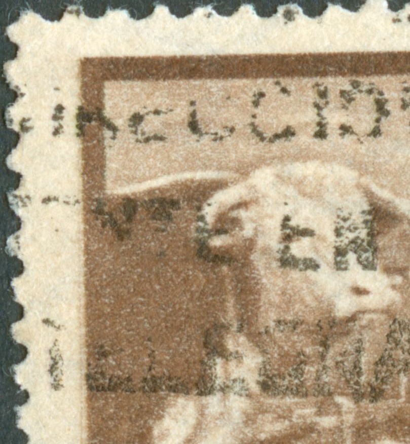
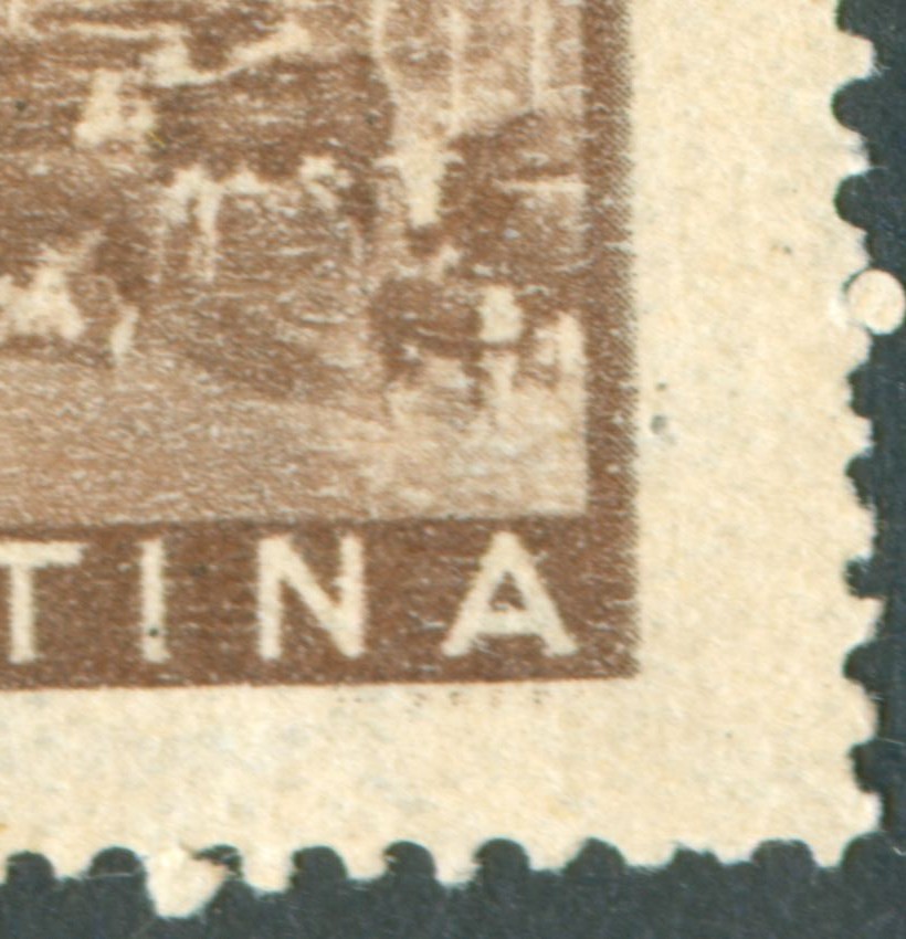
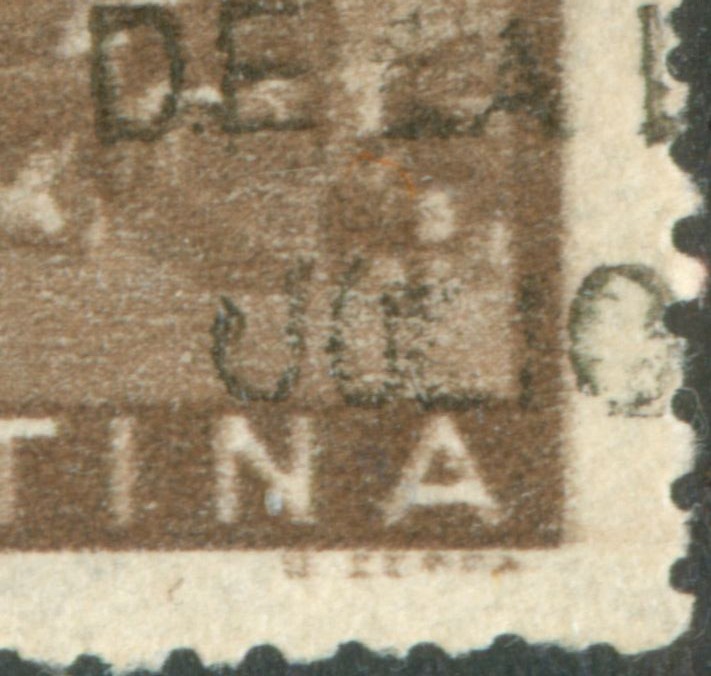
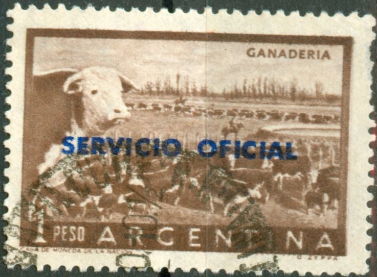
The presence of doctor's blade flaws - the thin lines that get printed as the blade that wipes off the superfluous ink had some damages - is helpful in establishing the direction of printing but as it is something that should not have happened, we can not and do not have rely on their presence!

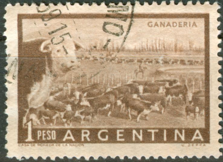
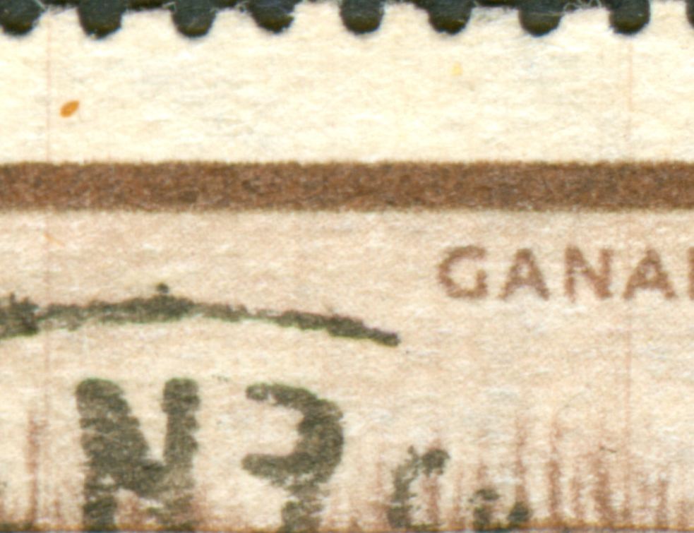
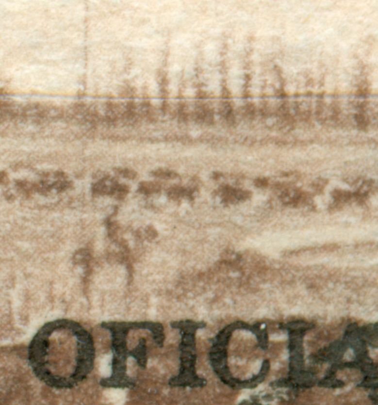
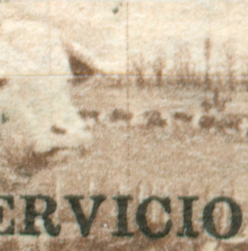
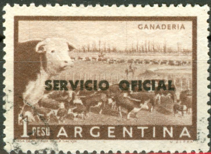
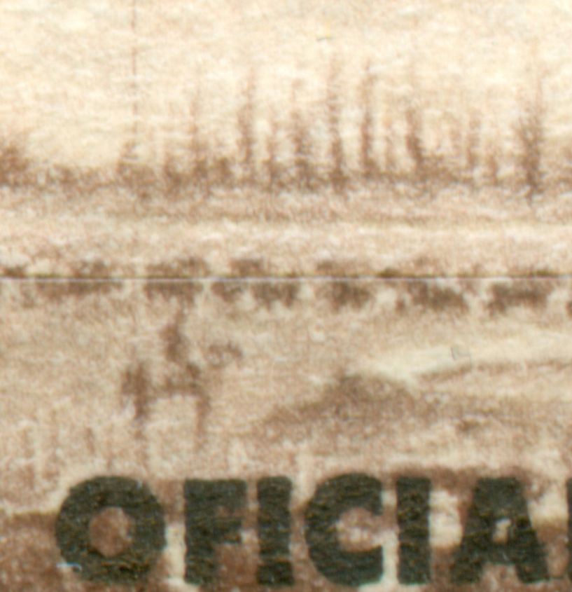
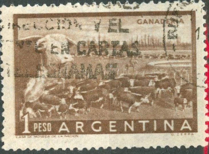
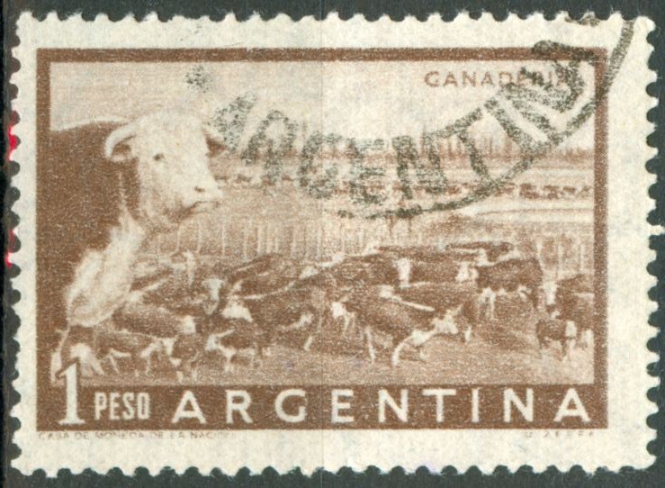
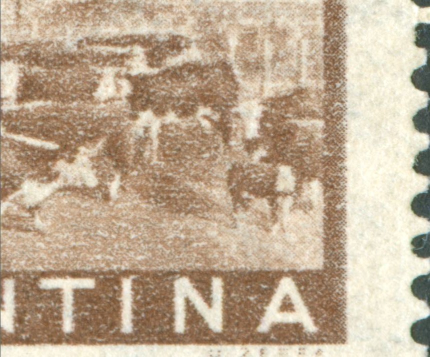
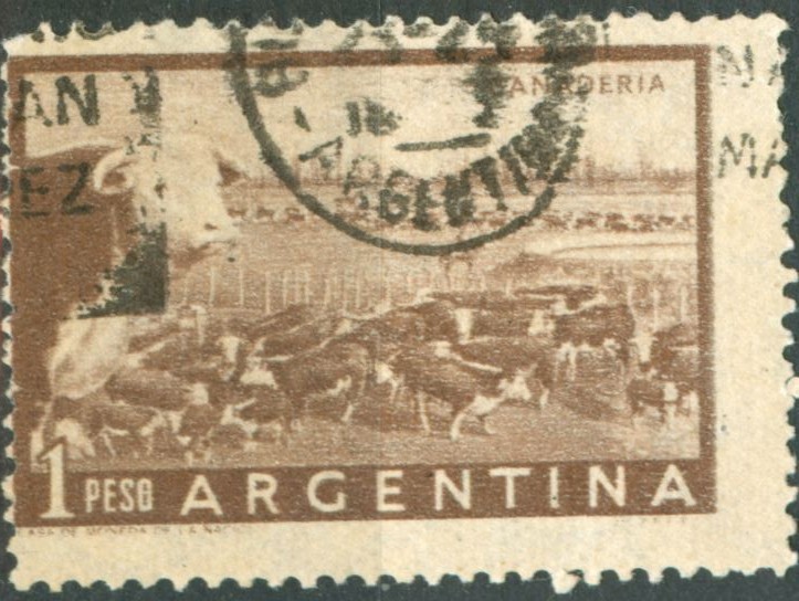
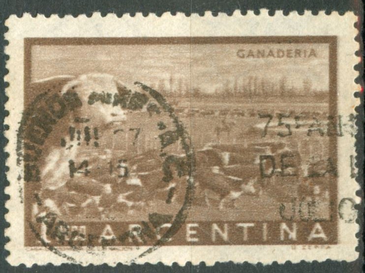
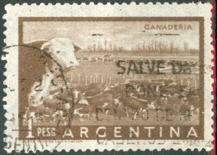
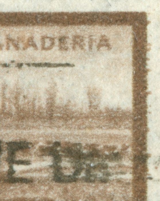
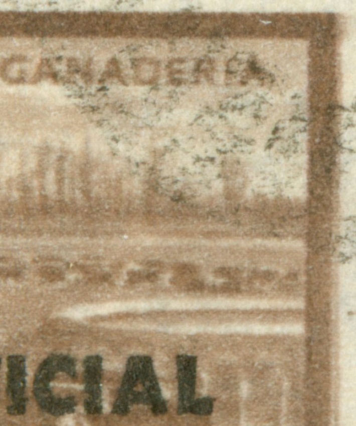
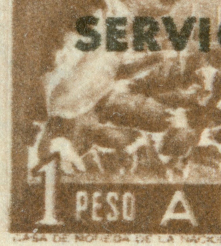
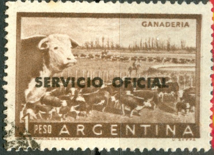
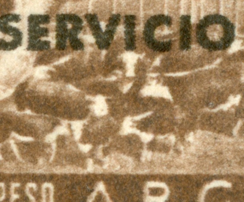
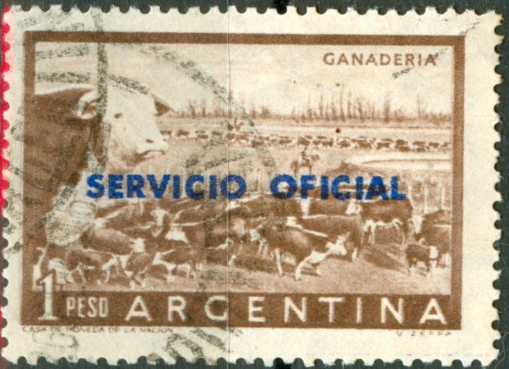
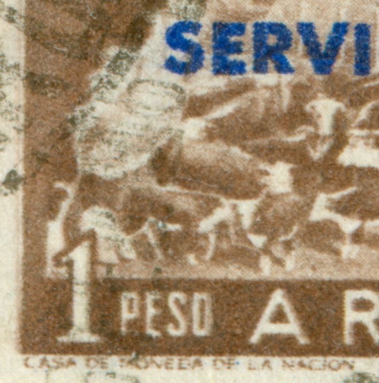
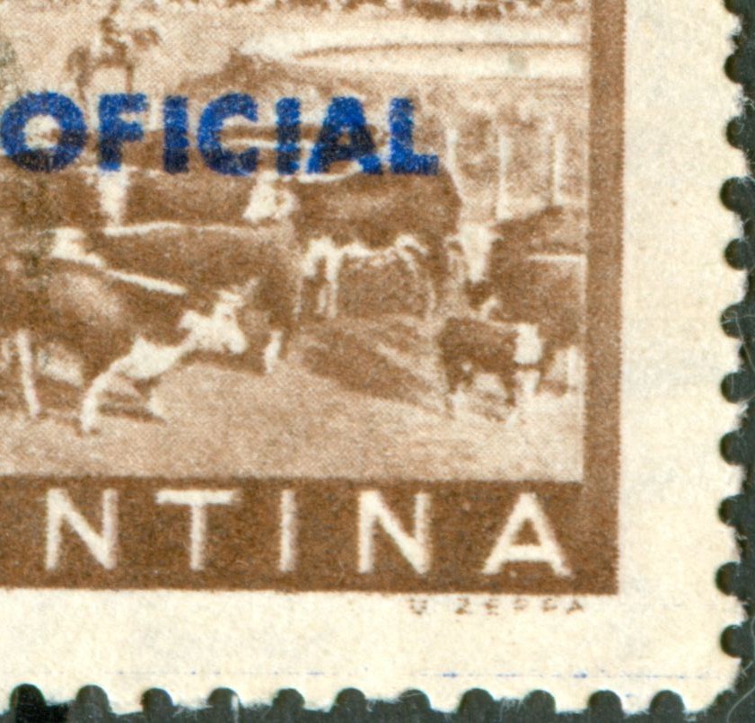
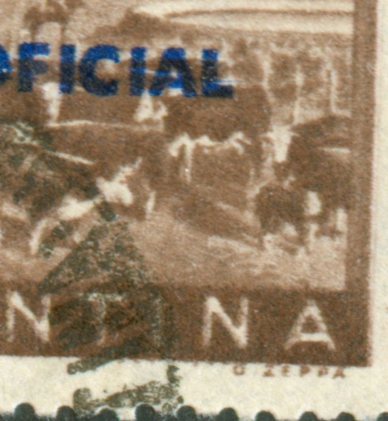
Quite often the ink flow in a preferential direction is obvious enough! In the case of the 1p Ganaderia we have good examples of the ink flowing towards the left and good examples of the ink flow towards the right; alas no horizontal thin lines observed!!

The suggestion of José Merlo that the printing sheet consists of 2 panes tête-bêche is quite a good explanation for the occurance of both opposite directions of printing. It is in fact a very similar situation as the one in which around 1973 the direction of printing was discovered - the tête-bêche booket-panes...

We are going to see this tête-bêche lay-out probably in several other P&R II/III values like the 1p Girasol, the 3p Cuesta de Zapata, the 5p Riqueza Austral and the 10p Puente del Inca to start with....

to be continued ....
Avatar de Usuario
Rein
Usuario Colaborador
Usuario Colaborador
Mensajes: 6258
Registrado: 13 Mar 2009 15:59
Ubicación: Leiden, Netherlands
Contactar:

Re: Double impression or preferential ink flow?

Mensaje por Rein »

The 1p Ganaderia had a short life - issued 01.04.1958 and superceded by the 1p Horse in August 1959!

The normal way for sheet-fed photogravure was to have a perpendicular direction of printing in relation to the direction of paper. The direction of paper being M - along the long axis of the stamp - the direction of printing would be either B [ink flowing upwards] or O [downwards]; the stamps here have the ink flowing upwards!!!

Imagen
Imagen
Imagen

in the fragments you can see a shade pointing upwwards.


Imagen
Imagen

the doctor's blade flaw!

to be continued ....
Avatar de Usuario
Rein
Usuario Colaborador
Usuario Colaborador
Mensajes: 6258
Registrado: 13 Mar 2009 15:59
Ubicación: Leiden, Netherlands
Contactar:

Re: Double impression or preferential ink flow?

Mensaje por Rein »

The Servicio Oficial with serifs in typography in black; direction of printing still B [ink upwards]:

Imagen
Imagen

Imagen
Imagen


to be continued ....
Avatar de Usuario
Rein
Usuario Colaborador
Usuario Colaborador
Mensajes: 6258
Registrado: 13 Mar 2009 15:59
Ubicación: Leiden, Netherlands
Contactar:

Re: Double impression or preferential ink flow?

Mensaje por Rein »

The Servicio Oficial without serifs in typography in black; direction of printing still B [ink upwards]:

Imagen
Imagen


to be continued ....
Avatar de Usuario
Rein
Usuario Colaborador
Usuario Colaborador
Mensajes: 6258
Registrado: 13 Mar 2009 15:59
Ubicación: Leiden, Netherlands
Contactar:

Re: Double impression or preferential ink flow?

Mensaje por Rein »

Somewhere during this period - 01.04.1958 - August 1959 - a new cylinder was made -probably with two tête-bêche panes of 10x10!

We find directions of printing L [ink flowing towards the left] and R [towards the right].

Imagen
Imagen

Imagen
Imagen
Imagen
Imagen

all 3 stamps with L!


Imagen
Imagen

Imagen
Imagen

the last 2 stamps with R!

to be continued ....
Avatar de Usuario
Rein
Usuario Colaborador
Usuario Colaborador
Mensajes: 6258
Registrado: 13 Mar 2009 15:59
Ubicación: Leiden, Netherlands
Contactar:

Re: Double impression or preferential ink flow?

Mensaje por Rein »

For the Servicio Oficial - sans serif version in typography - we find direction of printing R [towards the right], although L [ink flowing towards the left] should exist too:


Imagen
Imagen

this stamp with R!

to be continued ....
Avatar de Usuario
Rein
Usuario Colaborador
Usuario Colaborador
Mensajes: 6258
Registrado: 13 Mar 2009 15:59
Ubicación: Leiden, Netherlands
Contactar:

Re: Double impression or preferential ink flow?

Mensaje por Rein »

For the Servicio Oficial - sans serif version in black photogravure - we find both directions of printing: L [ink flowing towards the left] and R [towards the right] too:


Imagen
Imagen

this stamp with L!

Imagen
Imagen

this stamp with R!

N.B. both colours [brown and black] have the same direction of printing!

to be continued ....
Avatar de Usuario
Rein
Usuario Colaborador
Usuario Colaborador
Mensajes: 6258
Registrado: 13 Mar 2009 15:59
Ubicación: Leiden, Netherlands
Contactar:

Re: Double impression or preferential ink flow?

Mensaje por Rein »

For the Servicio Oficial - sans serif version in blue photogravure - we find both directions of printing: L [ink flowing towards the left] and R [towards the right] too:


Imagen
Imagen
Imagen

this stamp with L and a doctor's blade flaw in BLUE!

Imagen
Imagen

this stamp with R and a - short - doctor's blade flaw in BLUE!!

N.B. both colours [brown and blue] have the same direction of printing!

to be continued ....
Avatar de Usuario
Rein
Usuario Colaborador
Usuario Colaborador
Mensajes: 6258
Registrado: 13 Mar 2009 15:59
Ubicación: Leiden, Netherlands
Contactar:

Re: Double impression or preferential ink flow?

Mensaje por Rein »

I hope these postings have made it clear that in photogravure the direction of printing can be established - not always in every stamp that well as shown . Secondly that the Casa de Moneda has used more than one cylinder for definitives while turning the design 90 degrees!

It looks like it for the P&R II/III that the axis of the stamp design runs parallel to the axis of the cylinders and perpendicular to the direction of paper!

But also that another cylinder was prepared with the axis of the design parallel to the circumferential of the cylinder! This is not supposed be the optimal position for sheet-fed printing. ...

To balance the even distribution of ink on the cylinder a tête-bêche lay-out may have been applied which allows the cylinder to be mounted the other way around to diminish a wearing out of the cylinder by raking the superfluous inks....???

Last but not least , the Servico Oficial stamps - once the text got printed in photogravure - are bicoloured stamps printed in ONE run.

to be continued ...
Responder

Volver a “Argentina Philately in the language of Shakespeare”