Página 7 de 10
Re: Mexico - avant garde printing techniques - 1916-now
Publicado: 29 Abr 2014 08:34
por Rein
Re: Mexico - avant garde printing techniques - 1916-now
Publicado: 29 Abr 2014 08:35
por Rein
Re: Mexico - avant garde printing techniques - 1916-now
Publicado: 29 Abr 2014 08:36
por Rein
Re: Mexico - avant garde printing techniques - 1916-now
Publicado: 29 Abr 2014 08:38
por Rein
Re: Mexico - avant garde printing techniques - 1916-now
Publicado: 01 May 2014 16:49
por Rein
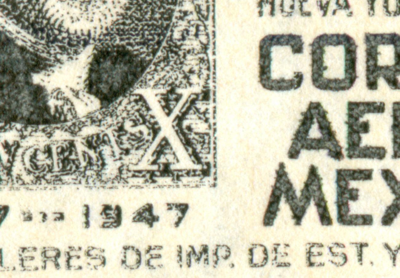
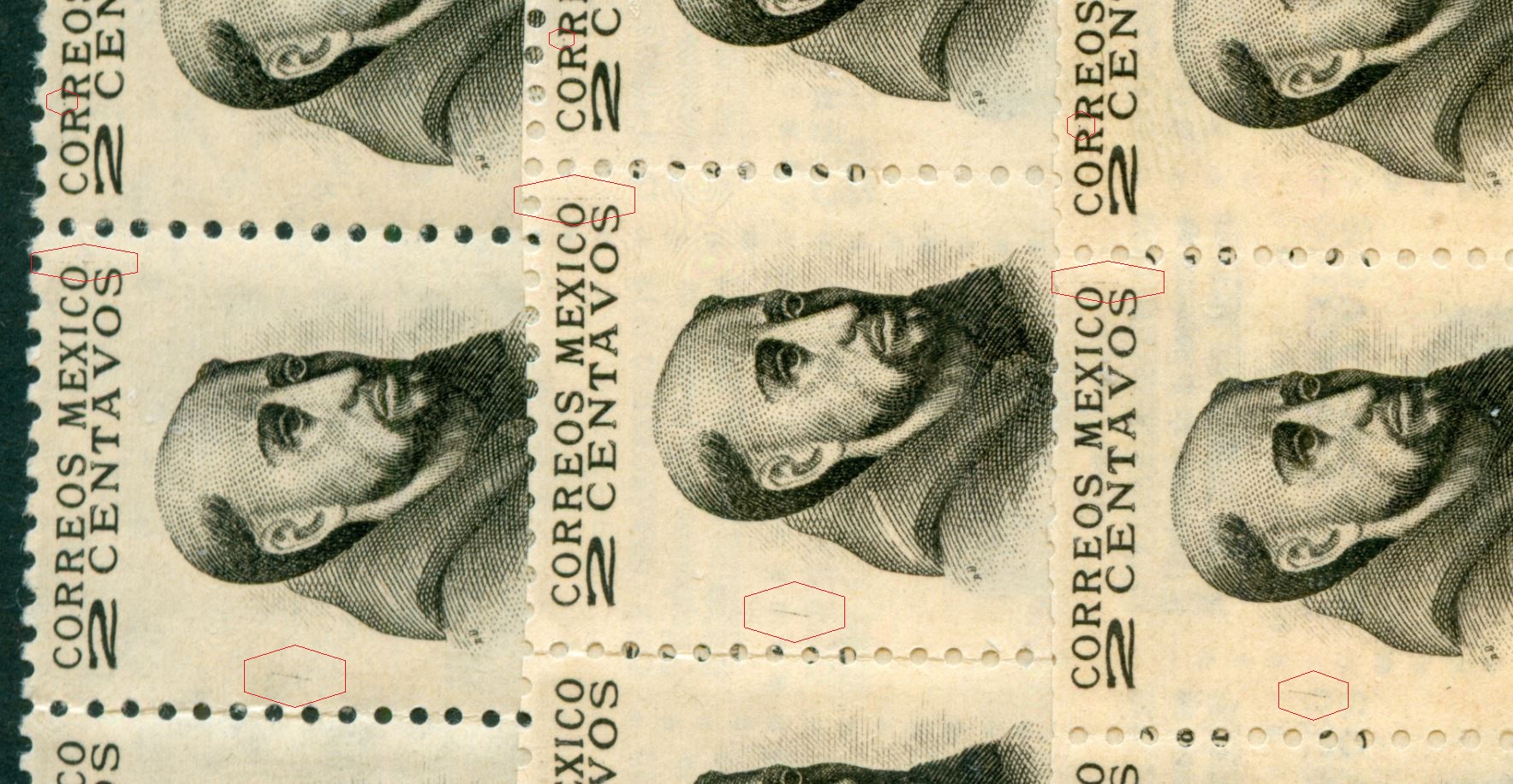
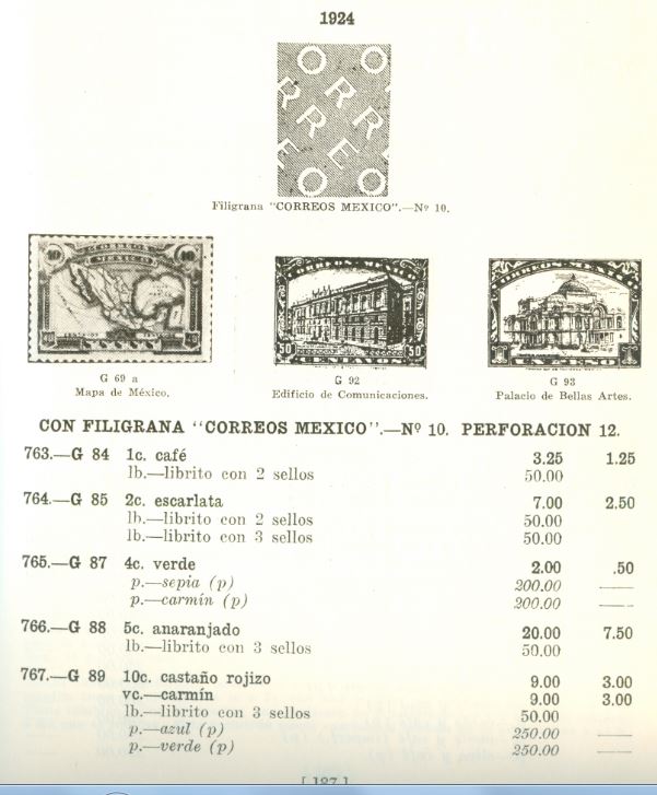
Watermark no 10 according to G. Celis Cano is supposed to have started in 1924 - la marca de agua: CORREOS MÉXICO.
The picture in Celis Cano [pag. 187, my 1971 edition] should be interpreted with the reading line ascending under an angle of some 40 degrees with the horizon! The horizon being perpendicular to the direction of paper [eje de enrollamiento]. In the above picture this would mean that the "E" of "Correo" will be positioned on top of each other!!!
Which is correct! Up to a point!!!
Re: Mexico - avant garde printing techniques - 1916-now
Publicado: 01 May 2014 16:54
por Rein
The various characters are aligned on top of each other! There is a column of "M", of "O", of "C" etc...
Re: Mexico - avant garde printing techniques - 1916-now
Publicado: 01 May 2014 16:57
por Rein
The various characters are aligned next to each other! There is a row of "M", of "O", of "C" etc...
Re: Mexico - avant garde printing techniques - 1916-now
Publicado: 01 May 2014 16:58
por Rein
The various characters are aligned next to each other! There is a row of "M", of "O", of "C" etc...
Re: Mexico - avant garde printing techniques - 1916-now
Publicado: 01 May 2014 17:59
por Rein
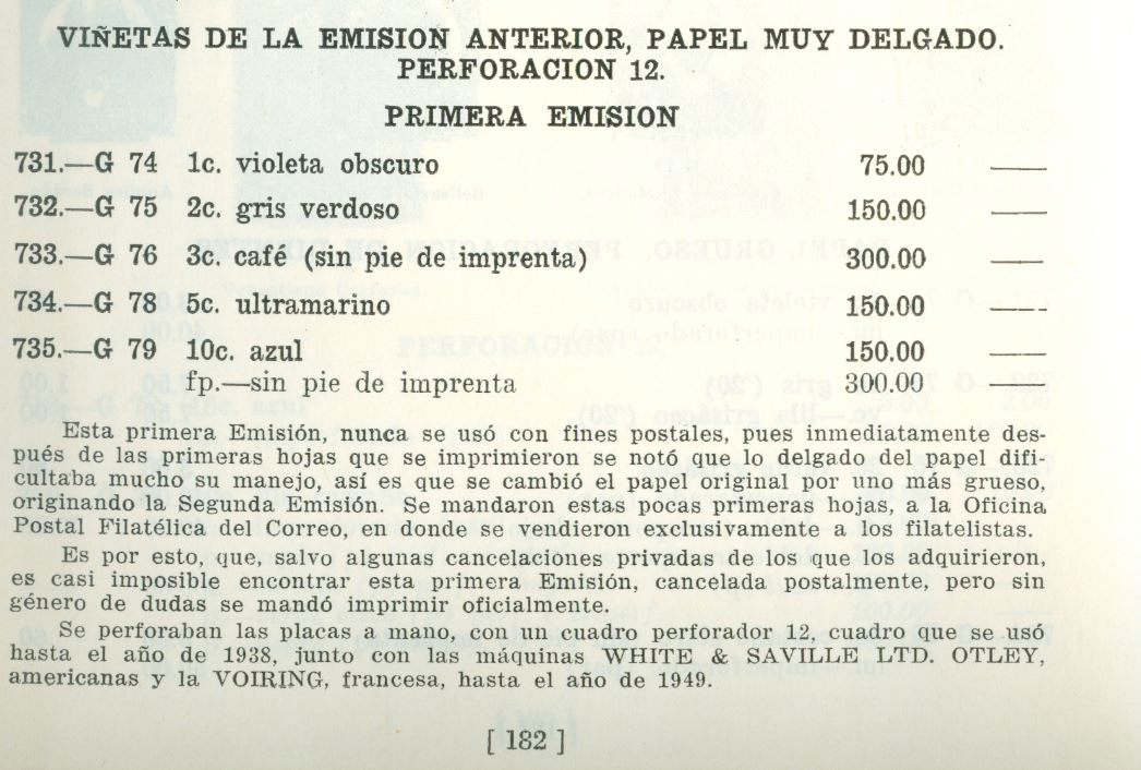
Two different manufactueres of printing presses are named here!
The first is Waite &Saville of England, the second is J. Voirin of France.
Re: Mexico - avant garde printing techniques - 1916-now
Publicado: 01 May 2014 18:10
por Rein
In understanding the functioning of the Waite & Saville or Voirin printing presses there is a lot missing!
Die stamping is NOT the usual type of recess we know of banknote printing companies or the later WIFAG presses...
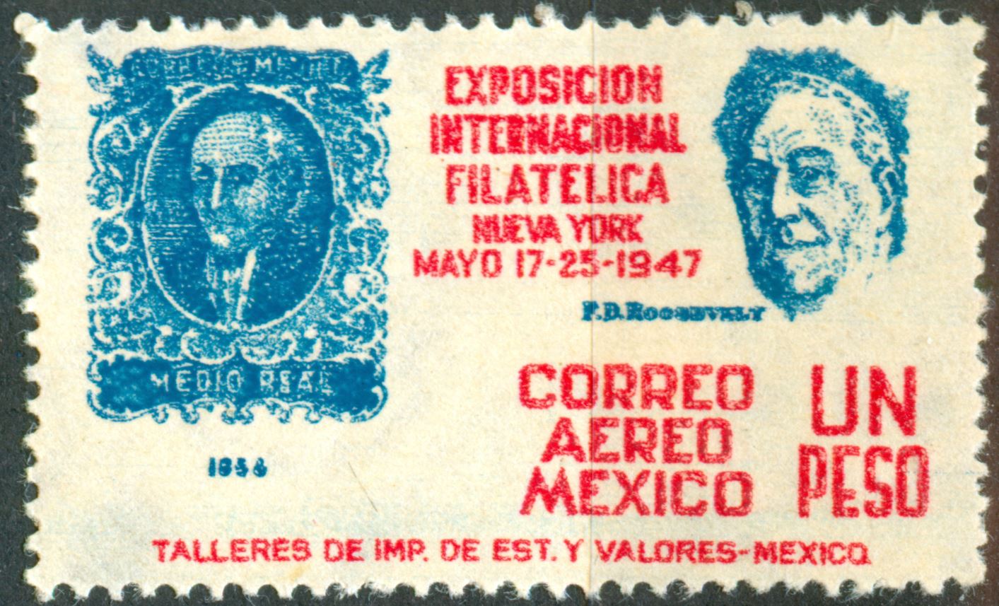
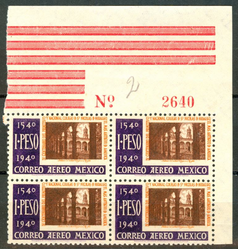
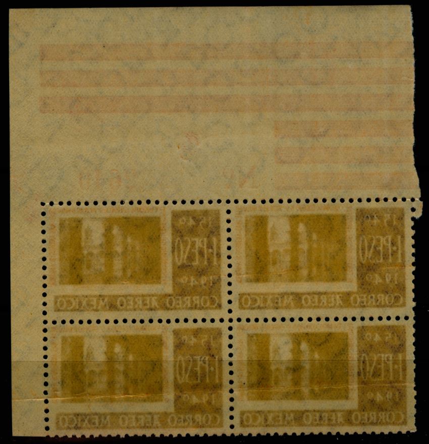
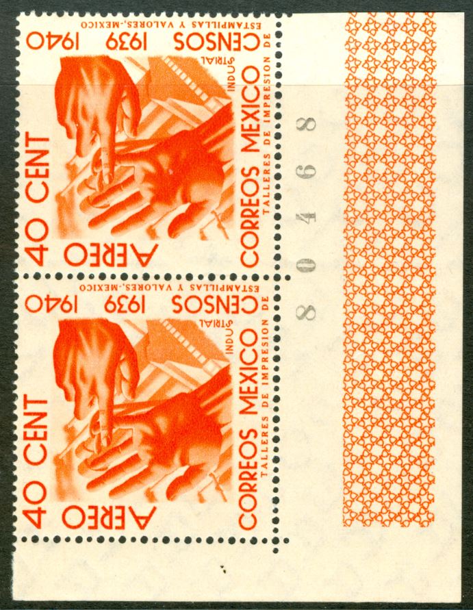
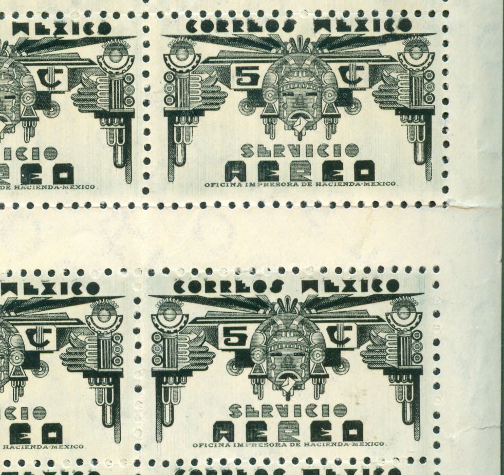
In the 1968 article we read that the stamps were printed in pairs of sheets of 30 (the airmail stamps) - de dos en dos - this can NOT be true.
Each "sheet" of 30 was "stamped" one after the other! And may be perforated immediately as well... You can tell this by the same characteristics of the design present in 3 consecutive "sheets" and as to the perforation the same characteristics are present in each "sheet". Another aspect is that the "double sheets" as how they apparently were available at the post office counters show sideways shifts of both the individual "sheet" of 30 AND their 'box"-perforation.
Re: Mexico - avant garde printing techniques - 1916-now
Publicado: 01 May 2014 18:13
por Rein
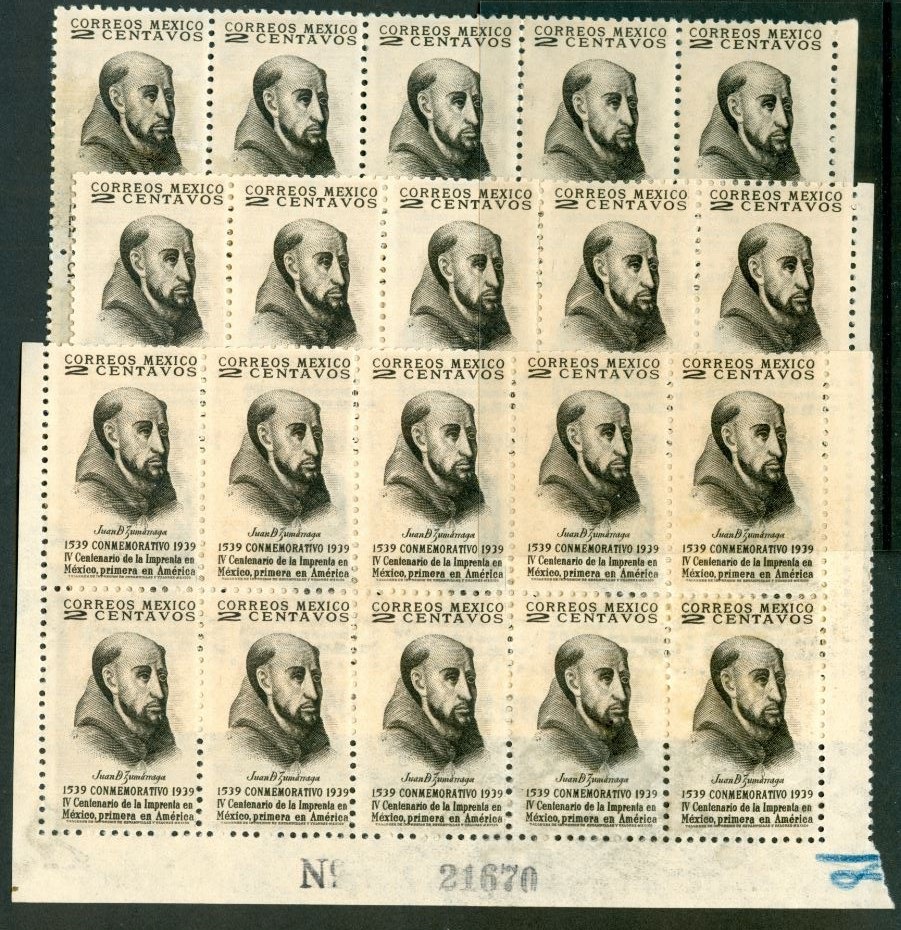
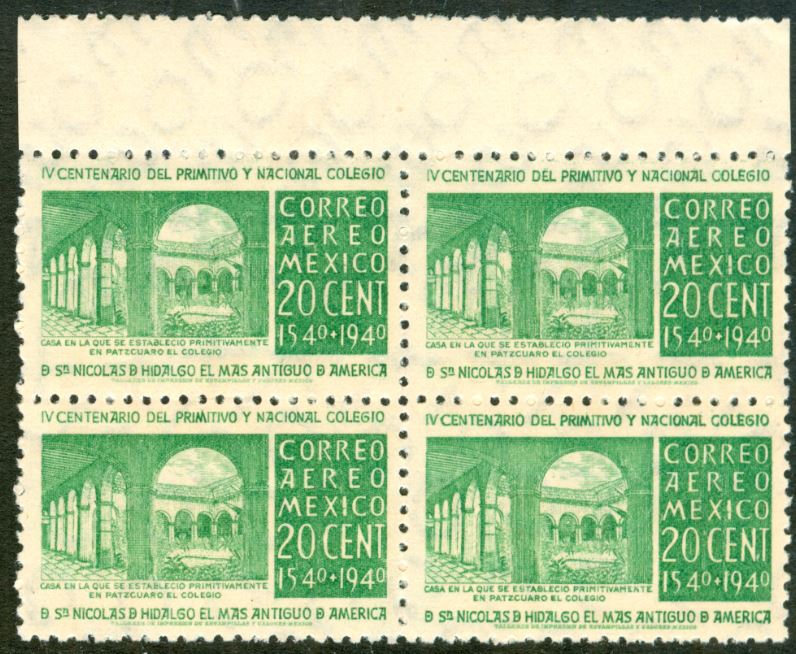
Three consecutive sheets! All have the same characteristics!
Re: Mexico - avant garde printing techniques - 1916-now
Publicado: 01 May 2014 18:13
por Rein
Re: Mexico - avant garde printing techniques - 1916-now
Publicado: 01 May 2014 18:18
por Rein
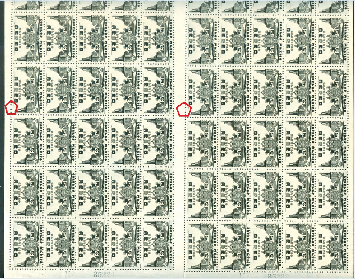
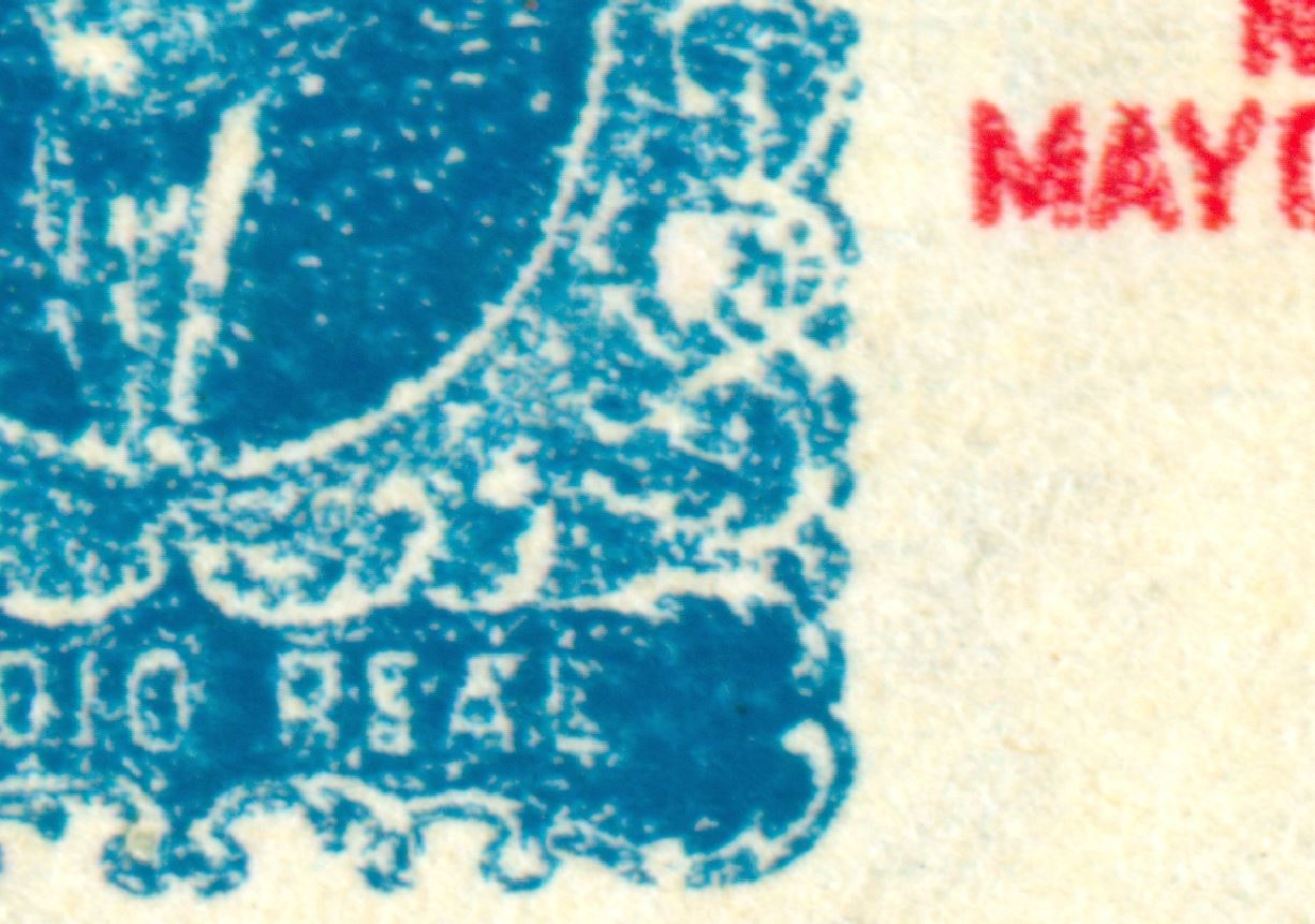
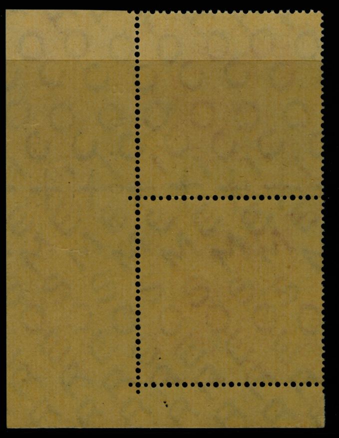
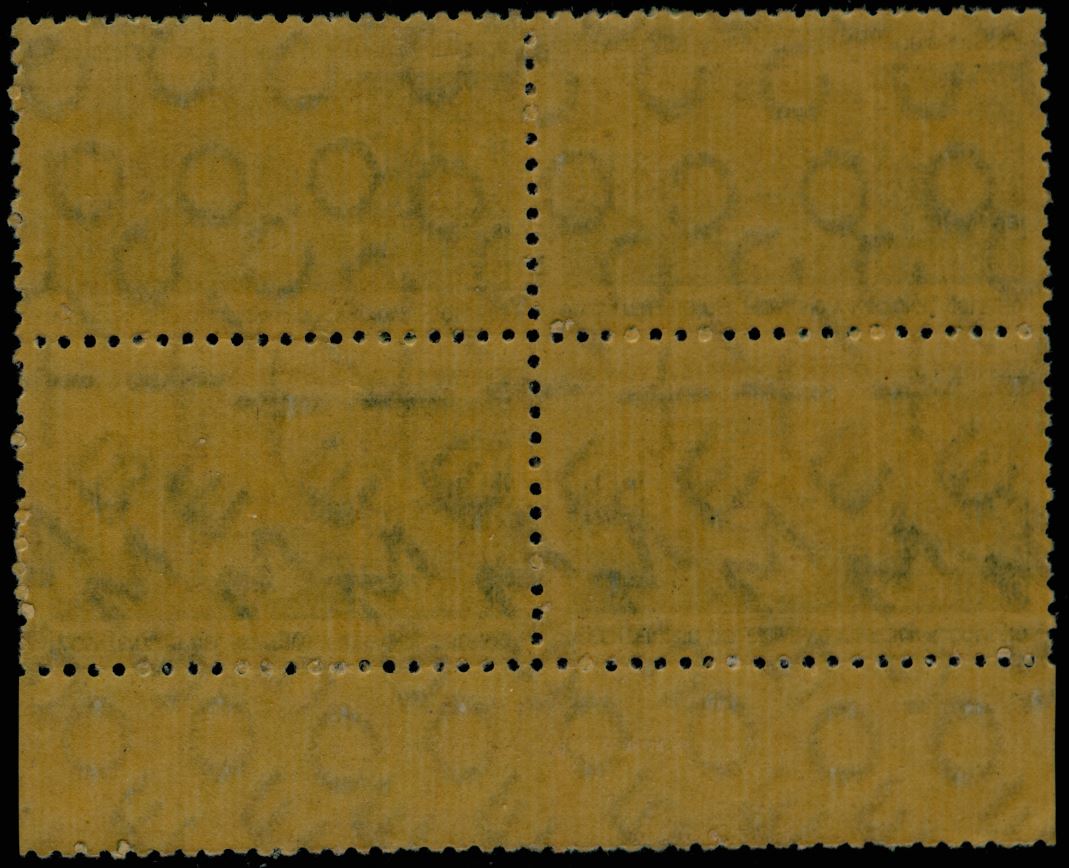
See the interrupt of the perforation!
Re: Mexico - avant garde printing techniques - 1916-now
Publicado: 01 May 2014 18:19
por Rein
The sideways shift is visible! And despite that the perforation seemed to stay centered...
Re: Mexico - avant garde printing techniques - 1916-now
Publicado: 02 May 2014 09:34
por Rein
Rein » 09 Nov 2010 06:38 escribió:
Most frequently used watermarks:
[I - 1923-1943 = Michel 7] MEXICO CORREOS
[II - 1935-1936 = Michel 8] SECRETARIA DE HACIENDA MEXICO
[III - 1937 =Michel 9] SECRETARIA DE HACIENDA MEXICO (lines between)
[IV - 1944-1946 = Michel 10] S.H.C.P. MEXICO (eagle in circle)
[V - 1946-1950 = Michel 11] GOBIERNO MEXICANO (eagle in oval)
[VI - 1953-1972 = Michel 12] MEX-MEX (eagle)
[VII - 1963-1972 = Michel 13] MEX (eagle)
The "Mexico Correos" we have already met:
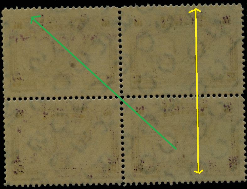
The direction of the text is important in this watermark and also note that the letters in a vertical "column" are the same! The word "Correos" is complete here.
to be continued ....
Almost 4 years ago I stumbled over these watermarks for the first time, and I almost forgot! Now after having received more material I come back to it!
The direction - indicated by the yellow arrow - points to the readable watermark text visible from the front of the stamp!