In a special section of the book called "Variedades por defectos de Impresion y Retoques" the plate flaws and the systematical flaws have not been separated. It may even be so that the writer has not realized that he might have made that distinction.
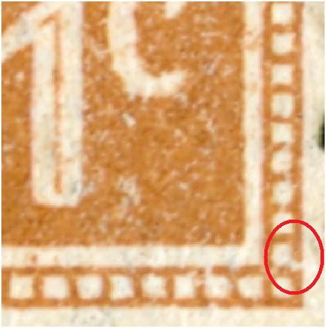
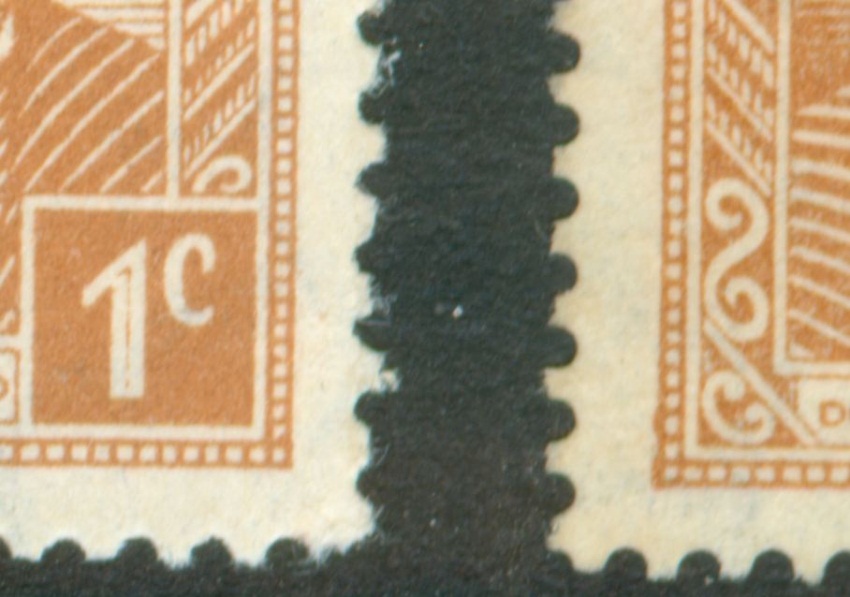
A great pity as recently one of the Foreros has published a great article on the root block of the 50c Petroleo in Revista! And the 50c Petroleo with the dot behind the word "Mar" is NOT a plate flaw but a systematical that will appear several times in a bundle of the 50c. The frequency - depending on the right period and type of paper - will be close to 10%!
to be continued ...
The Manual - G.A. Pettigiani - 2010
Moderador: Rein
-
patagonian
Re: The Manual - G.A. Pettigiani - 2010
I think you should consider write your own book...

-
Rein

- Usuario Colaborador

- Mensajes: 6258
- Registrado: 13 Mar 2009 15:59
- Ubicación: Leiden, Netherlands
- Contactar:
Re: The Manual - G.A. Pettigiani - 2010
Nestor,
thanks for the compliments but I think I need the help of Foreros here as well!
You can not simply ignore excellent studies as I said in my previous postings!
Thank you Educ!
thanks for the compliments but I think I need the help of Foreros here as well!
You can not simply ignore excellent studies as I said in my previous postings!
Thank you Educ!
-
leonardoleidi

- Usuario Verificado

- Mensajes: 1571
- Registrado: 07 Abr 2008 20:11
- Colecciono: Catálogos especializados de todo el mundo para clasificar variedades. También catálogos de sobres, vuelos, tarjetas postales, matasellos, historia postal, perforados y cualquier otra temática.
- Canje de Sellos: No
- Ubicación: Ciudadela Sur, Buenos Aires, Argentina
Re: The Manual - G.A. Pettigiani - 2010
I think it would be a great idea, to publish a Rein Book.
Saludos a todos
Leonardo Daniel Leidi Mora
Leonardo Daniel Leidi Mora
-
Rein
- Usuario Colaborador
- Mensajes: 6258
- Registrado: 13 Mar 2009 15:59
- Ubicación: Leiden, Netherlands
- Contactar:
Re: The Manual - G.A. Pettigiani - 2010
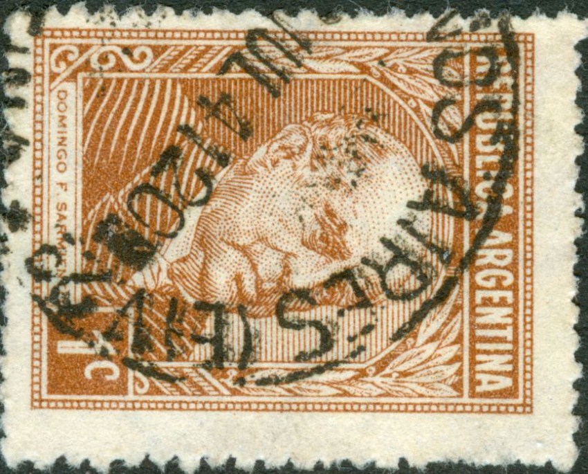
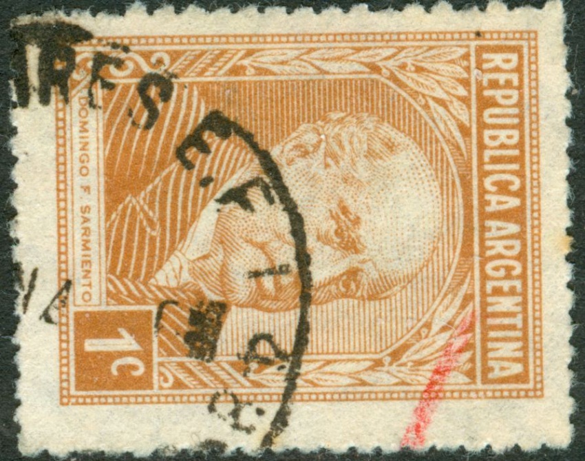
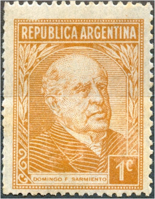
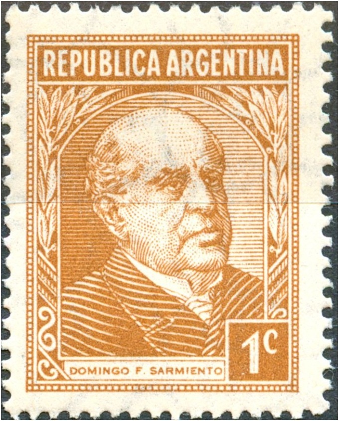
The various types we can find in the P&R I series starts off with the 1c D.F. Sarmiento in offset-litho and ends with the 20c Torito in offset-litho.
What I shall not discuss now is the fact that the designs generally had got decreased measurements by the time the series progressed. It is however rather uncomfortable to measure heights and widths with some accuracy. Maybe if you take a better look we can come up with new types!
Another way of approach is to continue describing the root blocks! Recognizing a particular stamp by the characteristics that belong to a particular root block confines the stamp to a particular [group of] printing(s). take as an example the 50c Petroleo with the dot behind "MAR"!
to be continued ....
-
Rein
- Usuario Colaborador
- Mensajes: 6258
- Registrado: 13 Mar 2009 15:59
- Ubicación: Leiden, Netherlands
- Contactar:
Re: The Manual - G.A. Pettigiani - 2010
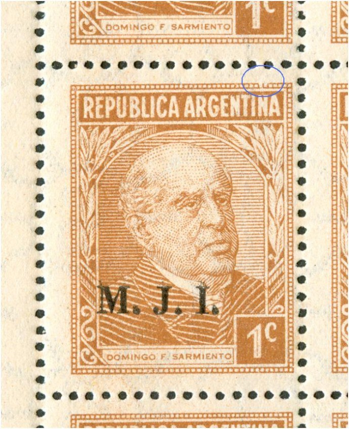
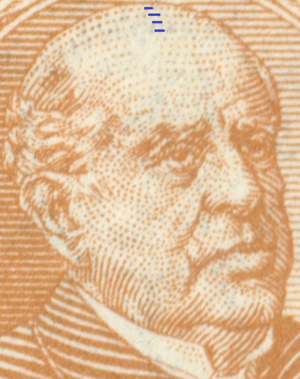
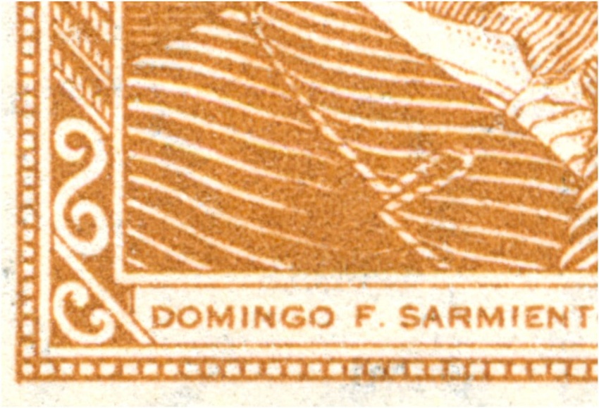
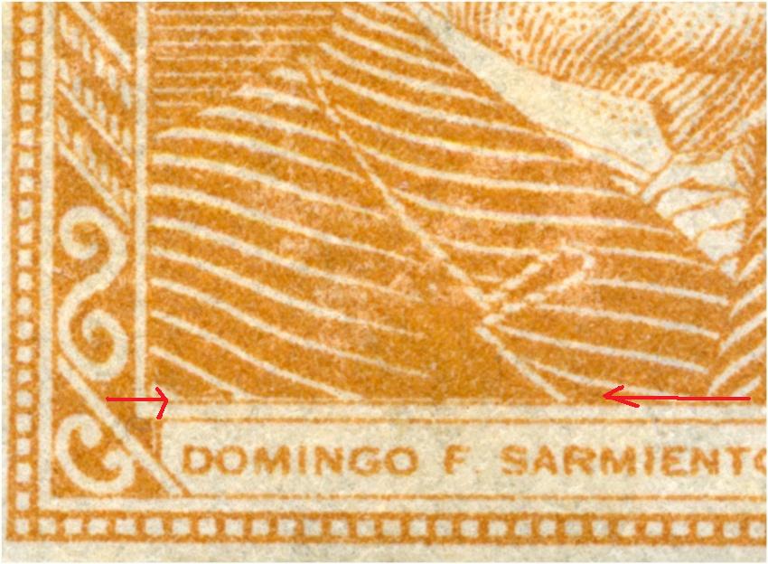
The 1c D.F. Sarmiento has 2 types when you look at the right bottom corner.
Type I [is it really the oldest one??] has NO break, type II has a tiny break. A real First Day Cover might give evidence:
The root block here is 5x5 what we can tell by the characteristics in blue and green!
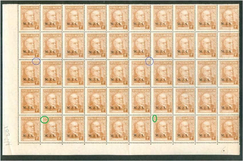
1st column, 8th row:
Same row but 5 columns to the right; 6th column, 8th row:
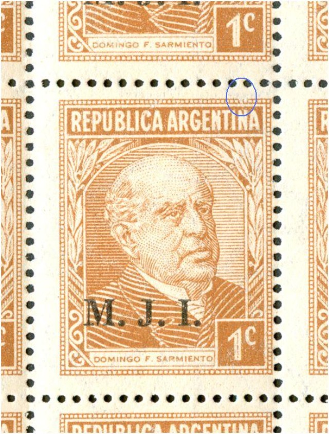
to be continued .....
Type I [is it really the oldest one??] has NO break, type II has a tiny break. A real First Day Cover might give evidence:
The root block here is 5x5 what we can tell by the characteristics in blue and green!
1st column, 8th row:
Same row but 5 columns to the right; 6th column, 8th row:
to be continued .....
-
Rein
- Usuario Colaborador
- Mensajes: 6258
- Registrado: 13 Mar 2009 15:59
- Ubicación: Leiden, Netherlands
- Contactar:
Re: The Manual - G.A. Pettigiani - 2010
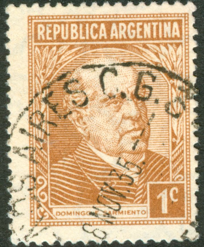
Quite early date of the 1c Sarmiento type II!
to be continued ....
to be continued ....
-
Rein
- Usuario Colaborador
- Mensajes: 6258
- Registrado: 13 Mar 2009 15:59
- Ubicación: Leiden, Netherlands
- Contactar:
Re: The Manual - G.A. Pettigiani - 2010
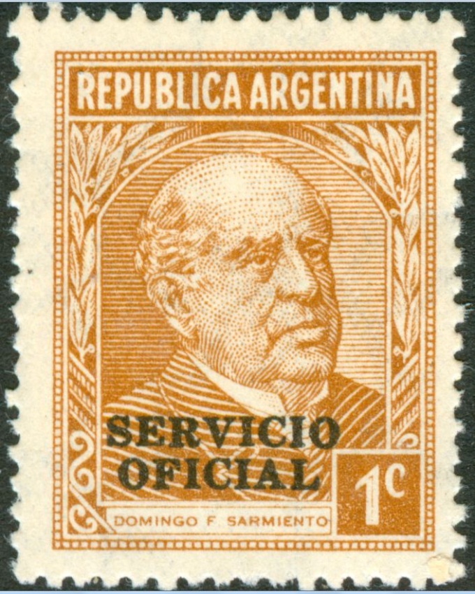
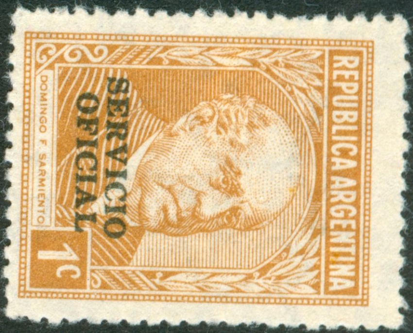
The Servicio Oficial on synmmetrical paper mesh and parallel watermark I have seen only in type I so far!
to be continued ....
to be continued ....
-
Rein
- Usuario Colaborador
- Mensajes: 6258
- Registrado: 13 Mar 2009 15:59
- Ubicación: Leiden, Netherlands
- Contactar:
Re: The Manual - G.A. Pettigiani - 2010
Remarkable that both types occur in the 1940 printings on Dutch paper - symmetrical paper mesh, orthogonal watermark!
type I:
to be continued ....
type I:
to be continued ....
-
Rein
- Usuario Colaborador
- Mensajes: 6258
- Registrado: 13 Mar 2009 15:59
- Ubicación: Leiden, Netherlands
- Contactar:
Re: The Manual - G.A. Pettigiani - 2010
type II:
to be continued ....
to be continued ....
-
Rein
- Usuario Colaborador
- Mensajes: 6258
- Registrado: 13 Mar 2009 15:59
- Ubicación: Leiden, Netherlands
- Contactar:
Re: The Manual - G.A. Pettigiani - 2010
Remarkable that both types occur in the 1940 printings on Dutch paper - symmetrical paper mesh, orthogonal watermark!
But with the Servicio Oficial so far only:
type II:
to be continued ....
But with the Servicio Oficial so far only:
type II:
to be continued ....
-
Rein
- Usuario Colaborador
- Mensajes: 6258
- Registrado: 13 Mar 2009 15:59
- Ubicación: Leiden, Netherlands
- Contactar:
Re: The Manual - G.A. Pettigiani - 2010
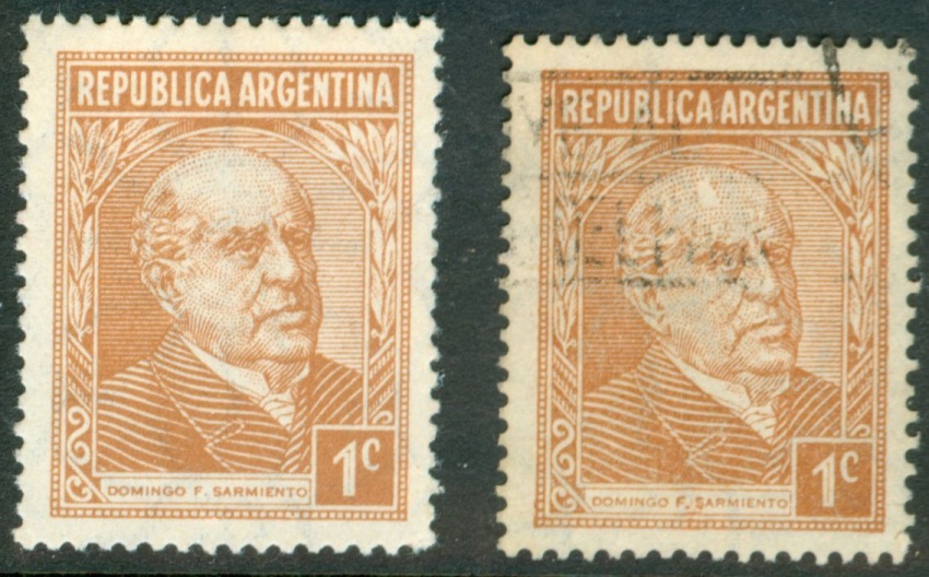
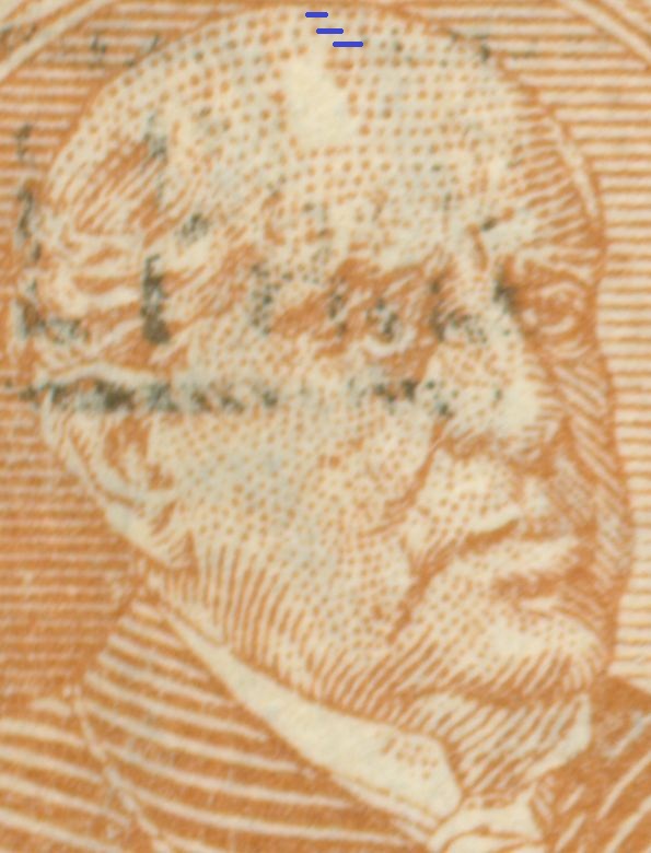
The two types of the 1c D.F. Sarmiento are clearly visible in the offset-litho versions. The difference between the first offset-litho and the typography version is mainly the general difference between offset-litho and typography. Still you may see some parts that slightly differ:
the offset-litho has a very egally spread ink and the edges are clean; the typography has edges that uneven especially in the corners!
The empty forehead in offset-litho:
The empty forehead in typography is more pronounced:
to be continued ....
-
Rein
- Usuario Colaborador
- Mensajes: 6258
- Registrado: 13 Mar 2009 15:59
- Ubicación: Leiden, Netherlands
- Contactar:
Re: The Manual - G.A. Pettigiani - 2010
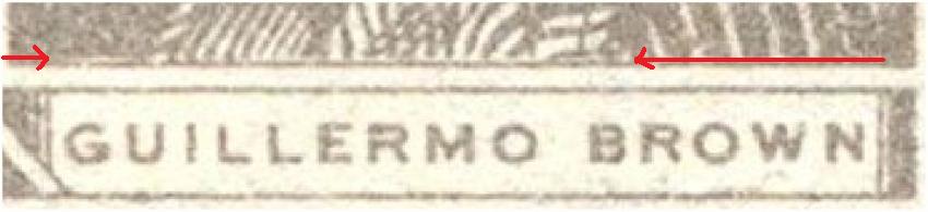
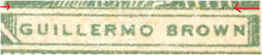
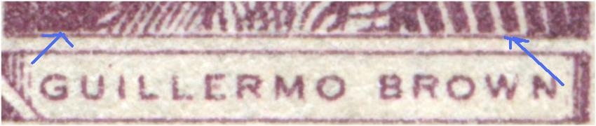
There is yet another way to split up the 1c D.F. Sarmiento according to types, like we can do with the G. Brown "stamps

The other type does not have this interval:
Both do NOT have the break in the frame!
to be continued .....
The other type does not have this interval:
Both do NOT have the break in the frame!
to be continued .....
-
Rein
- Usuario Colaborador
- Mensajes: 6258
- Registrado: 13 Mar 2009 15:59
- Ubicación: Leiden, Netherlands
- Contactar:
Re: The Manual - G.A. Pettigiani - 2010
There seems to be some system in it , at least this goes for the Guillermo Brown definitives, 4c grey and green and also the 20c:
The 1c D.F. Sarmiento:
to be continued ....
The 1c D.F. Sarmiento:
to be continued ....
-
Rein
- Usuario Colaborador
- Mensajes: 6258
- Registrado: 13 Mar 2009 15:59
- Ubicación: Leiden, Netherlands
- Contactar:
Re: The Manual - G.A. Pettigiani - 2010
So at least it seems a rather constant flaw or may be we should stil call it a "type"?! Just like the 20c G. Brown! We have to find out whether it occurred from the very beginning till the end of the 1c being printed or just somewhere in the middle...zeus25971 » 02 Apr 2009 22:04 escribió: Dear Rein,
I have some "half plates" of 1c Sarmiento and seems like the curiosity you mention above are in some positions of the plate. It would be great if someone else has plates of any of the seals you mention could verify if this repeats on every plates (in the 2 half plates I have there are some stamps that has the errors). In the next days I will take a deeper look at it and I will document the exact place in which this curiosity arises.
Best Regards
Luis
Tengo 2 medias planchas del 1c. SArmiento y pareceria ser que la curiosidad qu mencionas mas arriba estan en ciertas posiciones de la plancha. Estaria bueno si alguien mas posee planchas o recortes grandes que mencionas se riepute en todas las planchas ( en las dos medias polanchas que tengo, algunos sellos tienen los errores). En los proximos dias, estudiare en detalle las posiciones de plancha y lo documentare aqui. De paso les pido a los que pudieran tener planchas que la tengan a mano a ver si podemos verificar que realmente sea repetitivo y podamos incluirlo como variedad. La mejor manera de adelantarse al futuro, es inventarlo.
to be continued ....