Próceres y Riquezas volume II

Topics about Argentina Philately in english language.

Moderador: Rein

Avatar de Usuario
Rein
Usuario Colaborador
Usuario Colaborador
Mensajes: 6258
Registrado: 13 Mar 2009 15:59
Ubicación: Leiden, Netherlands
Contactar:

Re: Próceres y Riquezas volume II

Mensaje por Rein »

Imagen
Imagen
Imagen
Imagen

The print is normal with a direction of printing [ink flowing] towards the left; the back of the stamp shows the typical pockmarks! It seems that the gum had been applied on the coating side of the paper!

Also clearly visible the RA of the watermark - RA instead of AЯ!!!!


rc2335
Última edición por Rein el 27 Nov 2012 16:03, editado 1 vez en total.
Avatar de Usuario
Rein
Usuario Colaborador
Usuario Colaborador
Mensajes: 6258
Registrado: 13 Mar 2009 15:59
Ubicación: Leiden, Netherlands
Contactar:

Re: Próceres y Riquezas volume II

Mensaje por Rein »

The 80c Trigo

Posting on this stamp are spread over the Foro....

Sarcosis had displayed a nice triptych:

Imagen

From left to right: A = coated (tizado), B = mate importado, C = mate nacional.

This is absolutely correct! The scan of the coated paper is not that clear. Most likely it has an orthogonal watermark.
The matt imported paper has a parallel watermark and a vertical direction of paper running parallel to the long side of the stamp "M". The national imported paper has a orthogonal watermark and also a vertical direction f paper running parallel to the long side of the stamp "M".

And in the Mello Teggia 1998 we found 4 kinds of Trigo, of which we do not know whether the first is coated or not!

Imagen


This is awfully suggestive as to which colour/shade belongs to which paper!! It is confusing and misleading....

Papel Tizado imp.: castaño rojo y castaño gris, fil RO
Papel mate imp. :Castaño, fil. RO nitida , sol grande
Papel mate nac.,: castaño rojo y castaño gris, fil RO difusa, sol chico.

which is a bit better, but still not good enough!
Avatar de Usuario
Rein
Usuario Colaborador
Usuario Colaborador
Mensajes: 6258
Registrado: 13 Mar 2009 15:59
Ubicación: Leiden, Netherlands
Contactar:

Re: Próceres y Riquezas volume II

Mensaje por Rein »

There are uncoated papers and coated [and/or varnished] papers!

Let us deal with the uncoated first:

Imagen
Imagen

This is clearly imported paper - a parallel watermark, asymmetrical paper wire and a vertical direction of paper running parallel to the long side of the stamp "M".
Avatar de Usuario
Rein
Usuario Colaborador
Usuario Colaborador
Mensajes: 6258
Registrado: 13 Mar 2009 15:59
Ubicación: Leiden, Netherlands
Contactar:

Re: Próceres y Riquezas volume II

Mensaje por Rein »

Another uncoated paper, this time of of Argentinean make:

Imagen
Imagen

the following stamp is a lot whiter and may have some OBA's [optical brightening agents] that react whitish under the Ultra Violet lamp ".

Imagen
Imagen

This is clearly national paper - an orthogonal watermark, symmetrical paper wire and a vertical direction of paper running parallel to the long side of the stamp "M".
Avatar de Usuario
Rein
Usuario Colaborador
Usuario Colaborador
Mensajes: 6258
Registrado: 13 Mar 2009 15:59
Ubicación: Leiden, Netherlands
Contactar:

Re: Próceres y Riquezas volume II

Mensaje por Rein »

Now we find 2 coated papers, both of of English [?] make:

Parallel watermark, asymmetrical paper wire and a direction of paper parallel to the long side of the stamp "M":


Imagen

Imagen


Imagen
Imagen


Parallel watermark, asymmetrical paper wire and a direction of paper parallel to the short side of the stamp "m":

Imagen
Imagen
Avatar de Usuario
Rein
Usuario Colaborador
Usuario Colaborador
Mensajes: 6258
Registrado: 13 Mar 2009 15:59
Ubicación: Leiden, Netherlands
Contactar:

Re: Próceres y Riquezas volume II

Mensaje por Rein »

So far, not counting the numerous colours/shades [!] we have found 4 types of papers/watermarks instead of the 3 mentioned in the literature.

a. no coating - parallel watermark, imported paper
b. no coating - orthogonal watermark, national paper
c. coated - parallel watermark, imported paper, vertical direction of paper
d. coated - parallel watermark, imported paper, horizontal direction of paper

all stamps have the direction of printing L - ink flows to the left:

Imagen

which is how it should be considering the vertical direction of paper for most of the stamps! Printing with loose sheets of paper that have the direction of paper parallel with the direction of printing is asking for trouble. Every printer will know that! Why did that happen in the Casa de Moneda????
Avatar de Usuario
Rein
Usuario Colaborador
Usuario Colaborador
Mensajes: 6258
Registrado: 13 Mar 2009 15:59
Ubicación: Leiden, Netherlands
Contactar:

Re: Próceres y Riquezas volume II

Mensaje por Rein »

Yacare » 19 Sep 2009 14:26 escribió:
Aquí va mi aporte

Estos son los tres tonos de tengo, a mi criterio son :
el 1º MT 547 sepia
el 2do. 547a castaño gris
el 3ro 547b castaño (mate importado)
Imagen

Saludos
Yacare

The criterium you apply is the catalogue-number of Mello Teggia... Hardly something to call a criterium, isn''t it!!
Avatar de Usuario
Rein
Usuario Colaborador
Usuario Colaborador
Mensajes: 6258
Registrado: 13 Mar 2009 15:59
Ubicación: Leiden, Netherlands
Contactar:

Re: Próceres y Riquezas volume II

Mensaje por Rein »

labanderanocturna escribió: Gente, no les subo imágenes por que todavía no clasifique este sello, pero leyendo a G. Solari, el especifica:
Papel Tizado imp.: castaño rojo y castaño gris, fil RO
Papel mate imp. :Castaño, fil. RO nitida , sol grande
Papel mate nac.,: castaño rojo y castaño gris, fil RO difusa, sol chico.

Todos dent. 13 y 1/2

Saludos
Is that really true as far as the perforation gauge goes??? 13 1/2????

The perforations 13 1/2:13 and 13 1/2:

Imagen
Avatar de Usuario
Rein
Usuario Colaborador
Usuario Colaborador
Mensajes: 6258
Registrado: 13 Mar 2009 15:59
Ubicación: Leiden, Netherlands
Contactar:

Re: Próceres y Riquezas volume II

Mensaje por Rein »

jeque » 21 Sep 2009 20:52 escribió:
`Que divertido este post!

La primera y vital cuestión es si existe el tripo 80c. papel TIZADO, COLOR CASTAÑO GRIS.
Por supuesto que existe, y como bien dice Hécto78 es muy raro. Si quieren pueden ver una foto del mismo en la página 141 del catálogo GJ, y es el sello que catalogamos como 1044A.
Como dice el texto en azul un poco mas abajo, "el sello 1044A tiene un color muy particular, bien gris, y es sumamente escaso".

El valor de US$100.- es de referencia, yo tengo muy pocos en stock, y no lo puse más caro para no cosechar críticas, pero creo que vale mucho más.
Es más, en todas las colecciones especializadas en esta serie que he comprado en mi vida, lo ví pocas veces, y una sola tuve un cuadro. En mis subastas lo ponía más barato, creo que a US$50 de base cada sello y siempre subieron mucho, porque casi nadie tiene el verdadero castaño grisáceo.

Saludos a todo, GJ
jeque
Guillermo,

as I have displayed in my posts there are 4 variants of the 80c Trigo! Two of them are with matt paper, two of them have a coating [if that is true remains to be seen, maybe it is just a matter of varnish!].

Where are these 4 types in the catalogues????
Avatar de Usuario
Rein
Usuario Colaborador
Usuario Colaborador
Mensajes: 6258
Registrado: 13 Mar 2009 15:59
Ubicación: Leiden, Netherlands
Contactar:

Re: Próceres y Riquezas volume II

Mensaje por Rein »

jeque » 22 Sep 2009 01:34 escribió:
Estimado Rein, vos hacés una clasificación super-especializada del papel tizado.

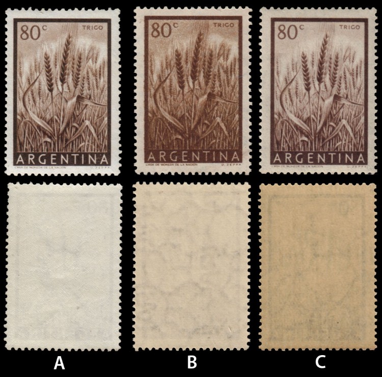
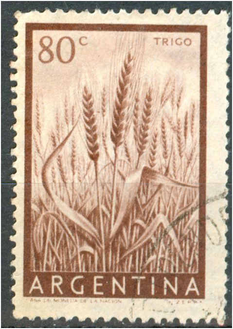
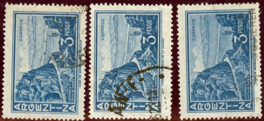
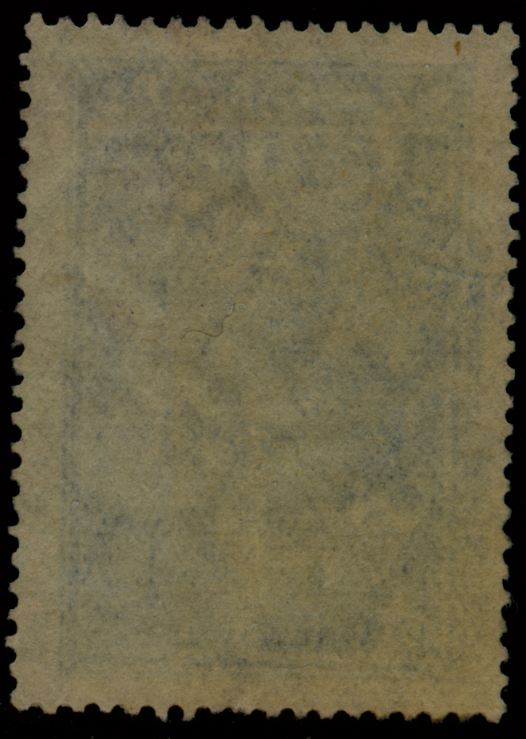
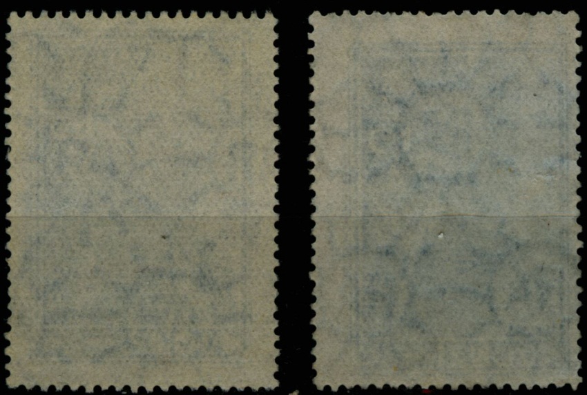
El sello impreso sobre papel mate nacional es el GJ.1044C
El que tiene papel mate importado es el GJ.1044B

Los 2 que vos indicás como papel tizado con dirección horizontal, o vertical del papel, corresponden al número GJ.1044
El GJ.1044A es una variedad de color muy especial de este mismo sello.

Tu clasificación del papel super-especializada del GJ.1044 excede el propósito de nuestro catálogo, ya que ponemos un limite que consideramos razonable para la mayoría de los coleccionistas.
Por lo que yo veo, sos un gran interesado en los papeles, su fabricación, y su clasificación, y tus trabajos sí serían muy útiles si los compilaras en un estudio especializado y profundo de estas series de correo ordinario de Argentina, que dan para mucho más.

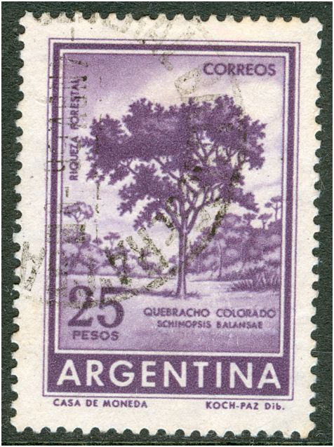
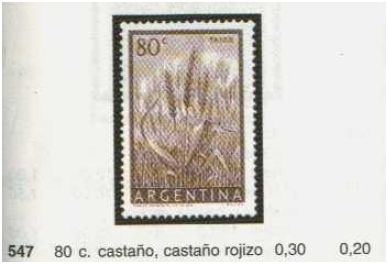
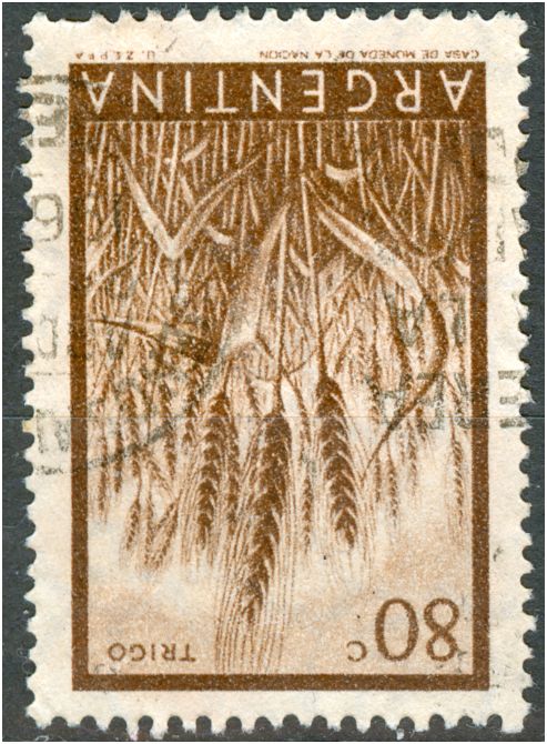
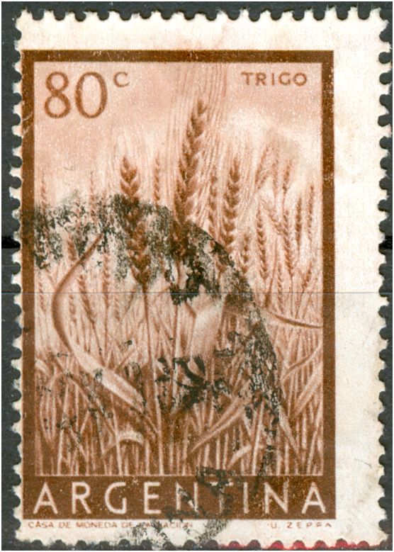
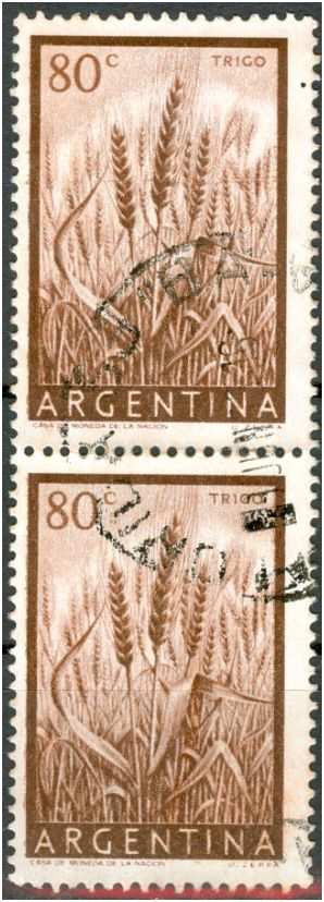
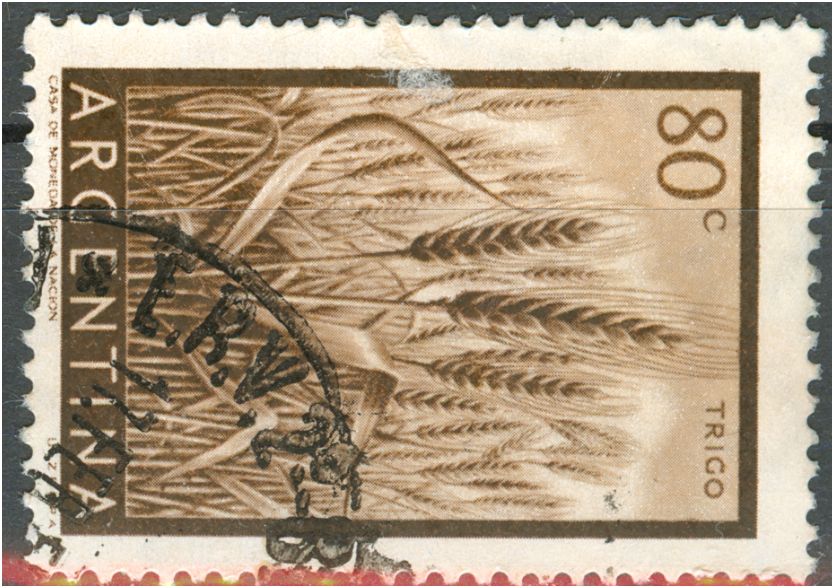
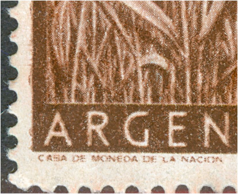
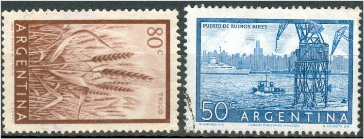
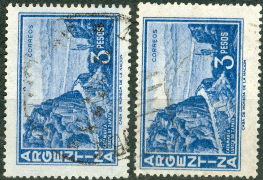
Por ejemplo, el sello del que aquí se habla, trigo 80c., tiene una infinidad de tonos y colores, algunos muy interesantes, que tampoco están catalogados. Cualquier coleccionista que decida especializarse en este sello podrá buscar y encontrará mucho más de lo que el catálogo indica, y así con cualquier otro sello de correo ordinario de nuestro país.
Si nosotros reflejáramos en el cat. GJ todo lo que existe con el nivel de especialización que vos sugerís, en lugar de un libro de 504 páginas tendríamos uno de 2000, y sería además tedioso y aburrido, y pero, incomprensible para el filatelista medio.

Por ejemplo, en la serie de próceres y riquezas del 35 damos a conocer someramente (con la idea de mejorarlo un poco más en el próximo), los 3 papeles más comunes (inglés, holandés, y austríaco), pero si quisiéramos podríamos escribir mas o menos unas 100 páginas solo dedicadas a esa serie. Basta considerar los estudios del precursor de todo ésto, Don Gerardo Hickethier (que por suerte vivió en Bahía Blanca y fue quien en mi juventud me inició en la filatelia), que estudiío MILLONES (y no exagero) de sellos de esta serie, y volcó sus hallazgos en unos estudios muy interesantes que luego siguió Carlos Varela y un grupo de gente de SOFIRA (en esa época AFRA). Yo tengo los originales de esos estudios de don Gerardo, y si los pusiera en el cat. GJ tendría solo unas 50 páginas o más dedicadas a papeles y filigranas de esta serie, lo que realmente considero poco interesante para la mayoría de los coleccionistas. Para quien esté interesado voy a tratar de encontrarlos, y les haré fotocopias a quienes lo soliciten.

Por supuesto, hubo y hay gente que se interesa y mucho en estos sellos, uno de ellos por lo que veo sos vos. En el cat. GJ verán siempre un grado de profundidad medio, no podemos clasificar papeles en forma tan minuciosa porque no es nuestro propósito.

Sin más por ahora (son mas de las 12pm, me voy a dormir!)
Saludos a todos, GJ
jeque
Guillermo,


thanks for you long reply!

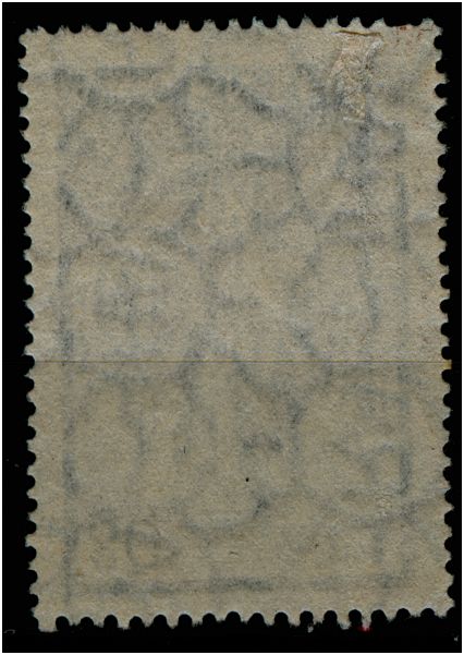
I agree that a book like yours may easily expand in a manner that it will not be cost-effective etc, but one of the most characteristic things of Argentinean philately is the study of papers and watermarks. The orientation of a watermark
- whether the AЯ runs horizontally or vertically - is extremely relevant for a printer. Should he have neglected that your book would have looked shabby and the binders would have gone mad! Within a particular orientation whether the letter are upright or up-side-down is not relevant for the printers.

There are not many Argentinean stamps that have both orientations of the watermark [or paper] and I think the inclusion of them would not expand your book much. I am not alone in this - Labandernocturna wrote "No me gustó que no se colocara la posición de filigrana cuando existen sellos con 2 tipos de filigranas, las flechitas para hablar en criollo. Cuando empecé me resultó muy cómodo para ir haciendo "el ojo", y aún hoy sigue siendo más fácil y rápido para mí ."

I will come back to several inconsistencies later on.

The studies you mentioned seem to be very interesting and I would like read them once you have found them again!
Avatar de Usuario
Rein
Usuario Colaborador
Usuario Colaborador
Mensajes: 6258
Registrado: 13 Mar 2009 15:59
Ubicación: Leiden, Netherlands
Contactar:

Re: Próceres y Riquezas volume II

Mensaje por Rein »

Guillermo Jalil escribió:
Basta considerar los estudios del precursor de todo ésto, Don Gerardo Hickethier (que por suerte vivió en Bahía Blanca y fue quien en mi juventud me inició en la filatelia), que estudiío MILLONES (y no exagero) de sellos de esta serie, y volcó sus hallazgos en unos estudios muy interesantes que luego siguió Carlos Varela y un grupo de gente de SOFIRA (en esa época AFRA). Yo tengo los originales de esos estudios de don Gerardo, y si los pusiera en el cat. GJ tendría solo unas 50 páginas o más dedicadas a papeles y filigranas de esta serie, lo que realmente considero poco interesante para la mayoría de los coleccionistas. Para quien esté interesado voy a tratar de encontrarlos, y les haré fotocopias a quienes lo soliciten.
Guillermo,

the studies you referred to seem to be most intriguing and I would be very pleased if you can make them more accessible to the student of Argentine stamps! Could you make photocopies???
Avatar de Usuario
Rein
Usuario Colaborador
Usuario Colaborador
Mensajes: 6258
Registrado: 13 Mar 2009 15:59
Ubicación: Leiden, Netherlands
Contactar:

Re: Próceres y Riquezas volume II

Mensaje por Rein »

The 3p Catamarca Cuesta de Zapata had been printed in photogravure on the sheet-fed Mailander by the Casa de Moneda de la Nacion on paper made by Zárate with an orthogonal watermark. Predominantly Zárate has the wire side printed and the felt side received the gum - the watermark letters we see from the back read like AЯ ....


Imagen
Imagen

Imagen
Imagen
Imagen

We might have some doubt about are eye-sight, but the first and the third stamp seem to display rather a RA than an AЯ!
Avatar de Usuario
Rein
Usuario Colaborador
Usuario Colaborador
Mensajes: 6258
Registrado: 13 Mar 2009 15:59
Ubicación: Leiden, Netherlands
Contactar:

Re: Próceres y Riquezas volume II

Mensaje por Rein »

Some less problematic:

Imagen
Imagen

The left one shows "RA"!
Avatar de Usuario
Rein
Usuario Colaborador
Usuario Colaborador
Mensajes: 6258
Registrado: 13 Mar 2009 15:59
Ubicación: Leiden, Netherlands
Contactar:

Re: Próceres y Riquezas volume II

Mensaje por Rein »

The 20p Nahuel Huapi Lake has the following type of papers:

- uncoated parallel watermark with an asymmetrical paper wire - English 'rayado vertical"
- uncoated orthogonal watermark with a symmetrical paper wire - Zárate granulado horizontal
- coated orthogonal watermark with a symmetrical paper wire - Zárate tizado granulado horizontal

to be continued ....
Avatar de Usuario
Rein
Usuario Colaborador
Usuario Colaborador
Mensajes: 6258
Registrado: 13 Mar 2009 15:59
Ubicación: Leiden, Netherlands
Contactar:

Re: Próceres y Riquezas volume II

Mensaje por Rein »

- uncoated parallel watermark with an asymmetrical paper wire - English 'rayado vertical"

Imagen
Imagen

direction of paper vertical!

to be continued ....
Responder

Volver a “Argentina Philately in the language of Shakespeare”