Página 1 de 2
Re: 1967 20p José de San Martin
Publicado: 05 Sep 2010 17:07
por Rein
Re: 1967 20p José de San Martin
Publicado: 01 Sep 2012 07:20
por Rein
JUANCA » 12 Aug 2012 00:19 escribió:
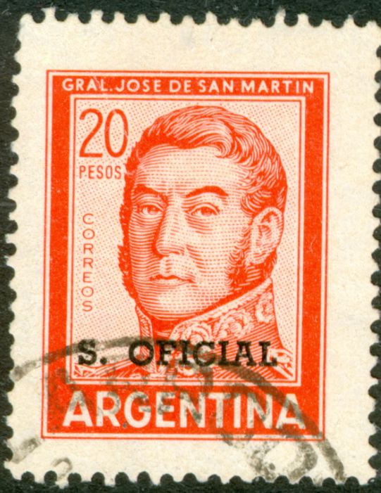
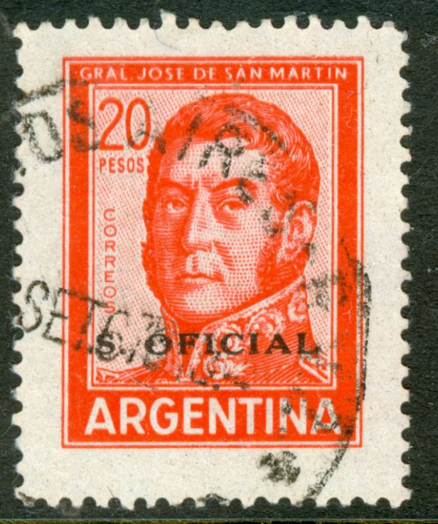
Consulto según vuestras apreciaciones.- Por lo que yo entiendo, sería Nº 411 b) MT - (Sobrecarga Tipo IV) - Gracias por las respuestas.- Juan Carlos -
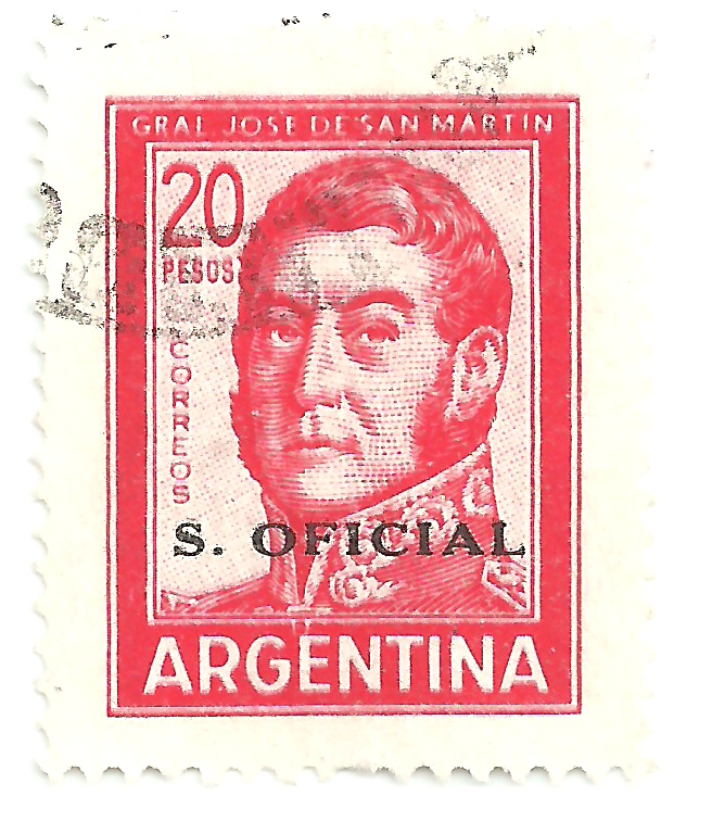
Apparently there is still a lot unclear about how many 20p JSM official stamps do exist!
G.Jalil in his 2009 catalogue does mention 3 different stamps!
- overprint type XIII - 755 - with watermark "redondo"
- overprint type XIII - 755 - with watermark "CdM"
- overprint type XIV - 770 - reduced size 13mm
Does this help????
to be continued .....
Re: 1967 20p José de San Martin
Publicado: 01 Sep 2012 07:27
por Rein
jorgec » 14 Aug 2012 18:08 escribió:
Es la sobrecarga comun (VI), lamentablemente no la rara (IV). Por lo cual seria MT 411, o 411c dependiendo de la filigrana. Pero ademas tiene doble impresion del sello (bastante comun en este caso), que no esta catalogada en MT pero si en VK74 y en GJ.
jorgec
Fredy » 14 Aug 2012 18:54 escribió:
Hola JUANCA:
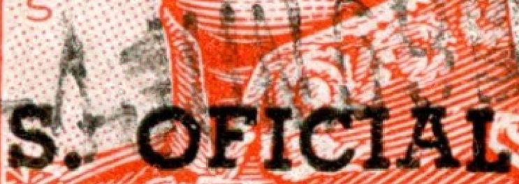
Tal como indica Jorge (jorgec) se trata de la sobrecarga más común. En esta podés encontrar la variedad de sobrecarga doble. Pero quiero mostrarte/les una variedad o doble impresión bastante piola:
Doble impresión de la sobrecarga.
Esta sobrecarga fue impresa en offset, pero podemos observar que hay una segunda impresión en huecograbado.
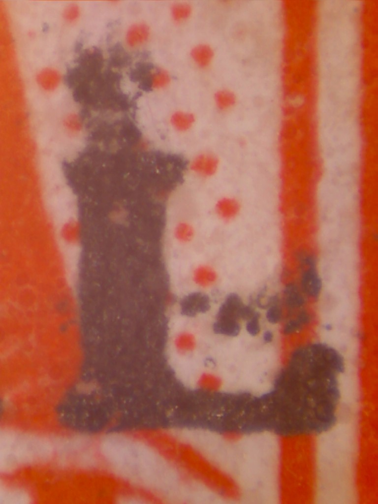
Por lo tanto, no deja de ser una linda sorpresa.
Yo poseo un cuadro y una sueltita, ambas piezas nuevas. Tal vez si buscan... puedan encontrar más.
Esto no está catalogado!!!
Suerte amigos.
Fredy
JUANCA » 15 Aug 2012 10:19 escribió:
Gracias Jorge y Fredy.- Ahora, digo yo, me cuesta ver la doble impresión del sello, aparentemente se nota mas en las letras de "correos".- ¿Cómo distinguir entonces una doble impresión con offset y huecograbado? "Tendrán que pasar muchos sellos antes mis ojos, antes de poder distinguir claramente sus peculiaridades" Saludos a todos.-
JUANCA
Fredy does not give much relief, but adds to the confusion by suggesting that an overprint had been applied by photogravure!
Still we do not really know which of the 3 stamps G. Jalil lists is involved here!
to be continue....
Re: 1967 20p José de San Martin
Publicado: 01 Sep 2012 07:30
por Rein
Fredy » 15 Aug 2012 20:37 escribió:
Es cierto JUANCA. Hay que ejercitar el ojo, no queda otra. Tambien hay que tener en cuenta algunos conceptos básicos sobre impresiones.
Para este caso en particular, la diferencia radica en que la impresión en offset es plana, plena sobre la superficie del sello. En cambio, la de huecograbado es en sobrerelieve (aunque en la imagen no se nota) y se presenta como puntos en diagonales.
A continuación repito la imagen con los puntos mencionados:
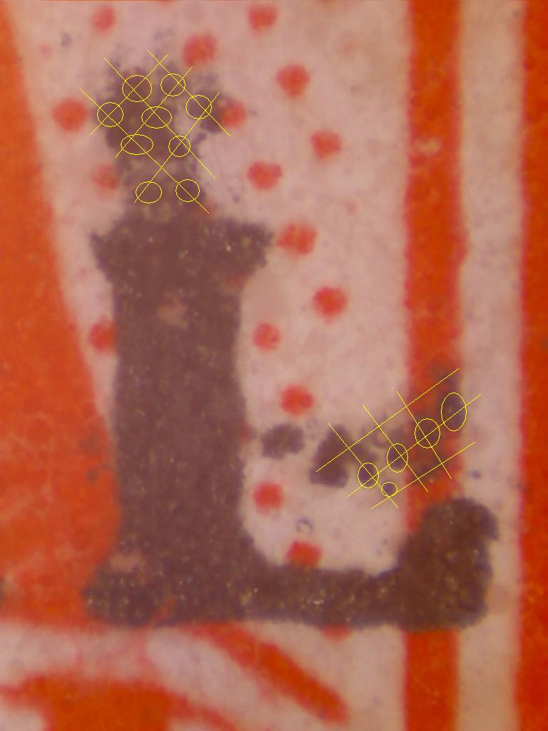
Puntos de la sobrecarga en huecograbado.
Espero quede mas claro el tema.
Saludos.
Fredy
Otin » 15 Aug 2012 22:02 escribió:
Fredy:
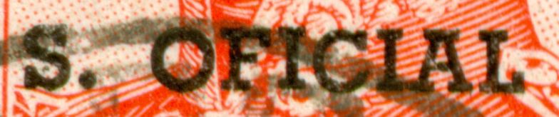
Ahora sí vi la impresión en huecograbado. Nunca hubiera sospechado de su existencia pues nunca la había visto en negro. En el scan anterior me parecía que era tinta del matasellos pero con este nuevo no quedan lugar a dudas. Lo que me motiva una pregunta: ¿en que sellos se usó ese tipo de impresión de la sobrecarga aparte del 1 peso Ganadería en azul?
Nito
Fredy enhances his suggestion of photogravure by adding an adapted scan!
The irregular positions of the assumed photogravure cells make it very unlikely that photogravure is involved at all...
to be continued ....
Re: 1967 20p José de San Martin
Publicado: 01 Sep 2012 08:39
por Rein
One of my first postings referred to this stamp!
Subject: The San Martin set in offset-litho and typography
Rein » 31 Mar 2009 08:34 escribió:
Of the San Martin series the 2, 4, 8 and 10p are mentioned in the catalogue of mr. Tello Meggia having been printed both in offset-litho and in typography . Similarly the article of Mr. J. Holler on the PyR II+III. I was wondering whether I had overlooked something that involved the 20p.
Today I received the excellent book by mr. J.R. Merlo about the printing methods for postage stamps in general and for Argentinean stamps in particular. He shows a lot of stamps that exist both in offset-litho and in typography including the here mentioned series. But again no 20p!!!!
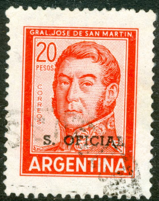
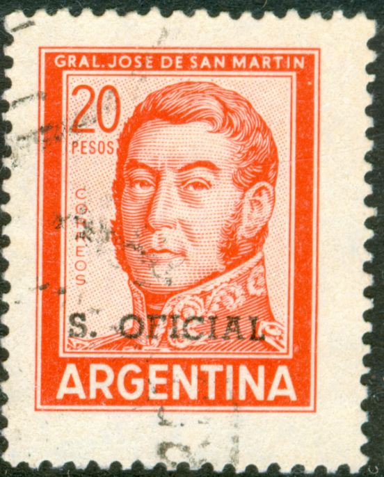
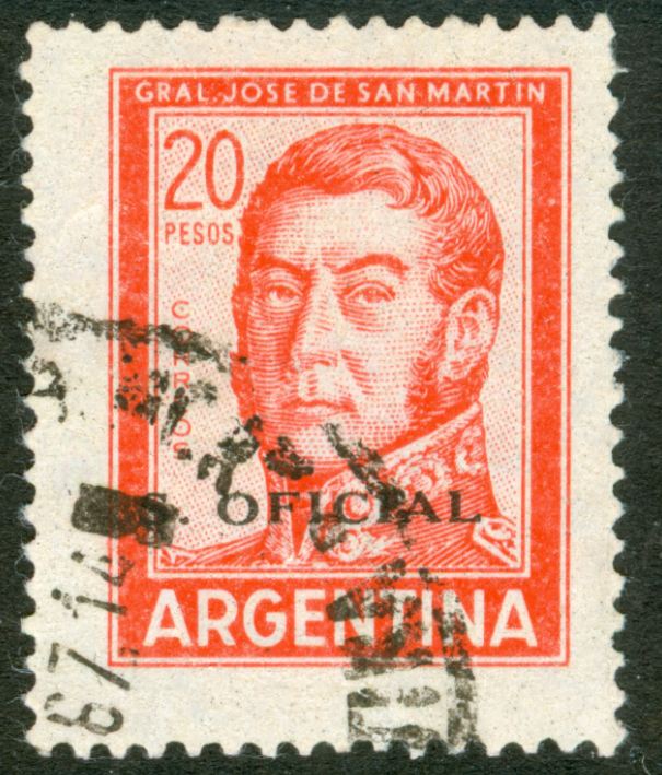
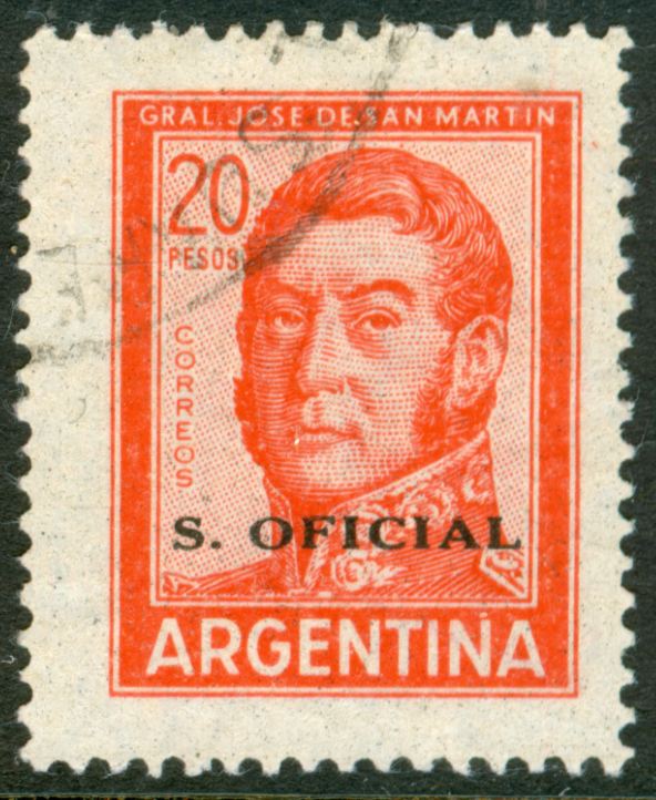
The 20p Jose San Martin in offset-litho:

details:
offfset-litho:
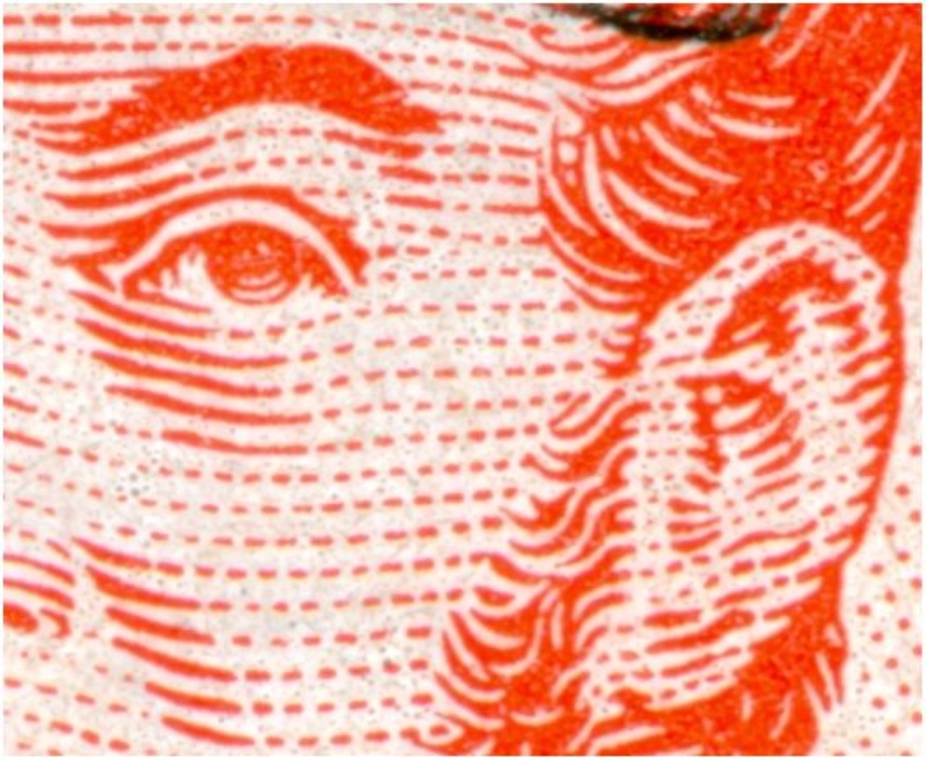
typography:
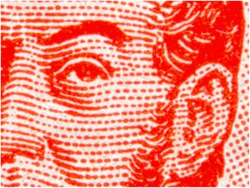
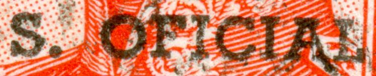
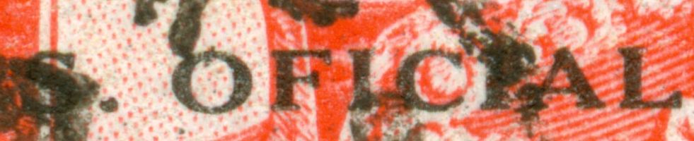
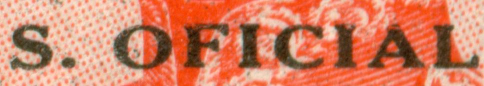
The overprint - in fact NO overprint but a second colour for the offset-litho printed bicoloured stamp - is referred to by Victor Kneitschel and Guillermo Jalil as type XIV!
N.B. the centre of the "O" is round / circular not upright elliptical as in type XIII!
to be continued ...
Re: 1967 20p José de San Martin
Publicado: 01 Sep 2012 08:41
por Rein
The two types of "overprint" with the wrong chronology!
Type IV first:
Type XIII later!

to be continued ....
Re: 1967 20p José de San Martin
Publicado: 01 Sep 2012 17:13
por Rein
In Dario Bardi's second book on the PyR definitves he does list the official stamps but somehow the listing is not quite accurate alas..
Type XIV - GJ 770 has TN 1
Type XIII - GJ 755 has both TN 1 and TN 3
Type XIII - GJ 756 has just TN 1
It is obvious that the GJ 756 has the TCM paper with the Casa de Moneda watermark!
GJ 770 having the Rayado Horizontal with a fluorescent front and a neutral back [F/N] is certainly wrong! It should have been TN 2 - granulado... I will not say anything about the luminescence as all my copies are used....
to be continued ...
Re: 1967 20p José de San Martin
Publicado: 01 Sep 2012 17:18
por Rein
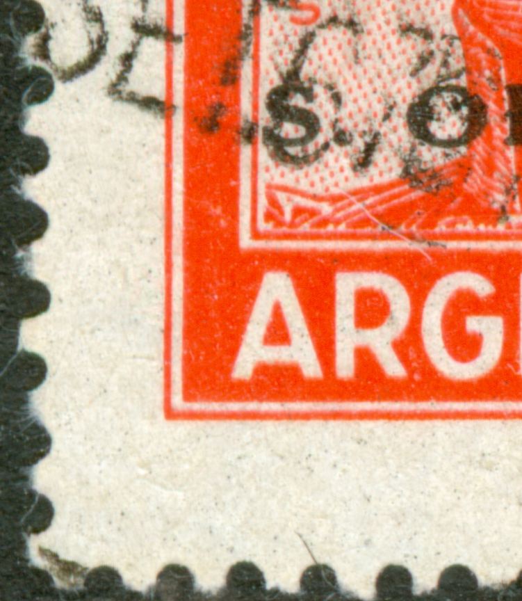
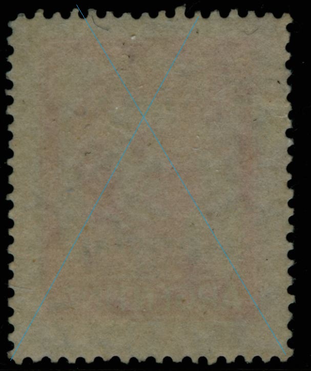
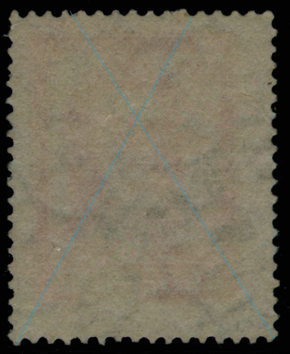
Type XIV with strong serifs and a circular round 'O":
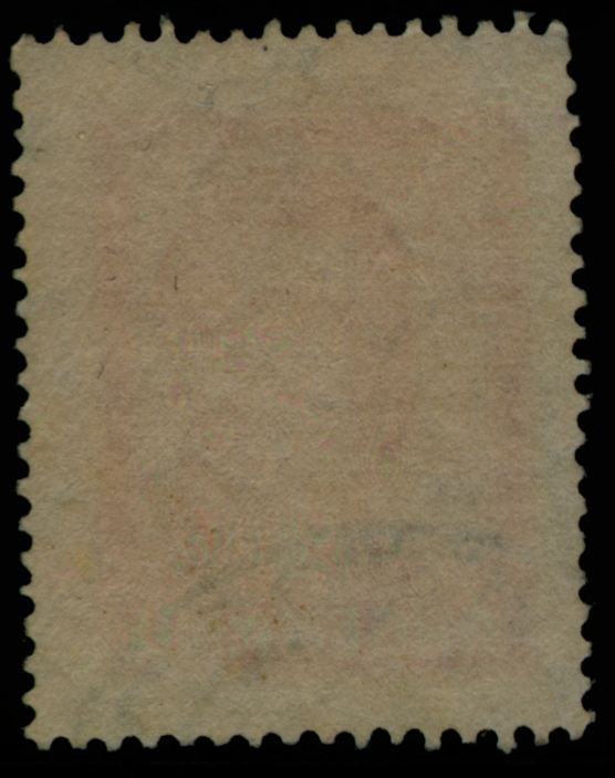
Clearly a symmetrical paper wire!
to be continued ...
Re: 1967 20p José de San Martin
Publicado: 01 Sep 2012 17:21
por Rein
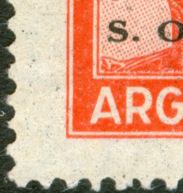
Type XIV with strong serifs and a circular round 'O":
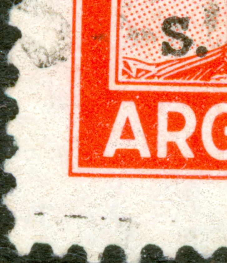
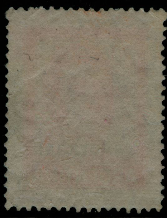
Clearly a symmetrical paper wire!
Note the Tizado Varioloso that has an enormous impact on the black print!
And also note the wide corrective perforation teeth at the top!
to be continued ...
Re: 1967 20p José de San Martin
Publicado: 01 Sep 2012 17:22
por Rein
Type XIV with strong serifs and a circular round 'O":
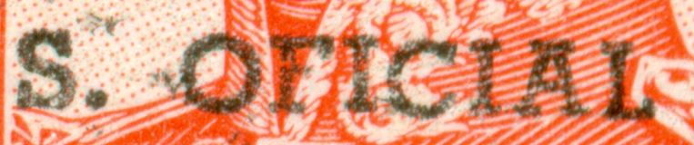
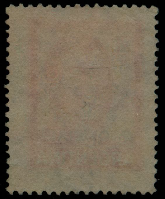
Clearly a symmetrical paper wire!
Note the Tizado Varioloso that has an enormous - destructive - impact on the black print!
And also note the wide corrective perforation teeth at the top!
to be continued ...
Re: 1967 20p José de San Martin
Publicado: 01 Sep 2012 18:36
por Rein
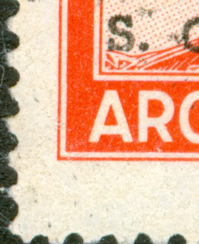
Type XIII with small, triangular serifs and an elliptical 'O":
Clearly a symmetrical paper wire!
to be continued ...
Re: 1967 20p José de San Martin
Publicado: 01 Sep 2012 18:37
por Rein
Type XIII with small, triangular serifs and an elliptical 'O":
Clearly a symmetrical paper wire!
to be continued ...
Re: 1967 20p José de San Martin
Publicado: 01 Sep 2012 18:38
por Rein
Type XIII with small, triangular serifs and an elliptical 'O":
Clearly a symmetrical paper wire!
to be continued ...
Re: 1967 20p José de San Martin
Publicado: 01 Sep 2012 21:35
por Otin
Rein,
Coincidently, I was studyieng papers of the %p Riqueza Austral (MT 606/a...) nd in your latest scan of 20p San Martín, which you say it is a symmetrical wire. But I see a rayado horizontal that, in your previous posts, would be an assymetrical wire. Can you please clarify? However let mi tell you yhat I think, coinciding with you, it is a symmetrical wire, but the illustrated paper you show the horizontal lines are well visible then it should be an asssymetrical wire. Saludos,
José
Re: 1967 20p José de San Martin
Publicado: 02 Sep 2012 04:03
por Rein
Otin escribió:Rein,
Coincidently, I was studyieng papers of the %p Riqueza Austral (MT 606/a...) nd in your latest scan of 20p San Martín, which you say it is a symmetrical wire. But I see a rayado horizontal that, in your previous posts, would be an assymetrical wire. Can you please clarify? However let mi tell you yhat I think, coinciding with you, it is a symmetrical wire, but the illustrated paper you show the horizontal lines are well visible then it should be an asssymetrical wire. Saludos,
José
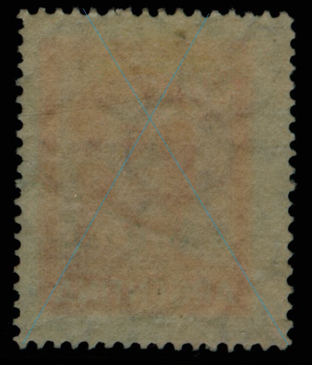
José,
I applied my "blue lines"!! Have a look back at the postings!
They are all symmetrical although some may also let you think there is a horizontal rayado visible

saludos, Rein