Position of the watermark
Fully in line with the idea that the reader shouldn't be bothered too much by discussing the direction of paper, the position of the watermark is seen relative to the longitudinal axis of a stamp!
Is the line of RA parallel to the long side of the stamp Pettigiani calls it "May" [mayor]; if it is parallel to the short side of the stamp he calls in "men" [menor]. Dario Bardi uses "M' and "m" here.
The methodological mistake both Bardi and Pettigiani make is that the prime importance of the direction of paper relative to the stamp's shape is for the printer. He decides - on good grounds - how the direction of paper [or grain direction] should run relative to the machinery he has. The lay-out of the printer's sheet - by reasons of efficiency - defines the relative position to the shape of our stamps!
The grain direction relative to the shape of the stamp can only have two positions - generally speaking this is not true as we can have other than rectangular shapes or the sheet is to make a slight slope in some printing processes:
- M - the direction of printing is parallel to the long side of the stamp
- m - the direction of printing is parallel to the short side of the stamp
Denoting it this way we can also deal with the no watermark stamps! Neither Bardi or Pettigiani can do that!
to be continued ...
The Manual - G.A. Pettigiani - 2010
Moderador: Rein
-
Rein

- Usuario Colaborador

- Mensajes: 6258
- Registrado: 13 Mar 2009 15:59
- Ubicación: Leiden, Netherlands
- Contactar:
Re: The Manual - G.A. Pettigiani - 2010
Gumming
Gumming was usually applied to the side of the paper that was not to be printed. Mistakes did occur at times and than we would find a readable RA as seen from the back of the stamp. This happened sometimes in the post-1953 period but hardly ever before that.
Pettigiani does not discuss the regular forms of breaking the gum mechanically even although that would help distinguishing the imported papers from the national papers!
the Zárate paper (or national paper) has the gum if broken rather horizontally or just one diagonal; the imported paper always has the gum broken diagonally both descending and ascending!
The extra breaking of the gum called "gofrado" was applied by the Casa de Moneda in 3 cases after World War II on national paper:
- 1c D.F. Sarmiento in offset-litho
- 20c G. Brown in offset-litho
- 40c J. de San Martin in flat-bed typography
to be continued ....
-
Rein
- Usuario Colaborador
- Mensajes: 6258
- Registrado: 13 Mar 2009 15:59
- Ubicación: Leiden, Netherlands
- Contactar:
Re: The Manual - G.A. Pettigiani - 2010
It is important to know what equipment the printing works have. For this series the Casa de Moneda de la Nacion did use 2 major printing methods: offset-litho and typography. Why for a certain face value both had been in use in unclear. We do not find an answer in Pettigiani's book.
Offset-litho had been in use since 1913 - one of the first - if not the first country using that printing metrhod for postage stamps! Pettigiani mentions 2 presse": the "Man" (Roland Man??) delivering 1000 sheets/hour and the "Crabtree" delivering 1500 sheets/hour. De Luca refers to an English press acquired by the Casa de Moneda on the 25th of October 1913.
To compare with what was possible in these days ( http://www.manroland.com/com/en/augsburg.htm ):
"In 1911 the "Roland" - the very first offset sheet-fed rotary press -is presented at the Turin Fair, where it is awarded a gold medal. This press was made in Offenbach, Germany". "The 1922 new single-colour offset press Klein-Roland 00 enables production of up to 5,000 sheets per hour. "
In 1908 after a merger the Maschinenfabrik Augsburg-Nürnberg AG. Hence the name MAN. In 1920 MAN is incorporated into the Gutehoffnungshütte group of companies; new: sheetfed offset presses. In 1921 new: webfed offset presses . And in 1931
the first high-performance, rotary webfed press with an output of 25.000 16-page newspapers per hour.
From the mid-1920s, printing press development in Offenbach moved rapidly forwards. The first German high-speed offset press was built in 1925, one year later a perfecting press, and in 1928 a two-color press that was to have a great influence on the future of offset press engineering – the common impression cylinder design.
Caspar Hermann was one of the pioneers of modern offset printing and dedicated his life to research. As opposed to other printing press manufacturers, the then Vomag company in Plauen specialized in building web offset presses from the outset. In 1913, Hermann was persuaded to go to Plauen where he advanced the construction of web and sheetfed offset presses and made Vomag the leading manufacturer of offset presses in Germany. As M.A.N. started manufacturing offset presses in 1920, Hermann took his expertise to Augsburg, worked there as an instructor, and helped to build the first M.A.N. web offset press in 1921.
to be continued ...
-
Rein
- Usuario Colaborador
- Mensajes: 6258
- Registrado: 13 Mar 2009 15:59
- Ubicación: Leiden, Netherlands
- Contactar:
Re: The Manual - G.A. Pettigiani - 2010
A 1928 Roland 2-colour press:

from the same source as in the previous posting.
to be continued ...
from the same source as in the previous posting.
to be continued ...
-
Rein
- Usuario Colaborador
- Mensajes: 6258
- Registrado: 13 Mar 2009 15:59
- Ubicación: Leiden, Netherlands
- Contactar:
Re: The Manual - G.A. Pettigiani - 2010
The Crabtree indeed comes form an English firm named "Crabtree of Gateshead":
http://www.crabpress.co.uk/Crabtree_of_ ... story.html
More information of when the "M.A.N." and the "Crabtree" actually arrived in the Casa de Moneda would be welcome. 1935 is more than 20 years after the fist acquisition of an offset-litho press!
to be continued ....
http://www.crabpress.co.uk/Crabtree_of_ ... story.html
More information of when the "M.A.N." and the "Crabtree" actually arrived in the Casa de Moneda would be welcome. 1935 is more than 20 years after the fist acquisition of an offset-litho press!
to be continued ....
-
Rein
- Usuario Colaborador
- Mensajes: 6258
- Registrado: 13 Mar 2009 15:59
- Ubicación: Leiden, Netherlands
- Contactar:
Re: The Manual - G.A. Pettigiani - 2010
Typography had long been made from flat-bed presses. The first reel-fed press stems from Goebel AG , Darmstadt, Germany.
The name Goebel is quite confusing as we find both Goebels and Goebbels in the book!
Thanks to Tony Rubiera I got confirmed my information that the Casa de Moneda was in touch with the German printing press manufacturer Goebel AG of Darmstadt, Germany. Citing from De Luca:
"Two color typographic rotary press 'Goebel' model B.P.M. used by the Mint (Casa de la Moneda) to print postal stamps. It was acquired in 1935, even if installed in its printing shop (taller) since November 1930 in test mode (a titulo de ensayo)."

This had to do with typography so far. Outisde the scope of the P&R I series as no photogravure had been used:
I had heard about some 35 years ago as I was studying the stamp printing history of the Leiden based firm "Nederlandsche Rotogravure Maatschappij". Leiden is my home town by the way! And I was born there too...
In their archives I found several stamps/essays related to Argentina and Mexico a.o. The NRM was instrumental in promoting the new types of rotary presses the Goebel AG was producing! Mainly for photogravure and recess but as they were into to typography a lot earlier also typography rotaries...
However, as J. Merlo is stating in his book, the Casa de Moneda did not buy a photogravure rotary in Darmstadt but a sheet-fed press from the German firm Mailänder in Stuttgart in 1938. Still they did buy a Goebel 4-colour reel-fed rotary press in 1968 with the options to have the perforations done in-line - that is a perforator affixed onto the press.
It is stranger that the Goebel had been mainly used for definitives - not in multicolour [!] - and hardly ever for commemoratives. Most definitives of the Proceres y Riquezas set in photogravure had been printed on the old sheet-fed machine with the direction of printing and the direction of paper perpendicular to each other. Occasionally the 2 directions can be found parallel!
After 1968 the systematical use of the Goebel for definitives was responsible for the introduction of an alternative stamp size! A slightly longer oblong stamp size that can be found for several definitives of that period. And what was just described as a change of the size of the stamp design [!] which it was NOT! It had to do with the new Goebel reel-fed photogravure rotary press...
to be continued ...
The name Goebel is quite confusing as we find both Goebels and Goebbels in the book!
Thanks to Tony Rubiera I got confirmed my information that the Casa de Moneda was in touch with the German printing press manufacturer Goebel AG of Darmstadt, Germany. Citing from De Luca:
"Two color typographic rotary press 'Goebel' model B.P.M. used by the Mint (Casa de la Moneda) to print postal stamps. It was acquired in 1935, even if installed in its printing shop (taller) since November 1930 in test mode (a titulo de ensayo)."
This had to do with typography so far. Outisde the scope of the P&R I series as no photogravure had been used:
I had heard about some 35 years ago as I was studying the stamp printing history of the Leiden based firm "Nederlandsche Rotogravure Maatschappij". Leiden is my home town by the way! And I was born there too...
In their archives I found several stamps/essays related to Argentina and Mexico a.o. The NRM was instrumental in promoting the new types of rotary presses the Goebel AG was producing! Mainly for photogravure and recess but as they were into to typography a lot earlier also typography rotaries...
However, as J. Merlo is stating in his book, the Casa de Moneda did not buy a photogravure rotary in Darmstadt but a sheet-fed press from the German firm Mailänder in Stuttgart in 1938. Still they did buy a Goebel 4-colour reel-fed rotary press in 1968 with the options to have the perforations done in-line - that is a perforator affixed onto the press.
It is stranger that the Goebel had been mainly used for definitives - not in multicolour [!] - and hardly ever for commemoratives. Most definitives of the Proceres y Riquezas set in photogravure had been printed on the old sheet-fed machine with the direction of printing and the direction of paper perpendicular to each other. Occasionally the 2 directions can be found parallel!
After 1968 the systematical use of the Goebel for definitives was responsible for the introduction of an alternative stamp size! A slightly longer oblong stamp size that can be found for several definitives of that period. And what was just described as a change of the size of the stamp design [!] which it was NOT! It had to do with the new Goebel reel-fed photogravure rotary press...
to be continued ...
-
Rein
- Usuario Colaborador
- Mensajes: 6258
- Registrado: 13 Mar 2009 15:59
- Ubicación: Leiden, Netherlands
- Contactar:
Re: The Manual - G.A. Pettigiani - 2010
Pettigiani also mentions the use of an hybrid form of typography and offset-litho called "hueco-offset" introduced around 1946.
I have already mentioned the reference Samuel Klass made to this type of printing process:
to be continued ...
I have already mentioned the reference Samuel Klass made to this type of printing process:
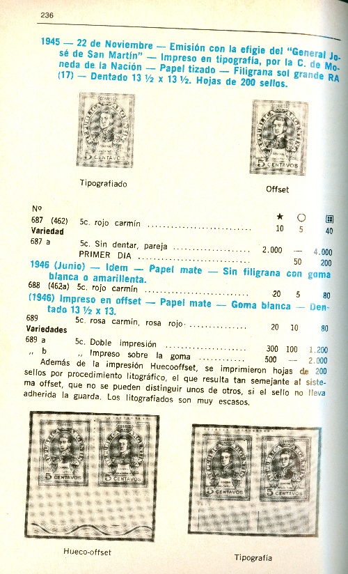
Pettigiani says we cannot differentiate the 2 methods - offset-litho and hueco-offset!In Samuel Klass 1970 "Catalogio de sellos postales de la Argentina" on page 236, he uses the term "huecoooffset"in relation to the 5c Jose de San Martin of 1945.
Googling the term I only come across a few old references - all in Spanish of course - to multicolour printing in the period of 1946-196x... Later references mention that this is the same as dry offset or laser prepared plates for offset. Of course we could not expect laser beams in 1945!!!!
Searching for "dry offset" it turns out to be typography with an intermediate cylinder like in offset.
In other words indirect typography better known by German stamp collectors as "Letterset".
http://bdph.mediagrafix.de/forum/showth ... 058&page=2
Do we have any references in the Argentina literature of this "indirect typography" or hueco-offset???
to be continued ...
-
Rein
- Usuario Colaborador
- Mensajes: 6258
- Registrado: 13 Mar 2009 15:59
- Ubicación: Leiden, Netherlands
- Contactar:
Re: The Manual - G.A. Pettigiani - 2010
Thanks to Jorge from Chile we know that the plates are typographical:
Which confirms my thoughts about the dry offset being indirect typography in fact so we rather call it offset-typo instead of offset-litho!
to be continued ...
jorgesurcl » 13 Sep 2009 23:15 escribió: Hola
En un libro llamado "Memoria 1963-73" de Casa de Moneda de Chile, encontré unas imágenes (diagramas) que muestran la diferencia entre el Offset normal y el Offset Seco (Dry offset).
En el Offset seco, la plancha tiene relieve (como en la Tipografía). Con ella entintada se imprime sobre un rodillo de goma que a su vez imprime el papel.
Este sistema no utiliza agua para mantener la plancha húmeda.
Los diagramas:
Esta página (de la Memoria) fue impresa en "Dry Offset":
Saludos
Which confirms my thoughts about the dry offset being indirect typography in fact so we rather call it offset-typo instead of offset-litho!
to be continued ...
-
Rein
- Usuario Colaborador
- Mensajes: 6258
- Registrado: 13 Mar 2009 15:59
- Ubicación: Leiden, Netherlands
- Contactar:
Re: The Manual - G.A. Pettigiani - 2010
Perforation
The stamps printed in offset-litho and in flat-bed typography were perforated on a separate machine using a perforation head out of the several standardized sizes.
The philatelic convention of denoting perforation gauges not more precise than 0.25 gives way to hardly manageble
13 1/4:13 [after the sheet-fed printing aplied on the aseparate machine] and 13 1/2 [applied in-line on the Goebel press].
Pettigiani says that the pins of the 13 are positioned irregularly and are thicker whereas those for the 13 1/2 are thinner and more regular.
What does not get mentioned in the book is that there are only 2 instances of stamps having been printed both on a flat-bed press and on a reel-fed rotary!
These are the 10c Rivadavia red and the 40c José de San Martin red on matt paper. This 40c stamp from flat-bed plates has a 13 1/4:13 perforation and does not get any recognition in Argentine catalogues.... Merlo does mention this very explicitly in his excellent book "" Los sistemas de impresión en filatelia" of 2006.
Why not read the Argentina classics??? And profit from them!
to be continued ...
-
Rein
- Usuario Colaborador
- Mensajes: 6258
- Registrado: 13 Mar 2009 15:59
- Ubicación: Leiden, Netherlands
- Contactar:
Re: The Manual - G.A. Pettigiani - 2010
In order to estimate the perforation gauge you need to know the "official" size of the stamps!
And in the case of the small sized P&R I this happened to be
24.0x30.5mm
Once you know that size it is a matter of counting the number of teeth both horizontally and vertically. In the previous posting I had done so: 16 horizontal, 20 vertical!
Now a simple mathematical exercise:
X : 20mm = 16 : 24mm => X = 32/24 = 4/3 = 13.333333333333 [in short 13.33 or rounded off to 13 1/4!]
X : 20mm = 20 : 30.5mm > X = 40:30.5 = 13.147 [also rounded off to 13 1/4!]
The 13 1/4:13 in the previous postings can not be good!
to be continued ....
-
Rein
- Usuario Colaborador
- Mensajes: 6258
- Registrado: 13 Mar 2009 15:59
- Ubicación: Leiden, Netherlands
- Contactar:
Re: The Manual - G.A. Pettigiani - 2010
As I have pointed out in the previous posting, the gauge has to do with the stamp size - heart-to-heart from the top row of holes to the bottom row of holes!
And indeed we have 30.5mm for the offset-litho printed stamps that usually have a comb that moved from left to right or vice versa!
But for the 13 1/4 perforation we need to look at the stamps in typography printed on the Goebel reel-fed press! The average height of those stamps is NOT 30.5mm but 30.0mm We have to re-read Leopoldo Tenorio Casal!
X : 20mm = 20 : 30mm => X = 40/30 = 4/3 = 13.33333333 [or rounded off 13.33 or 13 1/4].
So far we can not rely on our perforation gauges as long as they only provide us with the nearest quarter!
to be continued ...
And indeed we have 30.5mm for the offset-litho printed stamps that usually have a comb that moved from left to right or vice versa!
But for the 13 1/4 perforation we need to look at the stamps in typography printed on the Goebel reel-fed press! The average height of those stamps is NOT 30.5mm but 30.0mm
X : 20mm = 20 : 30mm => X = 40/30 = 4/3 = 13.33333333 [or rounded off 13.33 or 13 1/4].
So far we can not rely on our perforation gauges as long as they only provide us with the nearest quarter!
to be continued ...
-
Rein
- Usuario Colaborador
- Mensajes: 6258
- Registrado: 13 Mar 2009 15:59
- Ubicación: Leiden, Netherlands
- Contactar:
Re: The Manual - G.A. Pettigiani - 2010
All we have to do is to measure the height of the stamps - heart-to-heart of the perforation holes!
and this suggestion and advice I would have expected from Pettigiani!
SInce 1935 only 2 stamps in typogrphy had been printed both on the reel-fed Goebel and on a sheet-fed / flat-bed typography press:
the 10c Rivadavia in red in type II and the 40c José de San Martin.
The main difference - to be measured - is the height of the stamp provided there are NO correction teeth! The reel-fed stamps have a height of 30.0mm, the sheet-fed stamps have a height of 30.5mm:
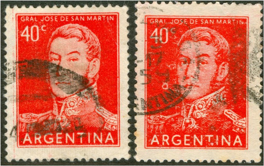
The right hand stamp also has a watermark turned 90 degrees:
viewtopic.php?f=2&t=2124
and this suggestion and advice I would have expected from Pettigiani!
SInce 1935 only 2 stamps in typogrphy had been printed both on the reel-fed Goebel and on a sheet-fed / flat-bed typography press:
the 10c Rivadavia in red in type II and the 40c José de San Martin.
The main difference - to be measured - is the height of the stamp provided there are NO correction teeth! The reel-fed stamps have a height of 30.0mm, the sheet-fed stamps have a height of 30.5mm:
The right hand stamp also has a watermark turned 90 degrees:
viewtopic.php?f=2&t=2124
-
Rein
- Usuario Colaborador
- Mensajes: 6258
- Registrado: 13 Mar 2009 15:59
- Ubicación: Leiden, Netherlands
- Contactar:
Re: The Manual - G.A. Pettigiani - 2010
I was hoping to find some reference to the manufacturer of the perforation machines. Pettigiani mentions the name Hogenfonet which does not sound like anything... Searching the World Wide Web did not give any results...
Famous manufacturers were Grover and Bickel. Both have been merger into WISTA now....
Famous manufacturers were Grover and Bickel. Both have been merger into WISTA now....
-
Rein
- Usuario Colaborador
- Mensajes: 6258
- Registrado: 13 Mar 2009 15:59
- Ubicación: Leiden, Netherlands
- Contactar:
Re: The Manual - G.A. Pettigiani - 2010
About time to get the factual description of each type of paper!
Pettigiani chooses to give the types a capital letter ranging from A to S. The first group of watermarks in uncoated paper - the wavy rays - get A-G; the second group of watermarks - the straight rays - get H-I.
Does Pettigiani follow Bardi???
No, Dario Bardi has 7 "mate importado" but does not use the chronological order that Pettigiani does. This is due to the so-called "mate lustroso" which Bardi denotes by MI 7

to be continued ...
Pettigiani chooses to give the types a capital letter ranging from A to S. The first group of watermarks in uncoated paper - the wavy rays - get A-G; the second group of watermarks - the straight rays - get H-I.
Does Pettigiani follow Bardi???
No, Dario Bardi has 7 "mate importado" but does not use the chronological order that Pettigiani does. This is due to the so-called "mate lustroso" which Bardi denotes by MI 7
to be continued ...
-
Rein
- Usuario Colaborador
- Mensajes: 6258
- Registrado: 13 Mar 2009 15:59
- Ubicación: Leiden, Netherlands
- Contactar:
Re: The Manual - G.A. Pettigiani - 2010
So far, everything in line with what we knew form Darió Bardi!
The "A" paper of Englsih origin - Wiggins, Teape & Alex Pirie\
http://thepapeterie.com/stoneywood_mill_20_century.aspx
From the above excerpts from a history it will not be clear from where exactly the paper comes. From which paper mill located where?!?!
to be continued ....
The "A" paper of Englsih origin - Wiggins, Teape & Alex Pirie\
http://thepapeterie.com/stoneywood_mill_20_century.aspx
Portals was also the manufacturer of paper for banknotes of Argentina during a long period!
1919
Wiggins Teape converted into a public company named Wiggins Teape & Co (1919) Ltd., and continued to trade under this name for over 40 years. The chairman was Mr P.W Holden, but this shortly passed to Mr Keith Barlow.
The commercal paper manufacture of Portals (1919) Ltd. was merged with Wiggins Teape (1919) Ltd., but Portals continued to make banknote paper at Laverstoke and Overton Mills.
1920
Wiggins Teape acquired Devon Valley Mill at Hele, near Exeter. Hele Mill had started the tradition of sending primroses to their customers together with a small poem, and this tradition was continued by Wiggins Teape for over 65 years. Mr. S.N. Cozens-Hardy was the general manager of Stoneywood from 1934 to 1947(?), but had previously been the manager of Devon Valley Mill.
1921
Waterton Mill was built for Pirie's Photographic Paper Ltd. adjacent to Stoneywood Works, and a new papermachine installed to make photographic base paper.
The offices, and possibly the new mill, were designed by Harbourne Maclennan of Jenkins & Marr and still retain all the original oak panelling and design features.
1922
Alex Pirie & Sons amalgamated with Wiggins Teape who had already started a new machine for photographic paper at Glory Mill in Buckinghamshire. This amalgamation set the new company on the road to expansion and development of new paper.
Mr Hardy was appointed as the new manager of Stoneywood Mill. He was previously the manager of the Withnell Fold Paper Mill
In 1922, Wiggins Teape restarted the tradition of Devon Valley Mill to send primroses to all the customers of Wiggins Teape. This tradition was continued until the late 1980's
1930
Colonel Wyndam Raymond Portal became chairman of Wiggins Teape. He was the eldest son of Sir William Portal and a direct descendant of Henri Portal who had come over to Britain with the Huguenots to escape persecution by the French, to start papermaking in Hampshire.
In addition to being Chairman of Wiggins Teape, he was also the managing directory of Portals (1919) Ltd., thus holding a unique position as the head of two major papermaking companies.* The Portals mill at Overton, near Basingstoke, still make banknote paper for the Bank of England and the banks of Scotland, remaining a competitor of Arjowiggins.
From the above excerpts from a history it will not be clear from where exactly the paper comes. From which paper mill located where?!?!
to be continued ....