Re: P&R 10c Rivadavia typography orphanage
Publicado: 04 Mar 2017 14:48
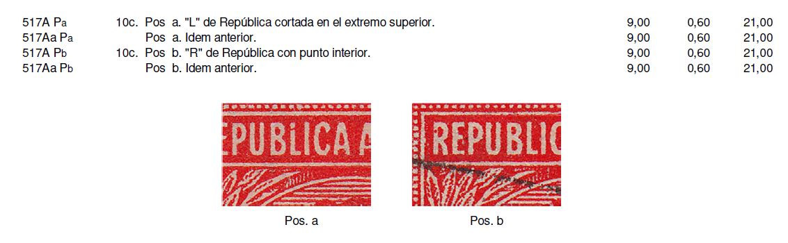
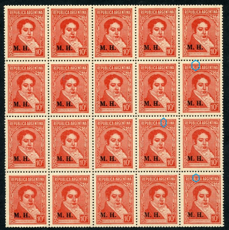
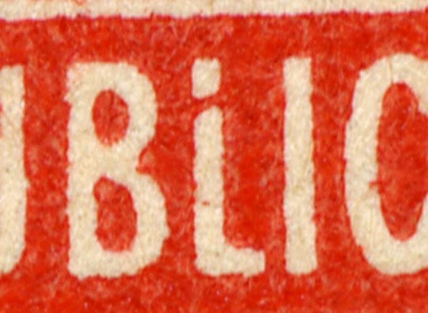
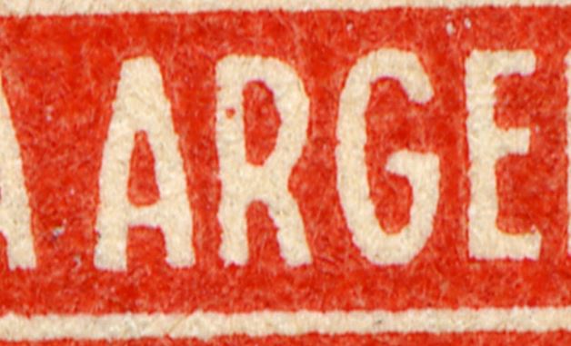
Two characteristics of the 517A cylinders (Type II) mentioned but NOT giving the position number?????
Abierto a la Comunidad Filatélica
http://foro.filateliaargentina.org/
Rein » 13 Sep 2009 12:41 escribió:
Tony,
it seems that I have overlooked a very peculiar "plate flaw" that does not occur every second horizontal row, but occurs at least twice in a sheet - judging from the blocks I have. I have that flaw several times - so if you feel like it I can spare you one block!
Rein » 13 Sep 2009 16:36
.....................
......................
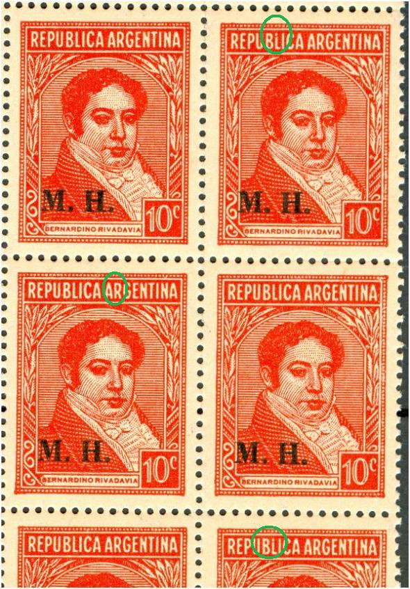
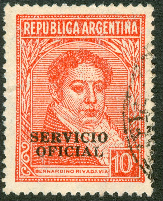
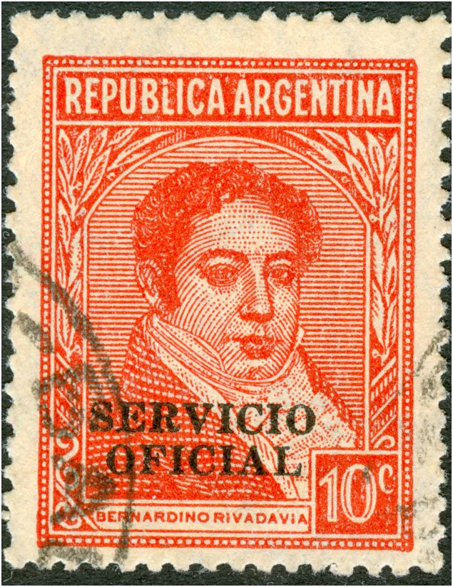
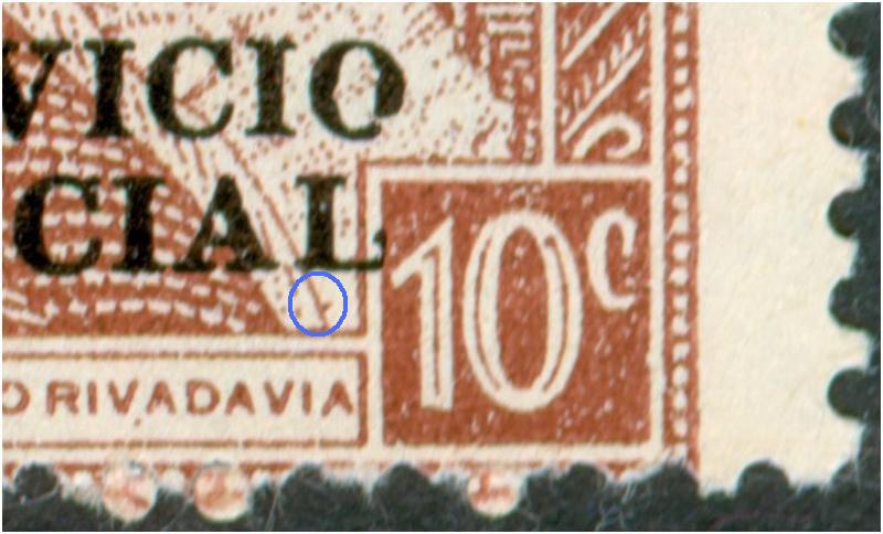
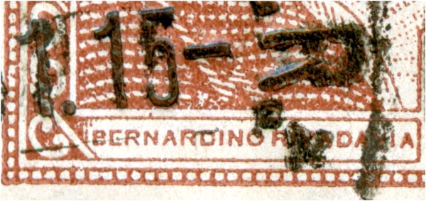
According to Tenorio Casal the "Servicio Oficial" is the only "S.O." on a sheet-fed 10c red! And occurs JUST in the 1938 printing!Rein » 14 Sep 2009 17:16 escribió:The broken "L" also in the servicio Oficial:
Eduardo,educ escribió: http://foro.filateliaargentina.org/down ... cvRojo.zip
aqui puse toda la informacion que pude
Eduardo
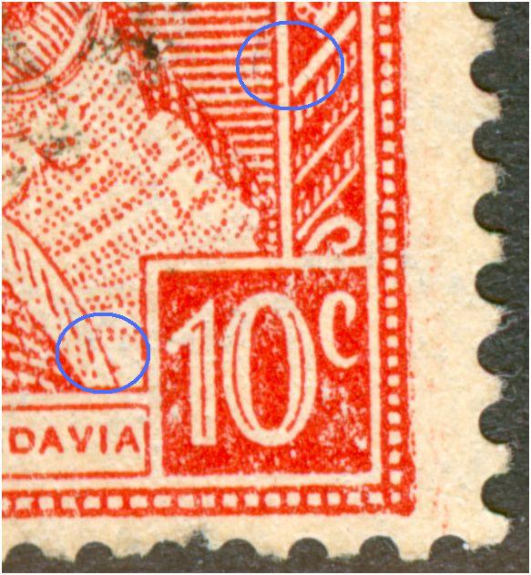
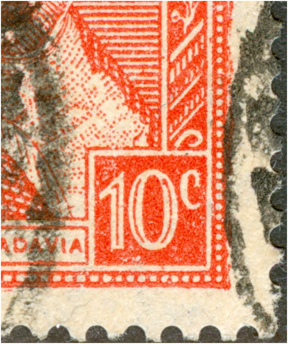
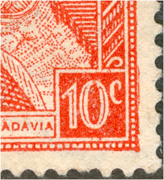
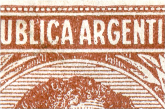
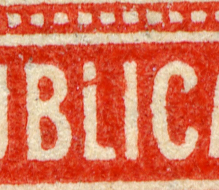
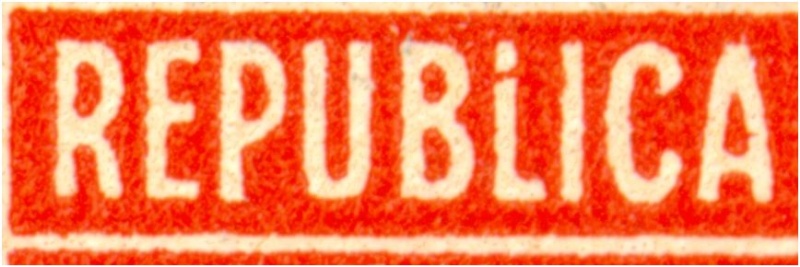
Rein» 15 Mar 2010 14:15 escribió:The 10c Rivadavia in red has 3 [THREE] types! The 3rd had 2 characteristics that I have described before. It turns out now that there 2 more characteristics - not always clearly printed and hence visible - that I have overlooked so far. The "-" above "DAVIA " had been described before so had the "." under the second "A"!
The "Jabots" in the 10c Chestnut - published here almost 8 years ago!Rein» 16 Jul 2009 21:04 escribió:
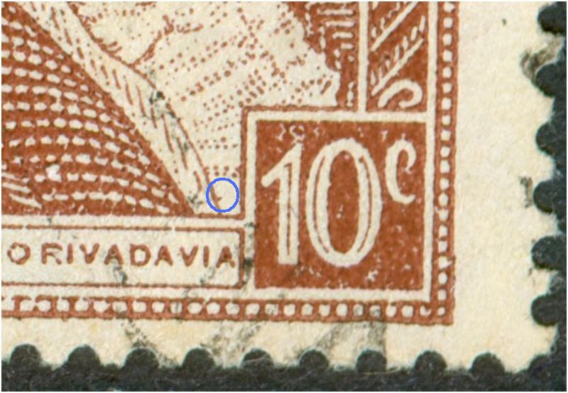
None of the chestnut stamps I have seen until today [!] had the dot underneath the first "A" of "Argentina".... But in the collection of 4-blocks the dot underneath the A was found quite often....
Also the dot underneath the "V" will be met again!
to be continued....
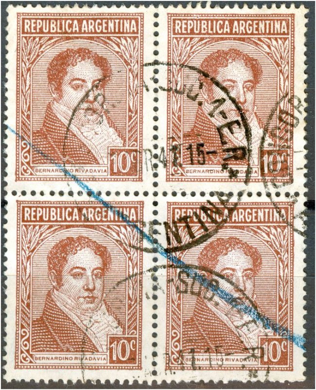
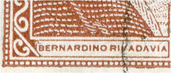
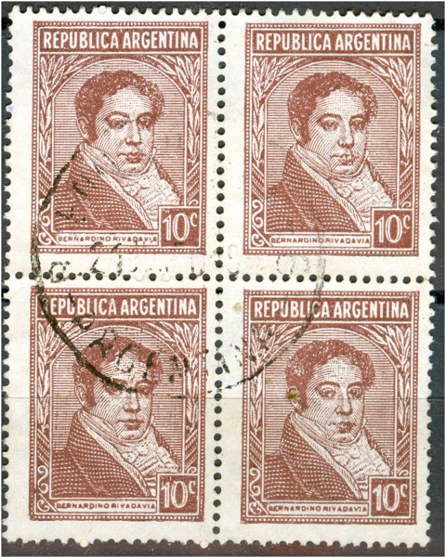
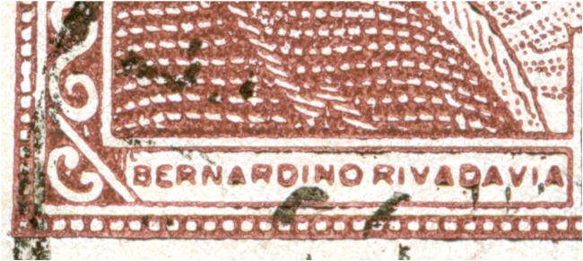
Rein» 17 Jul 2009 06:57 escribió:The 10c Rivadavia in typography chestnut, coated, in a block of 4:
The top left stamp:
and with the dot underneath the A:
The top right stamp:
The bottom left stamp:
The bottom right stamp:
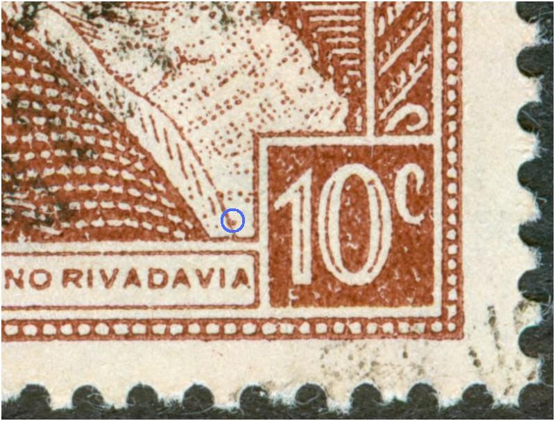
Watch the upright scratch above the first "N" of "Bernardino"!
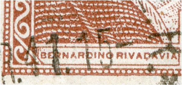
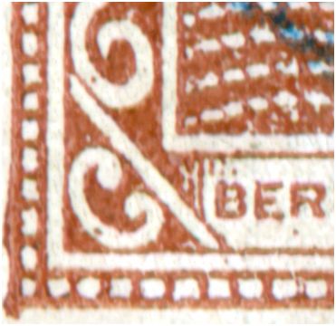
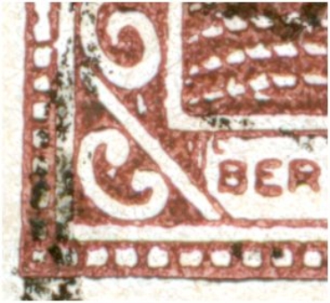
Rein » 17 Jul 2009 09:53 escribió:The 10c Rivadavia in typography chestnut - different shade, coated, in a block of 4:
With a hook left of the "Bernardino" - type VII:
This new lettering in the "L" version does not get explained by assuming the estereotipia method been used!!!Rein » 17 Jul 2009 10:01 escribió:Next to eachother:
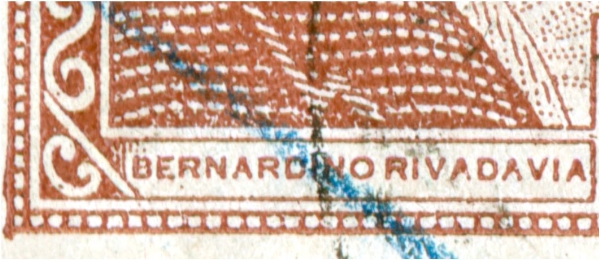
educ » 28 Feb 2017 21:35 escribió:Si no entiendo mal la discusión, aclaro que: en las primeras impreciones tipograficas del 10c marron se usaron las mismas planchas o identico diseño que se uso para el 10c rojo de rotativa de agosto de 1936, Tipo II R2,
Aunque los sellos de las imagenes son la variedad jabot , tambien esta la del punto sobre la N, y sus posiciones relativas coinciden, sobre el fondo que se ve un cuadriculado o lineas de puntos, se puede producir tal ves por la mala calidad del carton usado para obtener el estereotipo o tal vez, como dice Merlo que creia que de debian al tipo encapado que tenia el paper. A los catalogos les falta mucho.
Un gran saludo
Eduardo
If I do not misunderstand the discussion, I clarify that: in the first typographic printings of the 10c brown the same plates or identical design that was used for the red 10c of rotary of August of 1936, Type II R2 .
Although the stamps of the images have the jabot variety, there are also those with the point on the N, and their relative positions coincide, on the background that is seen as a grid or as dotted lines, can be the result perhaps of the poor quality of the carton used to get the stereotype, or maybe, as Merlo says he thought it weas due to the coated paper. The catalogues are missing a lot.
A big greeting