The Manual - G.A. Pettigiani - 2010

This sub-forum is dedicated to one of the most interesting and complex definitive series in 20th Century philately: the Argentina 1935-51 Definitives

Moderador: Rein

Avatar de Usuario
Rein
Usuario Colaborador
Usuario Colaborador
Mensajes: 6258
Registrado: 13 Mar 2009 15:59
Ubicación: Leiden, Netherlands
Contactar:

Re: The Manual - G.A. Pettigiani - 2010

Mensaje por Rein »

The 10 cent Rivadavia red type I in sheet-fed typography

Types of paper and their first use [according to Pettigiani] and their relative scarceness:

MI 1 01.10.1935 "c" for both

Relying a lot on the article made by Leopoldo Tenorio Casal (Nr 40 Revista del Centro Filatélico de la Plata - 1947) we should make a distinction between the sheet-fed and the reel-fed versions!

10c red type I:

01.10.1935 sheet-fed, 1st plate [only 1 printing]; the stamp measuring 24.0x30.5mm, the design 21.0x27.0mm; with comb perforation 13.333:13.147 [13 1/2:13 in M.T.].

As the comb perforation heads move horizontally - the vertical height of the stamp 30.5mm is constant!! The width may vary a bit as can be seen by the last horizontal teeth on the right hand side ... 13.3333 and 131.147 are not distinguishable with a traditonal philatelic perforation gauge!


Imagen
Imagen
Imagen


to be continued ....
Avatar de Usuario
Rein
Usuario Colaborador
Usuario Colaborador
Mensajes: 6258
Registrado: 13 Mar 2009 15:59
Ubicación: Leiden, Netherlands
Contactar:

Re: The Manual - G.A. Pettigiani - 2010

Mensaje por Rein »

The 10 cent Rivadavia red type II in sheet-fed typography

Types of paper and their first use [according to Pettigiani] and their relative scarceness:

MI 1 December 1935 "c" for both

Relying a lot on the article made by Leopoldo Tenorio Casal (Nr 40 Revista del Centro Filatélico de la Plata - 1947) we should make a distinction between the sheet-fed and the reel-fed versions!

10c red type II sheet-fed:

17.12.1935 sheet-fed, 2nd plate [2 printings]; the stamp measuring 24.0x30.5mm, the design 20.6x26.7mm; comb perforation 13.333:13.147 [13 1/2:13 in M.T.]

x.09.1938 sheet-fed, 3rd plate [2 printings]; no further details but for the fact that according to Tenorio Casal the word "Bernardino" is back to the length of the 1st plate....

As the comb perforation heads move horizontally - the vertical height of the stamp 30.5mm is constant!! The width may vary a bit as can be seen by the last horizontal teeth on the right hand side ... 13.3333 and 131.147 are not distinguishable with a traditonal philatelic perforation gauge!


Imagen
Imagen

type II:

Imagen

to be continued
Avatar de Usuario
Rein
Usuario Colaborador
Usuario Colaborador
Mensajes: 6258
Registrado: 13 Mar 2009 15:59
Ubicación: Leiden, Netherlands
Contactar:

Re: The Manual - G.A. Pettigiani - 2010

Mensaje por Rein »

The 10 cent Rivadavia red type II/III in reel-fed typography

Types of paper and their first use [according to Pettigiani] and their relative scarceness:

MI 1 April 1936 "c" for both

Relying a lot on the article made by Leopoldo Tenorio Casal (Nr 40 Revista del Centro Filatélico de la Plata - 1947) we should make a distinction between the sheet-fed and the reel-fed versions!

01.06.1936 reel-fed, 11 printings; the stamp measuring 24.0x30.0mm, the design 20.0x26.5mm; comb perforation 13.333:13.333 [13 1/2 in M.T.]

Type II and III occur on the 2 panes of 10x10 without any systematics! And so do the subtypes!

type II reel-fed with subtype:

Imagen

The dot above the "N" of "Bernardino" is the prime characteristic!


type III reel-fed:

Imagen
Imagen

type III reel-fed with subtype:

Imagen

Imagen
Imagen

Imagen
Imagen


to be continued ...
Avatar de Usuario
Rein
Usuario Colaborador
Usuario Colaborador
Mensajes: 6258
Registrado: 13 Mar 2009 15:59
Ubicación: Leiden, Netherlands
Contactar:

Re: The Manual - G.A. Pettigiani - 2010

Mensaje por Rein »

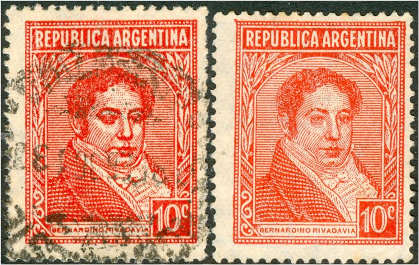
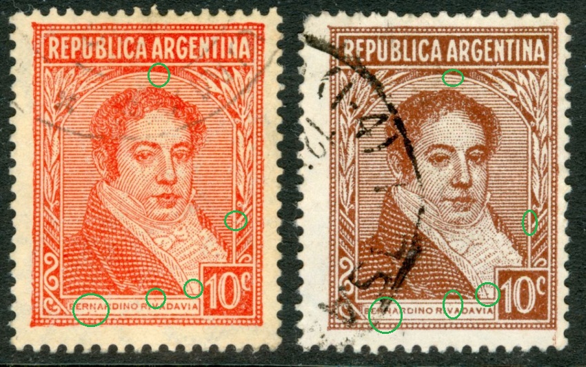
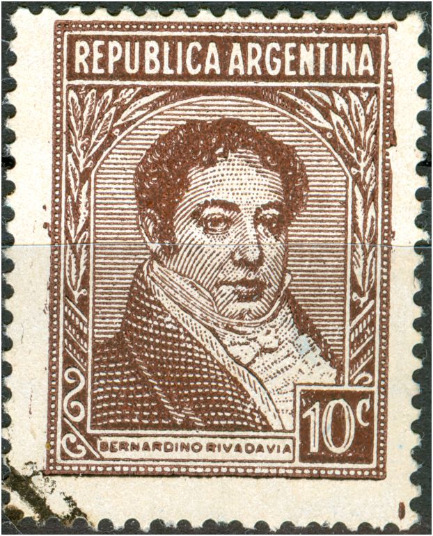
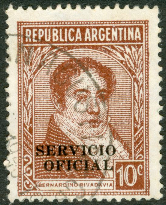
The 10c Rivadavia red had to be replaced by the 10c Rivadavia in chestnut-brown in the context of a full scale change of colours due to a change of international postage rates by 20.03.1939!

Tenorio Casal refers to a resolution of the Directorate-General of the Post Office of 27.12.1938 concerning the change of colour of the 10c Rivadavia. The chestnut-brown stamp was due for 16.03.1939. His article is rather confusing in writing about an offset-litho version appearing first followed by the typography version by 04.11.1939...

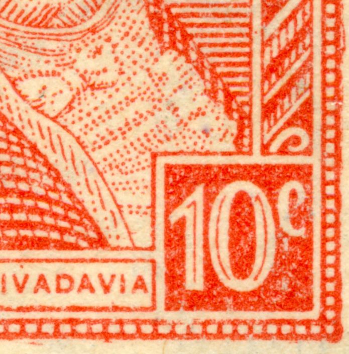
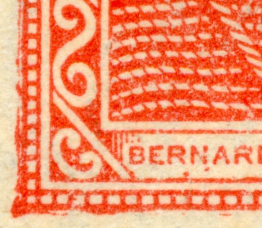
The type of paper for that stamp has always - for more than 70 years now - been considered to be a coated paper. Leopoldo Tenorio Casal mentions a coated paper of the 1st production for the 5c Moreno in typography of 05.04.1939.

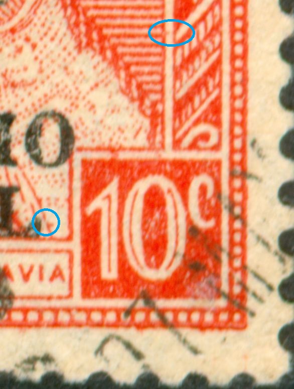
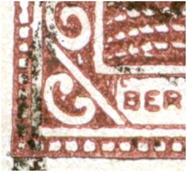
It seems rather safe to conclude that this 1e production paper was used both for the 5c [05.04.1939] and the 10c [16.03.1939]. Characteristics of the 1st production: 10mm diameter of the suns, inter-solar distances: 29.7x16.8mm.

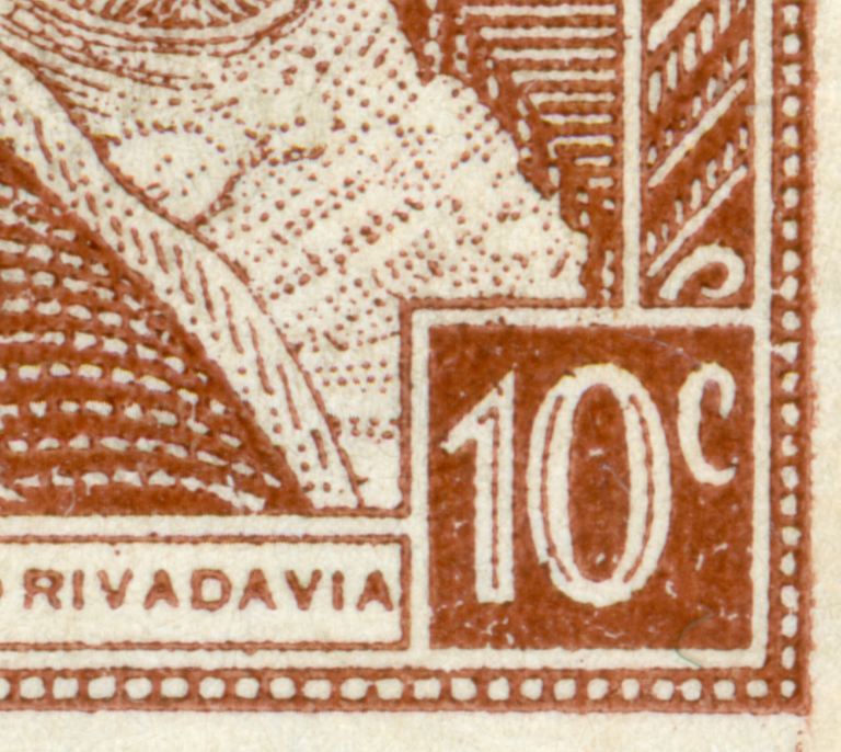
The 10c chestnut had never been found on un-coated paper so far. The suddenly an alleged stamp on "mate lustroso' was to be found dated in March 1939 [Merlo in Revista 228 ].

The "mate lustroso" for the 5c Moreno dates from 24.03.1940 and has the characteristics: 10mm diameter of the sun, inter-solar distances: 30x17.2mm.

What do we find in Pettigiani now!

The 5c mate lustroso is supposed to have been issued on 10.05.1939 [almost ONE YEAR earlier] and the 10c mate lustroso on 20.03.1939!!

Of course it is very difficult to judge stamps from a distance over the ocean!

But I am afraid that Pettigiani has completely mixed up matters and is confusing a slightly coated 10c chestnut for a mate lustroso. Bear in mind that mate lustroso is not even supposed to be a calandered paper [satinado] and that having a satinado confused with a tizado is an appreciated Argentine philatelic tradition....

Setting the price for an alleged 10c mate lustroso on ONLY 10.00 is absurd for what theoretically still could be a highly rare instance of the uncoated paper for the 10c Rivadavia chestnut in typography.

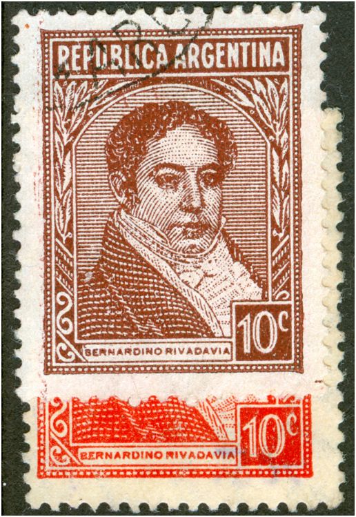
There is still the Casal scenario! The offset-litho version of 16.03.1939 DOES exist! :mrgreen:

to be continued ...
Avatar de Usuario
rubiera
Moderador
Moderador
Mensajes: 2139
Registrado: 10 Abr 2008 12:49
Contactar:

Re: The Manual - G.A. Pettigiani - 2010

Mensaje por rubiera »

And based on the used and on cover specimens, there seems to have been just one early printing of the 10c Brown, and regardless of whatever we call this stamp, it has the same paper as the first clay paper used for the 5c.

tony
sitio Ingles/Español de P y R I
http://www.somestamps.com/arg3551/index.htm
sitio general:
http://www.somestamps.com/
blog de P y R I en Ingles
http://arg3551.blogspot.com/
jorgec
Usuario Colaborador
Usuario Colaborador
Mensajes: 418
Registrado: 13 Ene 2010 13:41

Re: The Manual - G.A. Pettigiani - 2010

Mensaje por jorgec »

Rein escribió:What is obvious to me is that apart from a language barriere there is a cultural one. To say it bluntly and over-generalizing: placing everybody with a knowledge above average on a high pedestal and declare him impeccable. * ... In the culture where I live no one is an authority without having to prove himself constantly....
...
When you think I am factually wrong on some points, show it to me, give me arguments and I will not be stubborn forever not accepting that someone could have it more right than me.
...
I realize the cultural differences may let you suspect me of disrespect, but you are WRONG!
* of course I did mean "infallible" :)
The issue about cultural differences or language barriers sound like pretty lame excuses to me. Nobody said that Petttigiani is perfect or infallible, not at all. Nobody said that you are wrong (or right, for that matter). It is not about what you say, but about how you say it. To make matters worse, you don't even apologize (almost everybody else would have say something as "sorry if I sounded too harsh").
Avatar de Usuario
Rein
Usuario Colaborador
Usuario Colaborador
Mensajes: 6258
Registrado: 13 Mar 2009 15:59
Ubicación: Leiden, Netherlands
Contactar:

Re: The Manual - G.A. Pettigiani - 2010

Mensaje por Rein »

The 10 cent Rivadavia red in type II sheet-fed typography - Servicio Oficial


Sometimes the "Servicio Oficial" had been printed in offset-litho sometimes in typography. Pettigiani does not mention anything about it, although A. Fredy Yedro did mention these printing methods in his articles....

Types of paper:

MI 1 with Servicio Oficial in typography - 12mm

The main difference - to be measured - is the height of the stamp provided there are NO correction teeth! The reel-fed stamps have a height of 30.0mm, the sheet-fed stamps have a height of 30.5mm:

the 2nd one has 30.5mm, the others have 30.0mm!

Imagen


to be continued ....
Avatar de Usuario
Rein
Usuario Colaborador
Usuario Colaborador
Mensajes: 6258
Registrado: 13 Mar 2009 15:59
Ubicación: Leiden, Netherlands
Contactar:

Re: The Manual - G.A. Pettigiani - 2010

Mensaje por Rein »

The 10 cent Rivadavia red in type II/III reel-fed typography - Servicio Oficial


Sometimes the "Servicio Oficial" had been printed in offset-litho sometimes in typography. Pettigiani does not mention anything about it, although A. Fredy Yedro did mention these printing methods in his articles....

Types of paper:

MI 1 with Servicio Oficial in typography - 12mm

type II-reel-fed:

Imagen

Imagen

type III-reel-fed:

Imagen

Imagen

to be continued ....
Avatar de Usuario
Rein
Usuario Colaborador
Usuario Colaborador
Mensajes: 6258
Registrado: 13 Mar 2009 15:59
Ubicación: Leiden, Netherlands
Contactar:

Re: The Manual - G.A. Pettigiani - 2010

Mensaje por Rein »

The 10 cent Rivadavia chestnut-brown type II/III in reel-fed typography

Types of paper and their first use [according to Pettigiani] and their relative scarceness:

TI 1 1939 normal "c" for both; inverted "R" for both
TI 2 1939 normal "c" for both - I don't think the 1939 is OK! It should be closer to 1943!

Pettigiani mentions the design sizes: 26.8x20.3mm for the first printings [TI 1 and TI 2 partly] and 26.3x19.8mm for all later ones. My impression is that the 26.8x20.3mm goes with the types II/II and that type IV goes with the 26.3x19.8mm.

We will find TI 1 from 20.03.1939 onwards! As I have pointed out earlier the 10c mate lustroso is highly dubious.

The same types used for the 10c red - type II and type III reel-fed had also been used for the 10c chestnut!

Imagen

Imagen
Imagen

Imagen
Imagen

to be continued ...
Avatar de Usuario
Rein
Usuario Colaborador
Usuario Colaborador
Mensajes: 6258
Registrado: 13 Mar 2009 15:59
Ubicación: Leiden, Netherlands
Contactar:

Re: The Manual - G.A. Pettigiani - 2010

Mensaje por Rein »

The 10 cent Rivadavia chestnut-brown type IV in reel-fed typography

Types of paper and their first use [according to Pettigiani] and their relative scarceness:

TI 2 1942 normal "c" for both; This should be closer to 1945!
TI 3 1950 ascending "c' for both; descending "R" for both
TI 4 1949 ascending "c' for both; descending "R" for both
TI 5 1950 normal "R" for both; inverted "c" for both

Pettigiani mentions the design sizes: 26.8x20.3mm for the first printings [TI 1 and TI 2 partly] and 26.3x19.8mm for all later ones. My impression is that the 26.8x20.3mm goes with the types II/II and that type IV goes with the 26.3x19.8mm.

Somewhere in between June 1943 and 1947 when Tenorio Casal wrote his article a new cylinder for the 10c Rivadavia chestnut-brown in typography must have been made. We will find type IV from 1945 onwards! I would appreciated good scans of earlier than 1946 cancellations.

As important as the name tablet had been for distinguishing type I and II, the same goes for the new cylinder. They can be recognized by the different outlook of the left hand part of the name tablet:

Imagen

The differences in sizes Pettigiani refers to coincide with my own observations. The size of the 10c had changed constantly. This time the width has come down to 19.5 [the first 10c red was 21.0mm wide!]. A quick measuring of the word "Bernardino" will result in 5.8 [originally 6.2mm!] will help.

Imagen

The more characteristic feature is the "L" shaped appendix:

Imagen
Imagen


to be continued ...
Avatar de Usuario
rubiera
Moderador
Moderador
Mensajes: 2139
Registrado: 10 Abr 2008 12:49
Contactar:

Re: The Manual - G.A. Pettigiani - 2010

Mensaje por rubiera »

Rein escribió:About time to get the factual description of each type of paper!

Pettigiani chooses to give the types a capital letter ranging from A to S. The first group of watermarks in uncoated paper - the wavy rays - get A-G; the second group of watermarks - the straight rays - get H-I.

Does Pettigiani follow Bardi???

No, Dario Bardi has 7 "mate importado" but does not use the chronological order that Pettigiani does. This is due to the so-called "mate lustroso" which Bardi denotes by MI 7

Imagen


to be continued ...
Thanks for this comparison, Rein. I am planning to collate all of my images to match the Pettigiani book.

tony
sitio Ingles/Español de P y R I
http://www.somestamps.com/arg3551/index.htm
sitio general:
http://www.somestamps.com/
blog de P y R I en Ingles
http://arg3551.blogspot.com/
Avatar de Usuario
Rein
Usuario Colaborador
Usuario Colaborador
Mensajes: 6258
Registrado: 13 Mar 2009 15:59
Ubicación: Leiden, Netherlands
Contactar:

Re: The Manual - G.A. Pettigiani - 2010

Mensaje por Rein »

rubiera escribió:
Rein escribió:About time to get the factual description of each type of paper!

Pettigiani chooses to give the types a capital letter ranging from A to S. The first group of watermarks in uncoated paper - the wavy rays - get A-G; the second group of watermarks - the straight rays - get H-I.

Does Pettigiani follow Bardi???

No, Dario Bardi has 7 "mate importado" but does not use the chronological order that Pettigiani does. This is due to the so-called "mate lustroso" which Bardi denotes by MI 7

Imagen


to be continued ...
Thanks for this comparison, Rein. I am planning to collate all of my images to match the Pettigiani book.

tony
Tony,

from this little table it is clear that we have to study both the 1E1, 1E3's and 1L1 c.q. the 1E4's more intensively!
Avatar de Usuario
Rein
Usuario Colaborador
Usuario Colaborador
Mensajes: 6258
Registrado: 13 Mar 2009 15:59
Ubicación: Leiden, Netherlands
Contactar:

Re: The Manual - G.A. Pettigiani - 2010

Mensaje por Rein »

Tony,

the 1E4's contain both the 5c Moreno 1940 Mate Lustroso and the 1940 Holandés [PyR 1] and the 1939 Holandés [Housing Congress and the 1940 Airmails! We have to describe their characteristics in terms of fibres, calandering, felting and wire visibility NOT in terms of Casa de Moneda category numbers for the printing sheet sizes like 13, 27, 29 etc as José did. The numbers may help, but as long as we do not find any references in Casa de Moneda archives about the quality of the papers, we have to establish our own system bearing in mind that 3 different methods of printing [typography, offset-litho and photogravure] demand their specific type of paper!!!!.
Avatar de Usuario
Rein
Usuario Colaborador
Usuario Colaborador
Mensajes: 6258
Registrado: 13 Mar 2009 15:59
Ubicación: Leiden, Netherlands
Contactar:

Re: The Manual - G.A. Pettigiani - 2010

Mensaje por Rein »

rubiera escribió:
Thanks for this comparison, Rein. I am planning to collate all of my images to match the Pettigiani book.

tony
Tony,

Pettigiani's alphabetha is OK for the subtypes to be studied sooner or later as some of them certainly make sense. But otherwise I would stick to Bardi's and eventually split them up. His MI 7 might rather be a subtype of MI 3 ..... (your 1E4!)

And as I have said several times before we cannot ignore the types of paper used for the commemoratives and the airmails!
Avatar de Usuario
Rein
Usuario Colaborador
Usuario Colaborador
Mensajes: 6258
Registrado: 13 Mar 2009 15:59
Ubicación: Leiden, Netherlands
Contactar:

Re: The Manual - G.A. Pettigiani - 2010

Mensaje por Rein »

The 10 cent Rivadavia chestnut-brown n type II/III reel-fed typography - Servicio Oficial


Sometimes the "Servicio Oficial" had been printed in offset-litho sometimes in typography. Pettigiani does not mention anything about it, although A. Fredy Yedro did mention these printing methods in his articles....

Types of paper:

TI 1 with Servicio Oficial in typography - 12mm
TI 2 with Servicio Oficial in typography - 12mm - I have not seen it yet but it is most likely to exist


Imagen
Imagen

to be continued ....
Responder

Volver a “Patriots and Resources I”